
Introduction to Web Mapping
Session 9: Introduction to Web Mapping
In this tutorial we will use Mapbox GL JS to create an interactive webmap of 2016 presidential election results for New York State at the county level. We will recreate the style used by the New York Times in their election results maps.
For a very useful overview of election mapping check out this article from the New York Time’s Upshot.
Other Mapping Libraries
This tutorial uses Mapbox GL JS. However, this is by no means the only mapping library out there. Other notable libraries are:
-
Tangram - Tangram is a JavaScript library for rendering 2D & 3D maps live in a web browser with WebGL. It is tuned for OpenStreetMap but supports any source of GeoJSON/TopoJSON or binary vector data, including tilesets and single files (Documentation). Pairs well with Nextzen Vector Tiles.
-
Leaflet - Leaflet is the leading open-source JavaScript library for mobile-friendly interactive maps.
-
OpenLayers - OpenLayers is a high-performance, feature-packed library for creating interactive maps on the web. It can display map tiles, vector data and markers loaded from any source on any web page. OpenLayers has been developed to further the use of geographic information of all kinds.
-
Google Maps JavaScript - The Maps JavaScript API lets you customize maps with your own content and imagery for display on web pages and mobile devices. The Maps JavaScript API features four basic map types (roadmap, satellite, hybrid, and terrain) which you can modify using layers and styles, controls and events, and various services and libraries.
-
Carto JS - CARTO.js is a JavaScript library that interacts with different CARTO APIs. It is part of the CARTO Engine ecosystem.
-
D3.js - D3 is not necessarily a mapping library, but more of a general visualization library. It does include many mapping functions and can produce excellent maps.
Downloads
This tutorial uses the following data sets:
- US Counties. Download from U.S. Census Bureau - Tiger/Line Shapefiles. Select
2016andWeb Interface. Select2016again, if necessary, andCounties (and equivalent), and clickSubmit. Then, clickDownload national file.
-
US Presidential Election Results at the County Level. Download from MIT Election Data + Science Lab
-
Note: if the U.S. Census Bureau
Web Interfaceis not working - it often doesn’t - selectFTP Archive. There, select the folderTIGER1016and then eitherCOUNTYorSTATEand download the filestl_2016_us_county.zipandtl_2016_us_state.zip.
Please download a pre-processed version of the data set here.
Pre-processing the data
Before beginning with the web map we need to prepare the election data and the shapefiles we will display on the map:
-
First, take the election results data and either though Excel, Google Sheets, or any other means, generate a
.csvfile with results at the county level. -
This file needs to have the following fields:
County,State,GeoID,Trump,Clinton,Other,Total,Winner,WnrPerc - Here’s what each of these fields means:
County: County nameState: State nameGeoID: Geographic identifiers to match the county and state shapefiles downloaded from the U.S. Census BureauTrump: Number of votes for Donald TrumpClinton: Number of votes for Hillary ClintonOther: Number of votes for other candidatesTotal: Number of total votes for the state or countyWinner: Winning candidate for the state or countyWnrPerc: Percentage of votes out of the total for the winning candidate
- Don’t forget to also create the
.csvtfiles to accompany these two tables detailing the type of data for each of the fields.
Creating the GeoJSON Files for the Webmap
The webmap will use vector tiles coming from Mapbox and election data that we will overlay on top of it. The election data will come in the form of GeoJSON files. To generate them we need to join the election data .csv file we just produced with the county shapefile downloaded from the U.S. Census Bureau.
-
In QGIS join the election data table to its respective shapefile.
-
Once they are joined properly, right-click on the layer and export it as a JSON file. Although the format you choose here is JSON, the files will actually be exported as GeoJSON, which is just a version of a JSON file that also contains geographic information. Make sure you are exporting the GeoJSON with the
WGS 84projection as this is the projection most web maps use. -
In addition to the county polygon file we will also be exporting a GeoJSON file with point data for the county election results:
-
To generate that GeoJSON point file we first need to create a shapefile with the county centroids and with their corresponding attributes.
-
QGIS has a very simple tool to generate centroids under
Vector / Geometry Tools / Centroids..., however, since some county polygons have very irregular shapes, some of the centroids will be placed outside the actual polygons. To solve this problem, you should use therealcentroidplugin.- To install the plugin go to
Plugins / Manage and Install Plugins...and search forrealcentroid. Once you find it, go ahead and install it.
- To install the plugin go to
-
Once installed, use the plugin to generate centroids from the county layer. In addition to making sure the centroid is located within the polygon, this plugin also adds the attributes from the source file automatically to the centroid file.
-
-
Once you have the centroid shapefile, export it as a JSON file.
-
At the end of this process you should have two GeoJSON files, one with New York State county polygon data, and one with New York State county point data.
Setting Up the Base Map in Mapbox Studio
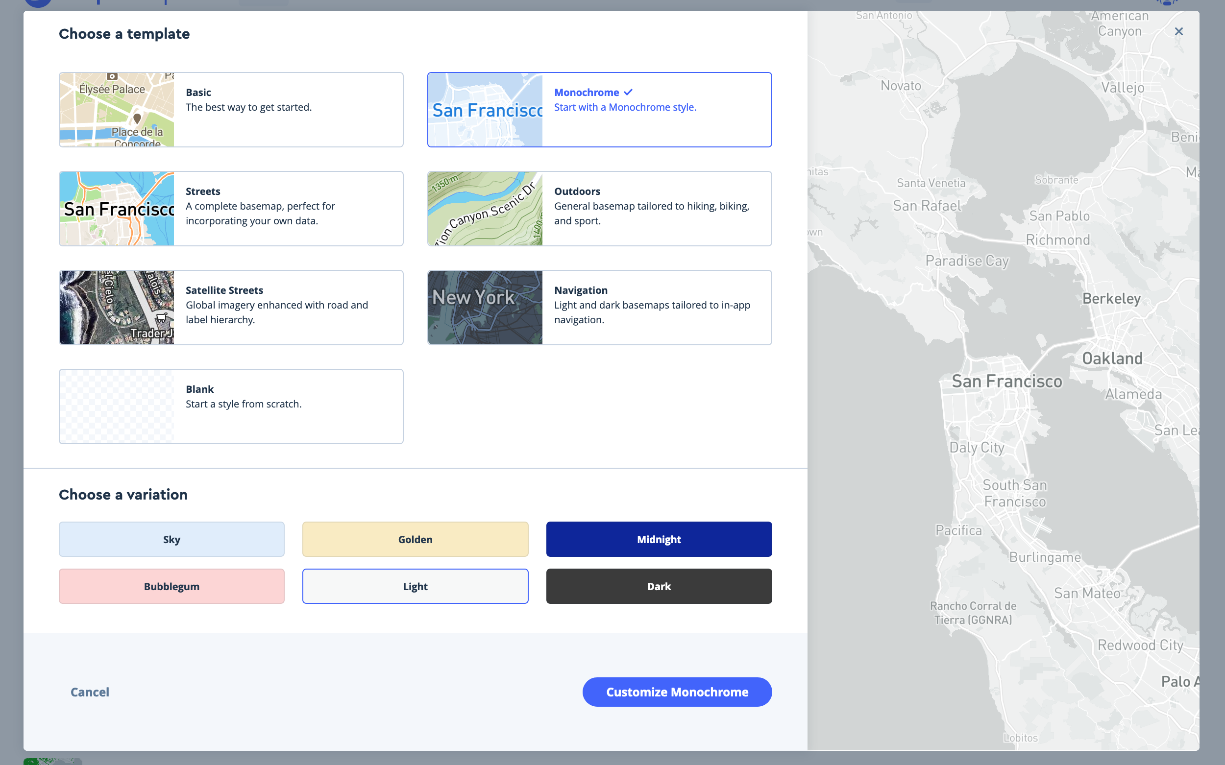
Before setting up our mapping site we should style the basemap we will use. To do this, go to your Mapbox Studio page and create a New style.
-
It is usually much easier to start from a template, otherwise you will have to add and style every single layer your map will use and do this for all zoom levels. The templates provided by Mapbox already include all this styling and have been tested and refined many many times.
-
To create our turnstile map we will use the
Monochrometemplate with aLightvariation. Choose it and clickCustomize Monochrome. This template provides a very neutral background on which to display our turnstile data.
-
On the next screen you’ll see the actual editor view with all the
componentsandlayersincluded on the map listed on the left hand side.Componentsare just groups of layers that have the same style.Layersare the individual parts of thecomponents. You can adjust the values forcomponentsor for individuallayers. However, if you want to modify only alayeryou’ll have to override the component style and unlock the layer. -
Layers with a
Ton their left represent label layers. There are also point, line, and polygon layers, and groups of layers. -
At the top of the editor you will see the current zoom level (10 by default at the start of the editing session), and the map starting coordinates.
-
If you click on a
componentor on alayeryou will see its style, and depending on the type of layer it is (point, line, polygon, text) you will be able to style different attributes. -
In the
layerpanel I find it very useful to click on theSelect databutton at the top of the menu, and to cycle through the layers in this view. -
Here, the items belonging to this specific layer will be highlighted in two colors, green for those items that are visible at this zoom level, and mauve for the items that belong to the layer but are not visible because of some styling condition.
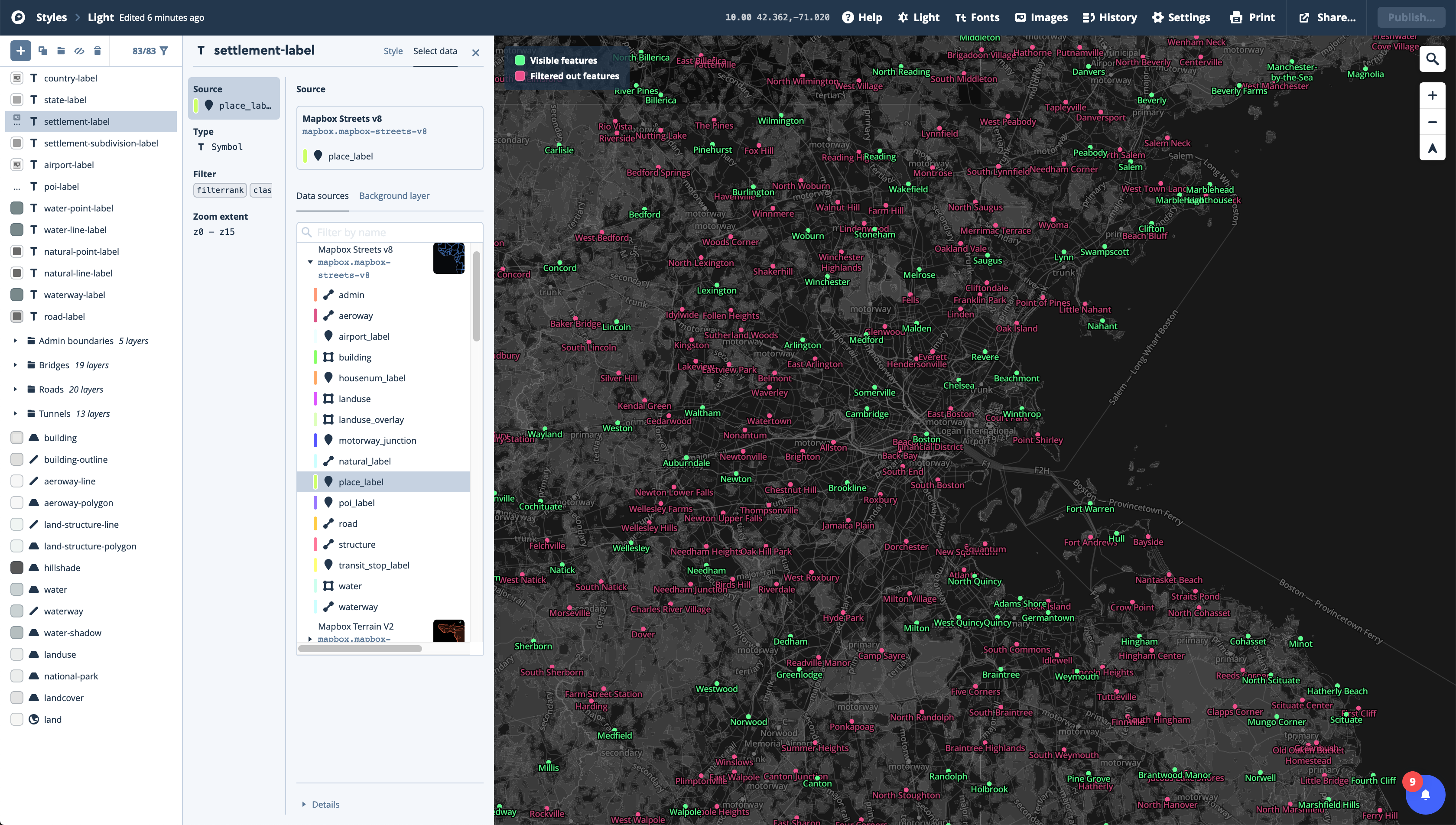
-
For this basemap we are actually going to do very little editing. Just a couple of adjustments to the color of the labels and hiding a few layers we don’t need.
-
First, rename the style by clicking on the
Monochrometext at the top left corner of the window. Rename it to something likeCustomMonochromeor something like that. -
Second, remove the following
componentsby selecting them and then clicking on the trash icon at the top of the panel. You could also just hide them by clicking on the crossed-out eye at the top of the panel:-
Buildings
-
Transit
-
Points of interest labels
-
-
Third, go into the
Road networkcomponent. There change the overall style fromStandardtoSimple, and reduce theRoad widthto the minimum using the slider. -
Fourth, change the water color by going into the
layerstab and choosing thewaterlayer underLand & water,water. There, first select theColortab. Then, click on theOverridebutton. And finally, change the color value to#d9d9d9.
-
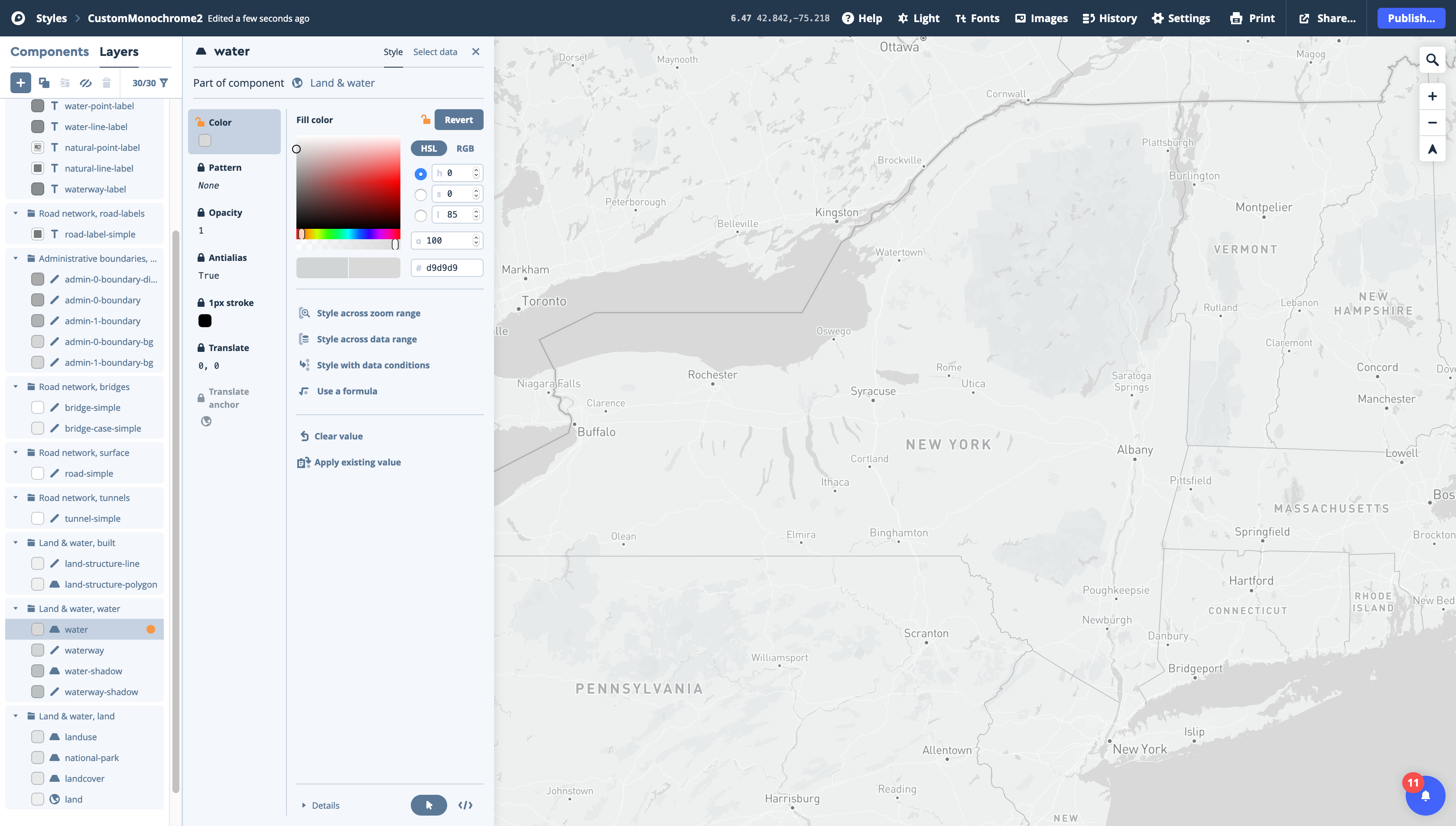
-
Once these adjustments are done, click on the
Publishbutton. You will ge a window were you can compare the original vs. the modified style. Make sure everything is alright and clickPublishagain. -
Finally, click on the
Stylesbutton at the top-left corner of the editor to go back to your styles list. You should see your new style listed there. -
To use this style on your interactive map, click on the
Sharebutton right of the style and copy theStyle URLunderDeveloper resources. It should look something likemapbox://styles/xxxxxx/xxxxxxxxxxx. -
The last thing we need to do in Mapbox is to generate an
Access token.-
To do this, click on the helmet at the top-right corner of the page and select
Account, or go to Mapbox’s account page. -
Once there, click on
+ Create a token. Give it a name, (usually corresponding to your project), and, for now, leave the URL blank. Once you have a set URL for your live webmap you will have to come back here and set the URL for this token, to restrict its use just for this address. -
Once this is done, click
Create token. You will see your new token in your token list page. It should look something likepk.xx...Copy it and have it handy for the next section.
-
Setting Up Your HTML, CSS, and JavaScript
The next step in the process is to create the basic setup for a webmap. This will comprise, initially, three files: index.html, styles.css, and map.js. The index.html file will contain the basic information your site will display, the styles.css will contain the styling of that information, and the map.js will contain the JavaScript code powering the map.
For this part of the process it is highly recommended to use an advanced text editor like VS Studio Code, Atom, or Sublime Text. These editors provide advanced functionality and formatting that will make writing code much easier and faster.
-
First, create a new folder on your computer for your webmap. In there, create the three (empty) files mentioned above
index.html,styles.css, andmap.js. -
Copy the following code to your
index.htmlfile:
<!DOCTYPE html>
<html>
<head>
    <meta charset='utf-8' />
    <title>2016 Election Results Map</title>
    <meta name='viewport' content='initial-scale=1,maximum-scale=1,user-scalable=no' />
    <script src='https://api.tiles.mapbox.com/mapbox-gl-js/v1.5.0/mapbox-gl.js'></script>
    <link href='https://api.tiles.mapbox.com/mapbox-gl-js/v1.5.0/mapbox-gl.css' rel='stylesheet' />
    <link rel="stylesheet" href="styles.css">
</head>

<body>
    <div id='map'></div>
    <script type='text/javascript' src="map.js"></script>
</body>

</html>
This html page contains the following elements:
-
In the
head:-
Information about the encoding of the site
-
The title (see on the tabs of your browser)
-
Links to Mapbox’s Javascript libraries and styles
-
And a link to your own style page (
<link rel="stylesheet" href="styles.css">). If you move or rename yourstyles.cssfile, make sure to adjust this link.
-
-
In the
body:-
A new
divelement to hold the map (with amapid) -
And a link to the
map.jsJavaScript file
-
Next, copy the following code to your map.js file:
mapboxgl.accessToken = 'Add your access token here';
var map = new mapboxgl.Map({
    container: 'map',
    style: 'Add your style URL here',
    zoom: 6.25,
    center: [-75.32, 42.88]
});
This map.js file contains the code that creates and controls the map:
-
Here, first, you setup your access token and then you create a
mapvariable that creates the map and sets its basic characteristics:-
What div it is in
-
The style to use
-
The starting zoom level
-
And the starting coordinates.
-
Finally, copy the following code to your styles.css file:
body {
    margin: 0;
    padding: 0;
}

#map {
    width: 90%;
    height: 800px;
    margin: 5em auto;
}
This css files sets some very basic styling:
-
For the
bodyit declares margins and padding to be 0.-
And for the
mapdiv, it sets the width to be 90% of the page, the height to be 800px, and horizontal margins to be of 5em up and down, and automatic on each side. -
Note that a height of 100% doesn’t work. The best bet is to set a fixed height, like 800px.
-
With this setup you can open your browser and there select File / Open and choose your index.html file. Your page should load with an interactive map centered on New York State and using your Mapbox style. You should be able to pan around and zoom in and out in this map.
Running a Localhost
One thing to note before proceeding is that for this part of the tutorial, and for the rest of it, you will need to run a localhost on your machine in order for the map to work properly. Running a localhost is equivalent to starting your own swerver on your computer and accessing through your browser.
Live Server Extension (VS Code)
The easiest way to run a localhost is to use VS Code as your text editor and install the Live Server extension. Once you’ve installed this extension, just go to your index.html file in VS Code and click on the Go Live button at the bottom left hand corner of your editor.
Through Python and the Terminal (MacOS)
To run a localhost on a MacOS do the following:
-
Open your
Terminalapplication. -
Use
cd(change directory) to navigate to your map folder. For example type something likecd brown_at_home/mymapto navigate to themymapfolder inside thebrown_at_homefolder. -
Once you are in the directory where the
index.html,styles.cssandmap.jsfiles are located typepython -m SimpleHTTPServer 8000if you have Python 2.x orpython3 -m http.server 8000if you have Python 3.x on your computer (by defaults, Macs come with Python 2.7 installed but to check which version you are running you can typepython -Vin your terminal). -
Finally, open your browser and navigate to
http://0.0.0.0:8000/. You should see your map there.
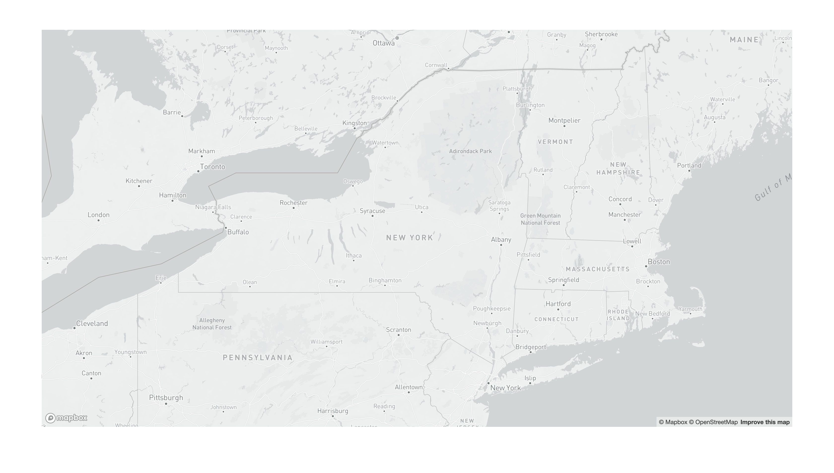
Adding Layers to Your Interactive Map
Next we need to add our layers to the map. We will start with the New York State counties election results. The dots will be used in a separate map further down in this tutorial.
-
First, create a sub-folder in your map folder. Call it
data. Add your GeoJSON election files there. -
Next, we need to create a function within our
map.jsfile that will add a new layer to the map and provide its basic settings:- Add the following code to the end of the file:
map.on('load', function () {
    map.addLayer({
        'id': 'countiesNY',
        'type': 'fill',
        'source': {
            'type': 'geojson',
            'data': 'data/NewYorkCounties.geojson'
        },
        'paint': {
            'fill-color': '#cccccc',
            'fill-outline-color': '#000000'
        }
    });
});
This piece of code does the following:
-
Waits until the map is loaded and then adds a new layer.
-
This layer has an
idand is of typefill, which is equivalent to polygon. Other types includebackground,line,symbol,raster,circle,fill-extrusion,heatmap, andhillshade. -
It provides the
sourcefor this layer. In our case it’s of the typegeojsonand it’s located in thedatafolder. -
Finally, it provides the style (
paint). Here, we are using a very basic gray fill and black outline. -
To see the
liveversion of your map, close that initial window we had opened and in VS Code, click on theGo Livebutton at the bottom-right corner. This will automatically create a local host and open a browser window pointed at that URL. It will also watch for any changes to your files and reload the page if it notices one.
Styling Layers Based on Categorical Attributes
To style the states layer based on who won we need to modify the attributes of that layer at the moment of adding it to the map. For this, modify the map.on function to the following:
map.on('load', function () {
    map.addLayer({
        'id': 'countiesNY',
        'type': 'fill',
        'source': {
            'type': 'geojson',
            'data': 'data/NewYorkCounties.geojson'
        },
        'paint': {
            'fill-color': [
                'match', ['get', 'Winner'],
                'Trump', '#cf635d',
                'Clinton', '#6193c7',
                'Other', '#91b66e',
                '#ffffff'
            ],
            'fill-outline-color': '#ffffff'
        }
    });
    map.addLayer({
        'id': 'countiesNY_outline',
        'type': 'line',
        'source': {
            'type': 'geojson',
            'data': 'data/NewYorkCounties.geojson'
        },
        'paint': {
            'line-color': '#ffffff',
            'line-width': 0.5
        }
    });
});
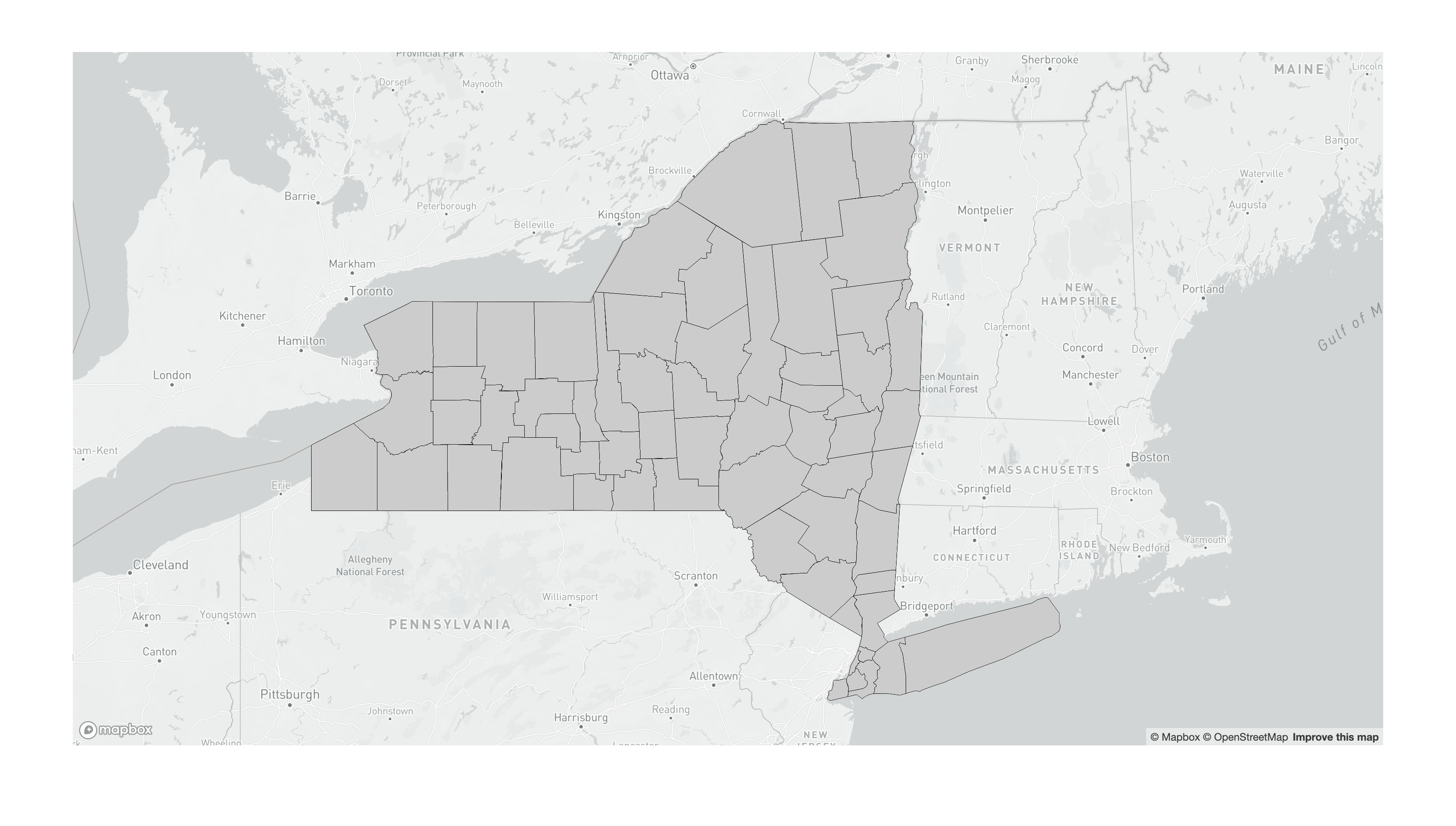
Here wer are doing two main things:
-
First we are modifying the attributes of the polygon layer to assign the fill based on the
Winnerproperty:-
Here, we use a
matchfunction, inside thefill-colorattribute, and in thatmatchfunction wegettheWinnerproperty from the GeoJSON file. -
In that
matchfunction we assign a color value for each category and add a final color value for theNULLvalues.
-
-
Second, we are adding an additional layer, based on the first one, but of type
lineto create the thick white outlines of the polygons: -
The problem is that currently Mapbox GL JS doesn’t allow you to control the with of the outline of a polygon. Therefore, we create a new layer, with different
idand of typelinebut based on the same source, and we can assign thickness and color.
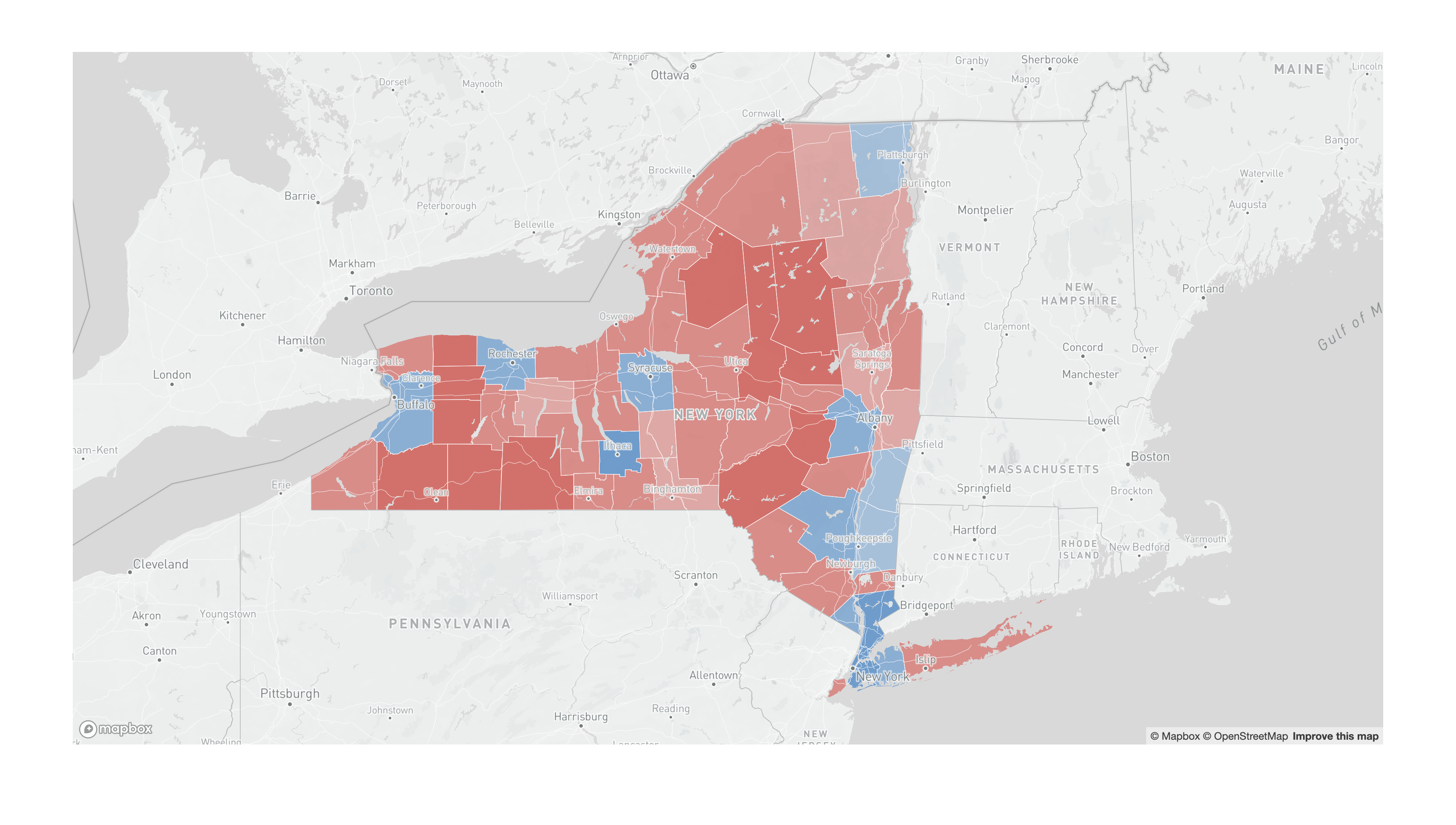
The current map should look something like this:
Adding the Layers Underneath the Labels
If you look closely, you’ll notice that our new layer is sitting on top of the state and city labels. To correct this we need to identify what layer the election data should be underneath of, and add that as a property of our layer.
- Modify your
map.onfunction to the following:
map.on('load', function () {
    // This is the function that prints the layers' IDs to the console
    var layers = map.getStyle().layers;
    for (var i = 0; i < layers.length; i++) {
        console.log(layers[i].id);
    }
    map.addLayer({
        'id': 'countiesNY',
        'type': 'fill',
        'source': {
            'type': 'geojson',
            'data': 'data/NewYorkCounties.geojson'
        },
        'paint': {
            'fill-color': [
                'match', ['get', 'Winner'],
                'Trump', '#cf635d',
                'Clinton', '#6193c7',
                'Other', '#91b66e',
                '#ffffff'
            ],
            'fill-outline-color': '#ffffff'
        }
    }, 'landuse'); // Here's where we tell Mapbox where to slot this new layer
    map.addLayer({
        'id': 'countiesNY_outline',
        'type': 'line',
        'source': {
            'type': 'geojson',
            'data': 'data/NewYorkCounties.geojson'
        },
        'paint': {
            'line-color': '#ffffff',
            'line-width': 0.5
        }
    }, 'landuse'); // Here's where we tell Mapbox where to slot this new layer
});
Here we did two things:
-
First, we added a short function that loops through the existing layers of the map and prints to the console the IDs of all the layers in the basemap. This way we can identify the layers and figures out where we would like our new layers to go.
-
Second, at the end of each
map.addLayerfunction, we added the id of thelanduselayer to mark where these new layers should be slotted in the stack.
Changing the Opacity Based on the Data
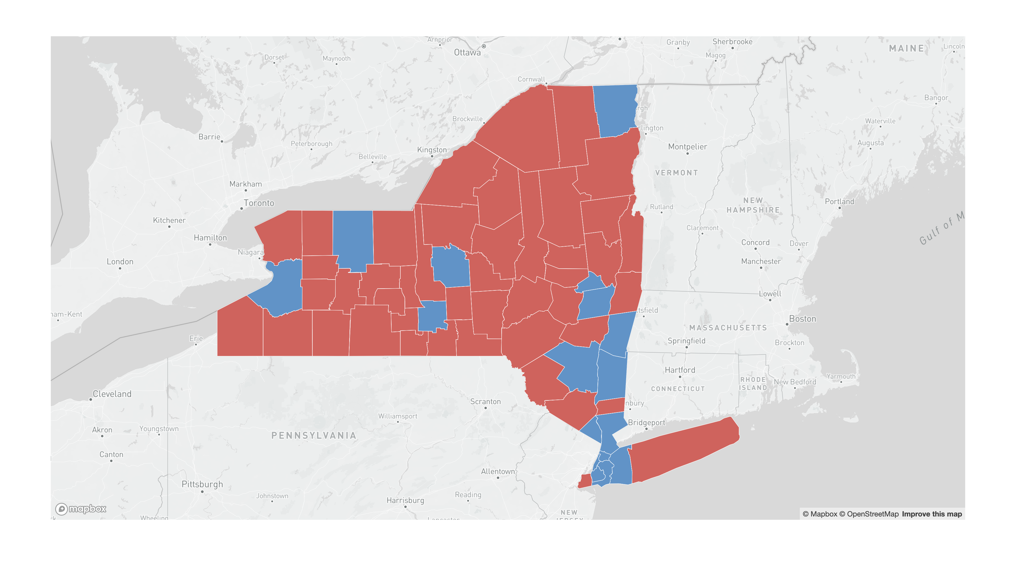
Another thing we can do to make this map tell a better, more nuanced story is to change the opacity of the color based on the actual percentage of votes the winning candidate got. To do this we can change the opacity of the fill color based on the percentage of votes given to the winning candidate.
To do this modify your map.addLayer function (for the polygon layer) to the following:
map.addLayer({
        'id': 'countiesNY',
        'type': 'fill',
        'source': {
            'type': 'geojson',
            'data': 'data/NewYorkCounties.geojson'
        },
        'paint': {
            'fill-color': [
                'match', ['get', 'Winner'],
                'Trump', '#cf635d',
                'Clinton', '#6193c7',
                'Other', '#91b66e',
                '#ffffff'
            ],
            'fill-opacity': [
                'step', ['get', 'WnrPerc'],
                0.3, 0.4,
                0.5, 0.5,
                0.7, 0.6,
                0.9
            ]
        }
    }, 'landuse');
Note the new expression in the fill-opacity section. Here, we are setting up a series of steps based on the WnrPerc field in the data. This means, for example, that for values below 0.4, the opacity will be 0.3, for values between 0.4 and 0.5, the opacity will be 0.5, and so on.
Note also that there always has to be an extra value, which will be applied to any values that don’t fall within the specified values. In this case this value is 0.9. This also applies to the match expression in the fill-color section; that value is #ffffff.
Setting up the maximum and minimum zoom levels and the bounds of the map
To set the max and min zoom levels for the map add the following two lines to the setup of the map variable (make sure you add a comma at the end of each line):
-
maxZoom: 8, -
minZoom: 6,
To set the bounds of the map (so that people won’t be able to go off the highlighted area) add the next line to the setup of the map variable: maxBounds: [[-83, 39], [-68, 46]]
Creating Popups
Apart from zooming in and out, and panning, the other main feature of interactive maps is popups, which give you extra information about a specific feature. In this section we will create popups for the the county-level data.
Interacting with the map usually happens in map.on functions. To set the popup behavior we will code three of those functions: one function will open the the popup, and two will change the cursor icon – into a hand when hovering over a feature, and back into an arrow when not over one.
- Add the following piece of code at the end of your
map.jsfile:
// Create the popup
map.on('click', 'countiesNY', function (e) {
    var winner = e.features[0].properties.Winner;
    var wnrPerc = e.features[0].properties.WnrPerc;
    new mapboxgl.Popup()
        .setLngLat(e.lngLat)
        .setHTML(winner + '<br>' + wnrPerc)
        .addTo(map);
});
// Change the cursor to a pointer when the mouse is over the countiesNY layer.
map.on('mouseenter', 'countiesNY', function () {
    map.getCanvas().style.cursor = 'pointer';
});
// Change it back to a pointer when it leaves.
map.on('mouseleave', 'countiesNY', function () {
    map.getCanvas().style.cursor = '';
});
In these functions we are doing the following:
-
First, we are saying, if there’s a click on the map, and that click is on a
countiesNYfeature, do the following with that feature (which we will calle):-
Get the
WinnerandWnrPercattributes and assign them to their own variables. -
Create the popup (
new mapboxgl.Popup()) with coordinates from the click element, with somehtmlelements based on the variables, and add it to the map.
-
-
Second, we are saying that if the mouse enters (
mouseenter) or leaves (mouseleave) one of these features, change the icon for the mouse to apointeror back to the default.
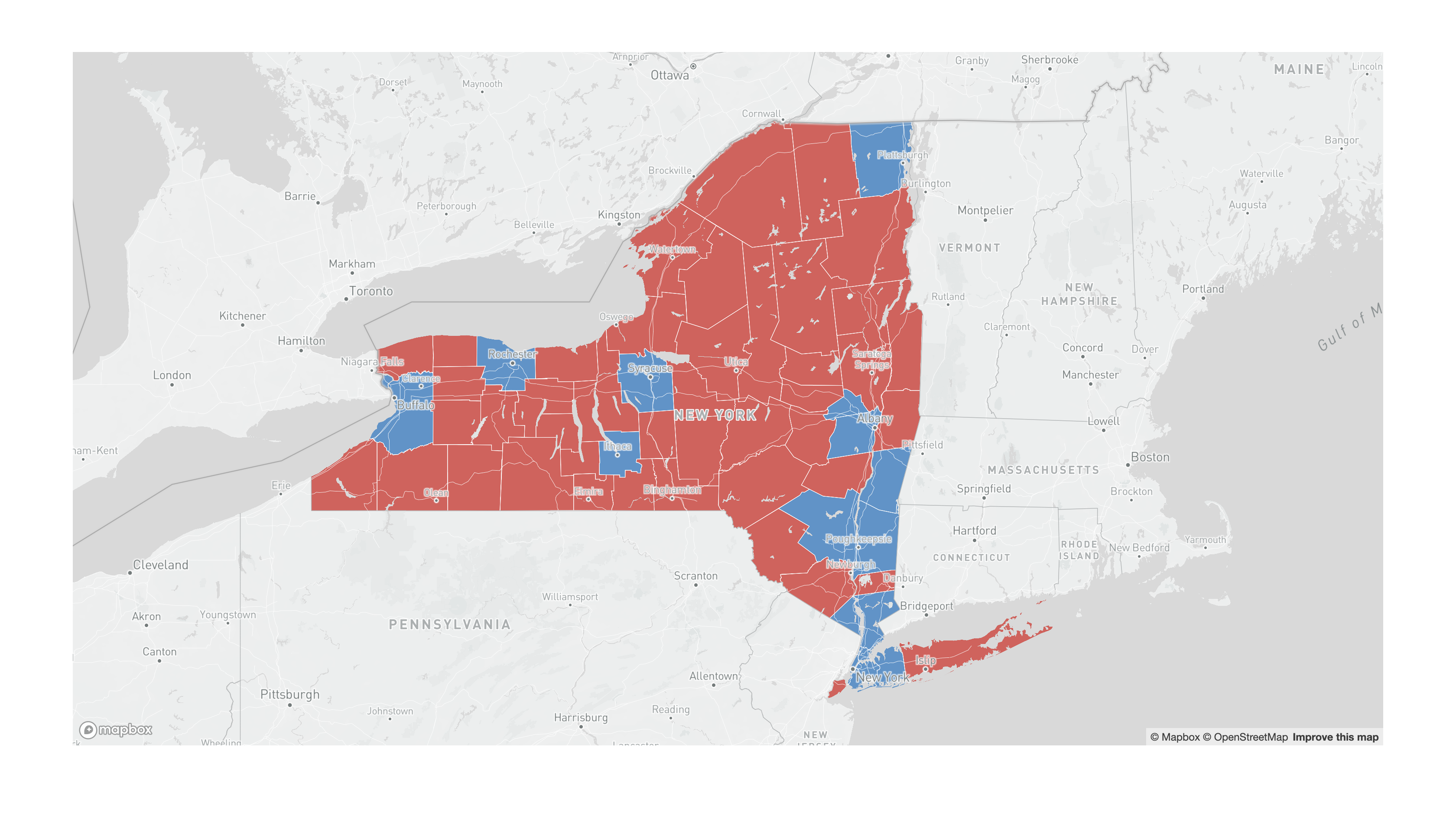
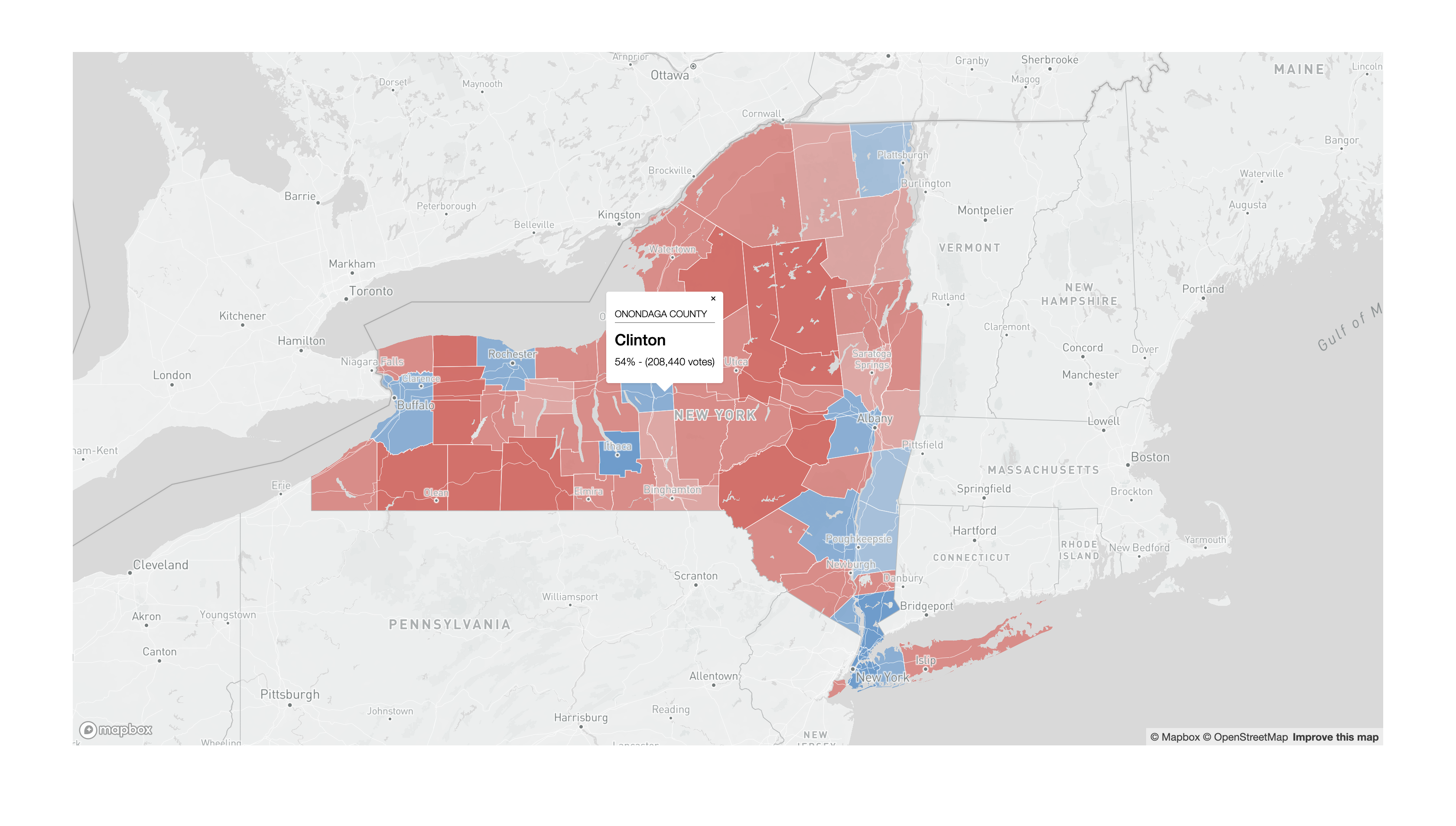
The map with the basic popup should look like this:

The only thing left to do is to add more information to the popup and style it properly.
- The final popup JavaScript section should look like this:
// Create the popup
map.on('click', 'countiesNY', function (e) {
    var countyName = e.features[0].properties.NAMELSAD;
    var winner = e.features[0].properties.Winner;
    var wnrPerc = e.features[0].properties.WnrPerc;
    var totalVotes = e.features[0].properties.Total;
    wnrPerc = (wnrPerc * 100).toFixed(0);
    totalVotes = totalVotes.toLocaleString();
    countyName = countyName.toUpperCase();
    new mapboxgl.Popup()
        .setLngLat(e.lngLat)
        .setHTML('<h4>' + countyName + '</h4>'
            + '<h2>' + winner + '</h2>'
            + '<p>' + wnrPerc + '% - (' + totalVotes + ' votes)</p>')
        .addTo(map);
});
// Change the cursor to a pointer when the mouse is over the countiesNY layer.
map.on('mouseenter', 'countiesNY', function () {
    map.getCanvas().style.cursor = 'pointer';
});
// Change it back to a pointer when it leaves.
map.on('mouseleave', 'countiesNY', function () {
    map.getCanvas().style.cursor = '';
});
And the styling in the css should look like this:
.mapboxgl-popup-content h4 {
    font-weight: 300;
    font-size: 0.9em;
    border-width: 0px 0px 0.5px 0px;
    border-style: solid;
    border-color: rgb(80, 80, 80);
    margin-top: 0.5em;
    margin-bottom: 0.5em;
}
.mapboxgl-popup-content h2 {
    font-weight: 500;
    margin-top: 0.5em;
    margin-bottom: 0.3em;
}
.mapboxgl-popup-content p {
    font-weight: 300;
    margin-top: 0.3em;
    margin-bottom: 0em;
}
Your popups should now look something like this:
Final code for the New York State map
Your final code for the New York State map should look something like this:
- The
index.htmlfile:
<!DOCTYPE html>
<html>
<head>
    <meta charset='utf-8' />
    <title>2016 Election Results Map</title>
    <meta name='viewport' content='initial-scale=1,maximum-scale=1,user-scalable=no' />
    <script src='https://api.tiles.mapbox.com/mapbox-gl-js/v1.5.0/mapbox-gl.js'></script>
    <link href='https://api.tiles.mapbox.com/mapbox-gl-js/v1.5.0/mapbox-gl.css' rel='stylesheet' />
    <link rel="stylesheet" href="styles.css">
</head>

<body>
    <div id='map'></div>
    <script type='text/javascript' src="map.js"></script>
</body>

</html>
- The
map.jsfile:
mapboxgl.accessToken = 'Your access token here...';
var map = new mapboxgl.Map({
    container: 'map',
    style: 'Your Mapbox style URL here...',
    zoom: 3,
    maxZoom: 9,
    minZoom: 3.5,
    center: [-99, 38],
    maxBounds: [[-180, 15], [-30, 72]]
});

map.on('load', function () {
    // This is the function that finds the first symbol layer
    var layers = map.getStyle().layers;
    for (var i = 0; i < layers.length; i++) {
        console.log(layers[i].id);
    }
    map.addLayer({
        'id': 'centroidsNY',
        'type': 'circle',
        'source': {
            'type': 'geojson',
            'data': 'data/CountyCentroidElectionData.geojson'
        },
        'paint': {
            'circle-radius':
                ['interpolate', ['linear'], ['zoom'],
                    3, ['max', ['/', ['sqrt', ['abs', ['-', ['get', 'Trump'], ['get', 'Clinton']]]], 35], 1],
                    9, ['max', ['/', ['sqrt', ['abs', ['-', ['get', 'Trump'], ['get', 'Clinton']]]], 15], 5],
                ],
            'circle-color': [
                'match', ['get', 'Winner'],
                'Trump', '#cf635d',
                'Clinton', '#6193c7',
                'Other', '#91b66e',
                '#ffffff'
            ],
            'circle-stroke-color': '#ffffff',
            'circle-stroke-width': 0.5,
            'circle-opacity': [
                'step', ['get', 'WnrPerc'],
                0.3, 0.4,
                0.5, 0.5,
                0.7, 0.6,
                0.9
            ]
        }
    }, 'admin-0-boundary-disputed');
});

// Create the popup
map.on('click', 'centroidsNY', function (e) {
    var countyName = e.features[0].properties.NAMELSAD;
    var winner = e.features[0].properties.Winner;
    var wnrPerc = e.features[0].properties.WnrPerc;
    var totalVotes = e.features[0].properties.Total;
    wnrPerc = (wnrPerc * 100).toFixed(0);
    totalVotes = totalVotes.toLocaleString();
    countyName = countyName.toUpperCase();
    new mapboxgl.Popup()
        .setLngLat(e.lngLat)
        .setHTML('<h4>' + countyName + '</h4>'
            + '<h2>' + winner + '</h2>'
            + '<p>' + wnrPerc + '% - (' + totalVotes + ' votes)</p>')
        .addTo(map);
});
// Change the cursor to a pointer when the mouse is over the centroidsNY layer.
map.on('mouseenter', 'centroidsNY', function () {
    map.getCanvas().style.cursor = 'pointer';
});
// Change it back to a pointer when it leaves.
map.on('mouseleave', 'centroidsNY', function () {
    map.getCanvas().style.cursor = '';
});
- The
styles.cssfile:
body {
    margin: 0;
    padding: 0;
}

#map {
    width: 90%;
    height: 800px;
    margin: 5em auto;
}
.mapboxgl-popup-content h4 {
    font-weight: 300;
    font-size: 0.9em;
    border-width: 0px 0px 0.5px 0px;
    border-style: solid;
    border-color: rgb(80, 80, 80);
    margin-top: 0.5em;
    margin-bottom: 0.5em;
}
.mapboxgl-popup-content h2 {
    font-weight: 500;
    margin-top: 0.5em;
    margin-bottom: 0.3em;
}
.mapboxgl-popup-content p {
    font-weight: 300;
    margin-top: 0.3em;
    margin-bottom: 0em;
}
Creating a Graduated Point Interactive Map
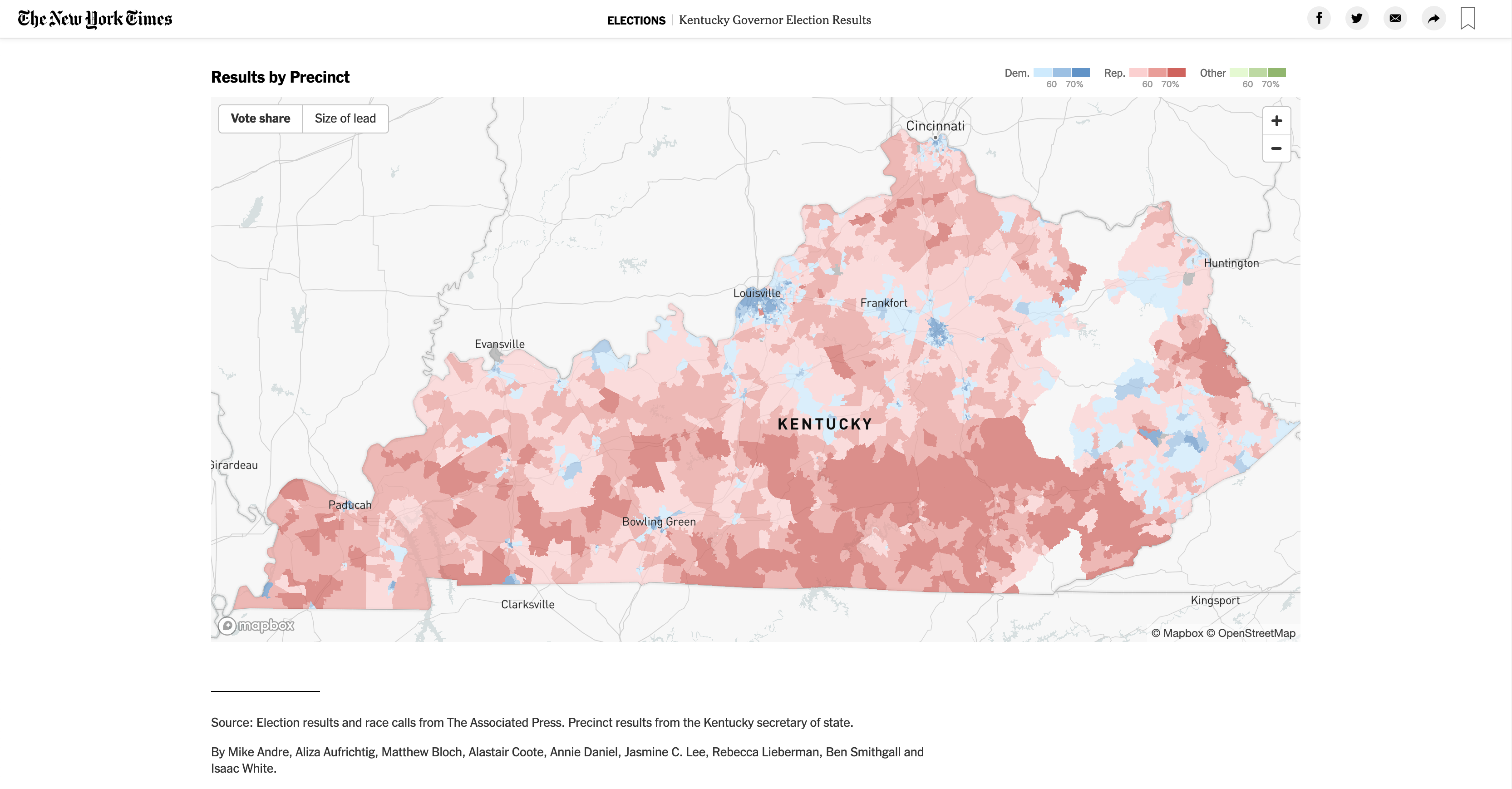
In this last section of the tutorial we will create a graduated point map, similar to this one produced by the New York Times:

Our map will use the same base map we configured above, but instead of the county polygon layer we will add the centroids we created in QGIS. In addition, most of the general map settings will stay the same. We will use the same index.html and styles.css files and a modified version of the map.js file.
-
First, remove the two polygon layers from your map.
-
Second, add the centroids layer, but style it as points. For now, all points should have the same size but different fill based on who won the 2016 presidential election. Also, comment out the popup functions by adding
//at the beginning of each line or/*at the begging of the code block and*/at the end
The map.js file looks like this. Notice that we’ve changed the zoom, the maxZoom, the minZoom, the center and the maxBounds.
mapboxgl.accessToken = 'Your access token';
var map = new mapboxgl.Map({
    container: 'map',
    style: 'Your style URL',
    zoom: 3,
    maxZoom: 9,
    minZoom: 3.5,
    center: [-99, 38],
    maxBounds: [[-180, 15], [-30, 72]]
});

map.on('load', function () {
    // This is the function that finds the first symbol layer
    var layers = map.getStyle().layers;
    for (var i = 0; i < layers.length; i++) {
        console.log(layers[i].id);
    }
    map.addLayer({
        'id': 'centroidsNY',
        'type': 'circle',
        'source': {
            'type': 'geojson',
            'data': 'data/CountyCentroidElectionData.geojson'
        },
        'paint': {
            'circle-radius': 5,
            'circle-color': [
                'match', ['get', 'Winner'],
                'Trump', '#cf635d',
                'Clinton', '#6193c7',
                'Other', '#91b66e',
                '#ffffff'
            ],
            'circle-stroke-color': '#000000',
            'circle-opacity': [
                'step', ['get', 'WnrPerc'],
                0.3, 0.4,
                0.5, 0.5,
                0.7, 0.6,
                0.9
            ]
        }
    }, 'landuse');
});
Your map should now look something like this:
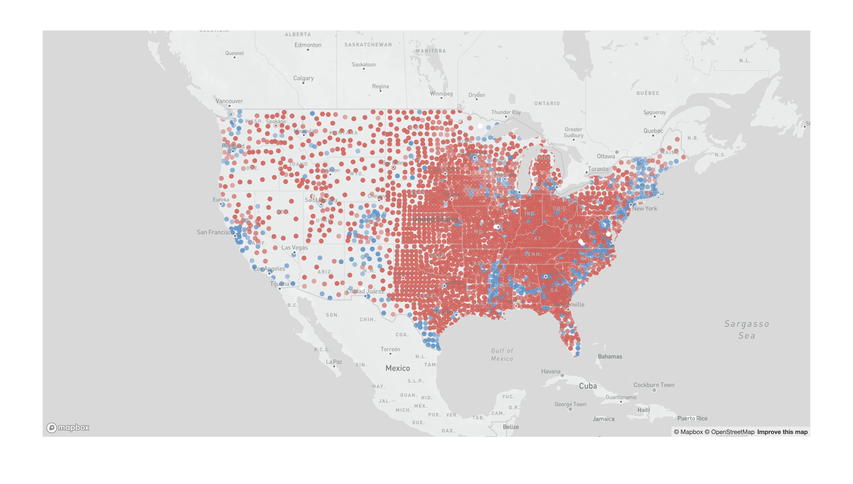
Next, we need to tie the size of the dots to the difference in votes between Trump and Clinton. To make this tutorial a bit simpler we will ignore the counties were someone other than Trump or Clinton won. Modify your map.addLayer function to this:
map.on('load', function () {
    // This is the function that finds the first symbol layer
    var layers = map.getStyle().layers;
    for (var i = 0; i < layers.length; i++) {
        console.log(layers[i].id);
    }
    map.addLayer({
        'id': 'centroidsNY',
        'type': 'circle',
        'source': {
            'type': 'geojson',
            'data': 'data/CountyCentroidElectionData.geojson'
        },
        'paint': {
            'circle-radius':
                ['max', ['/', ['sqrt', ['abs', ['-', ['get', 'Trump'], ['get', 'Clinton']]]], 40], 2],
            'circle-color': [
                'match', ['get', 'Winner'],
                'Trump', '#cf635d',
                'Clinton', '#6193c7',
                'Other', '#91b66e',
                '#ffffff'
            ],
            'circle-stroke-color': '#ffffff',
            'circle-stroke-width': 0.5,
            'circle-opacity': [
                'step', ['get', 'WnrPerc'],
                0.3, 0.4,
                0.5, 0.5,
                0.7, 0.6,
                0.9
            ]
        }
    }, 'admin-0-boundary-disputed');
});
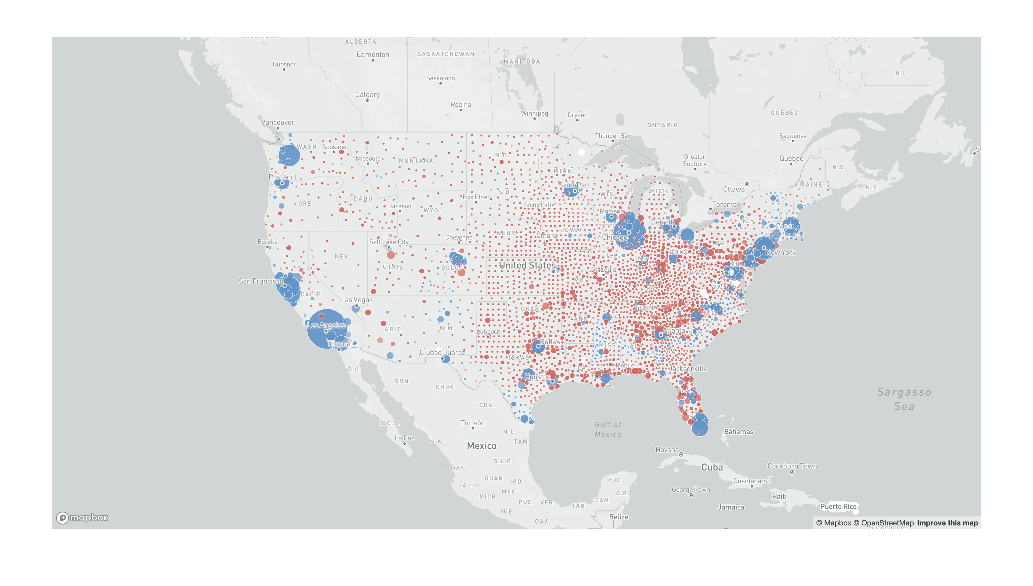
The important line here is 'circle-radius': ['max', ['/', ['sqrt', ['abs', ['-', ['get', 'Trump'], ['get', 'Clinton']]]], 40], 1], which gets the difference between Clinton and Trump votes, in absolute values (abs), takes the square root of that value (sqrt), divides that value by 40, and then if that value is less than 1, makes it equal to 1 using the max expression.
Your map should now look something like this:
Next, we need to tie that size to the zoom level. Modify the circle-radius setting to:
'circle-radius':
    ['interpolate', ['linear'], ['zoom'],
        3, ['max', ['/', ['sqrt', ['abs', ['-', ['get', 'Trump'], ['get', 'Clinton']]]], 35], 1],
        9, ['max', ['/', ['sqrt', ['abs', ['-', ['get', 'Trump'], ['get', 'Clinton']]]], 15], 5],
    ],
If you zoom in and out, you’ll see the size of the circles automatically adjusting to the zoom level.
Finally, we need to add back the popup code, now with the circles instead of the polygons:
// Create the popup
map.on('click', 'centroidsNY', function (e) {
    var countyName = e.features[0].properties.NAMELSAD;
    var winner = e.features[0].properties.Winner;
    var wnrPerc = e.features[0].properties.WnrPerc;
    var totalVotes = e.features[0].properties.Total;
    wnrPerc = (wnrPerc * 100).toFixed(0);
    totalVotes = totalVotes.toLocaleString();
    countyName = countyName.toUpperCase();
    new mapboxgl.Popup()
        .setLngLat(e.lngLat)
        .setHTML('<h4>' + countyName + '</h4>'
            + '<h2>' + winner + '</h2>'
            + '<p>' + wnrPerc + '% - (' + totalVotes + ' votes)</p>')
        .addTo(map);
});
// Change the cursor to a pointer when the mouse is over the centroidsNY layer.
map.on('mouseenter', 'centroidsNY', function () {
    map.getCanvas().style.cursor = 'pointer';
});
// Change it back to a pointer when it leaves.
map.on('mouseleave', 'centroidsNY', function () {
    map.getCanvas().style.cursor = '';
});
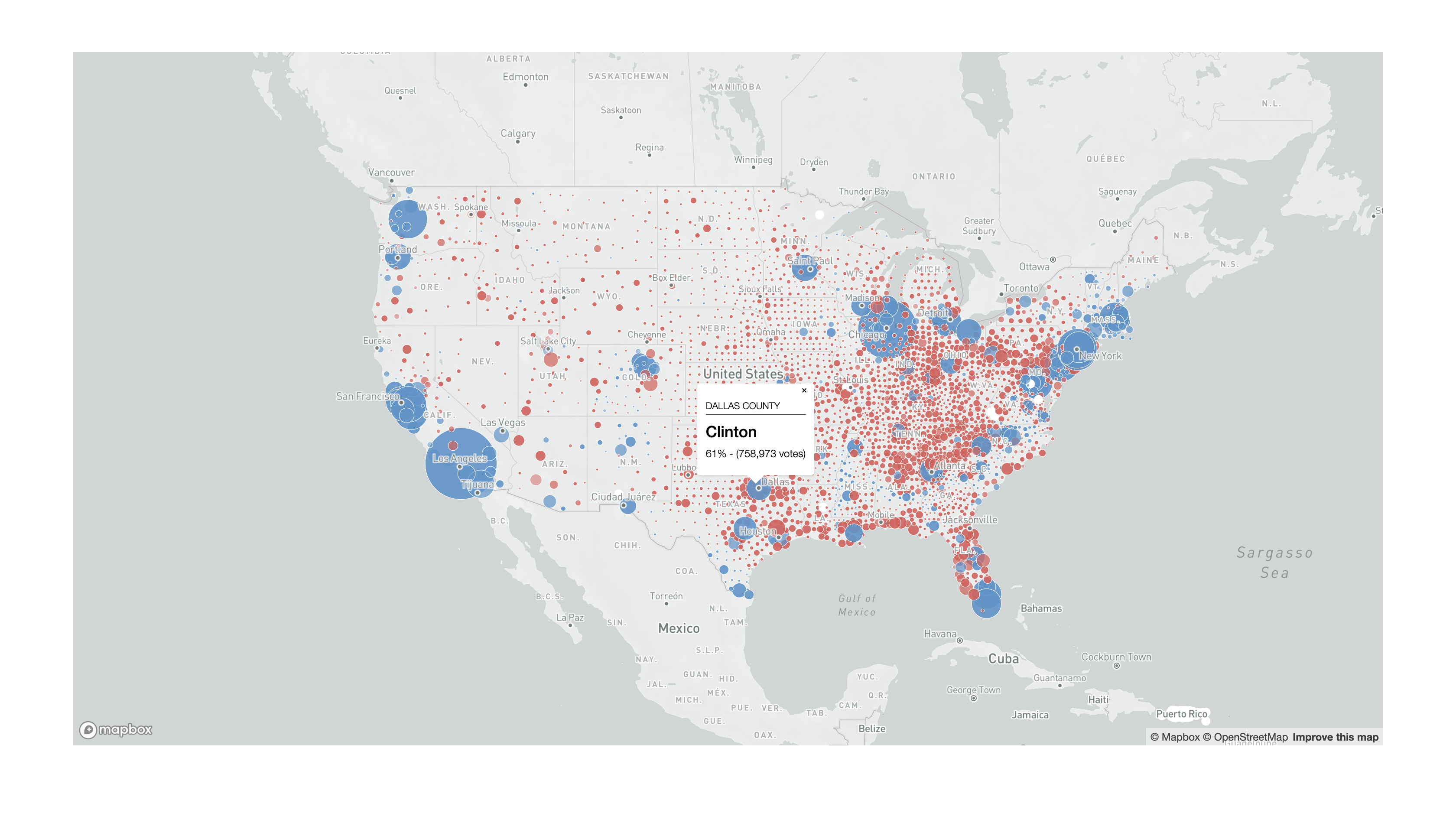
Your final map should look something like this:
The final map.js file is as follows:
mapboxgl.accessToken = 'Your access token here';
var map = new mapboxgl.Map({
    container: 'map',
    style: 'Your Mapbox style URL here',
    zoom: 3,
    maxZoom: 9,
    minZoom: 3.5,
    center: [-99, 38],
    maxBounds: [[-180, 15], [-30, 72]]
});

map.on('load', function () {
    // This is the function that finds the first symbol layer
    var layers = map.getStyle().layers;
    for (var i = 0; i < layers.length; i++) {
        console.log(layers[i].id);
    }
    map.addLayer({
        'id': 'centroidsNY',
        'type': 'circle',
        'source': {
            'type': 'geojson',
            'data': 'data/CountyCentroidElectionData.geojson'
        },
        'paint': {
            'circle-radius':
                ['interpolate', ['linear'], ['zoom'],
                    3, ['max', ['/', ['sqrt', ['abs', ['-', ['get', 'Trump'], ['get', 'Clinton']]]], 35], 1],
                    9, ['max', ['/', ['sqrt', ['abs', ['-', ['get', 'Trump'], ['get', 'Clinton']]]], 15], 5],
                ],
            'circle-color': [
                'match', ['get', 'Winner'],
                'Trump', '#cf635d',
                'Clinton', '#6193c7',
                'Other', '#91b66e',
                '#ffffff'
            ],
            'circle-stroke-color': '#ffffff',
            'circle-stroke-width': 0.5,
            'circle-opacity': [
                'step', ['get', 'WnrPerc'],
                0.3, 0.4,
                0.5, 0.5,
                0.7, 0.6,
                0.9
            ]
        }
    }, 'admin-0-boundary-disputed');
});

// Create the popup
map.on('click', 'centroidsNY', function (e) {
    var countyName = e.features[0].properties.NAMELSAD;
    var winner = e.features[0].properties.Winner;
    var wnrPerc = e.features[0].properties.WnrPerc;
    var totalVotes = e.features[0].properties.Total;
    wnrPerc = (wnrPerc * 100).toFixed(0);
    totalVotes = totalVotes.toLocaleString();
    countyName = countyName.toUpperCase();
    new mapboxgl.Popup()
        .setLngLat(e.lngLat)
        .setHTML('<h4>' + countyName + '</h4>'
            + '<h2>' + winner + '</h2>'
            + '<p>' + wnrPerc + '% - (' + totalVotes + ' votes)</p>')
        .addTo(map);
});
// Change the cursor to a pointer when the mouse is over the centroidsNY layer.
map.on('mouseenter', 'centroidsNY', function () {
    map.getCanvas().style.cursor = 'pointer';
});
// Change it back to a pointer when it leaves.
map.on('mouseleave', 'centroidsNY', function () {
    map.getCanvas().style.cursor = '';
});
Obviously, after finishing both of your webmaps you need to add the rest of the content for the page. This should always include a legend for the map, as well as the sources for the data.