
Parsing Data and Creating Basic Graphs (Python, Pandas, Geopandas, Matplotlib)
Session 2: Parsing Data and Creating Basic Graphs
You can find a copy of the original Jupyter Notebook file here, and here’s a video recording of the session:
We know subway usage in New York City decreased dramatically during first two weeks of the current COVID-19 outbreak. But by how much exactly? And is it the same all around the city? This tutorial will guide you through the basic steps of parsing the notoriously difficult MTA turnstile data and giving it geographic attributes. Our final product will be a Jupyter Notebook with maps and graphs exploring the magnitude and extent of this decrease, as well as its correlation with income levels across the city.
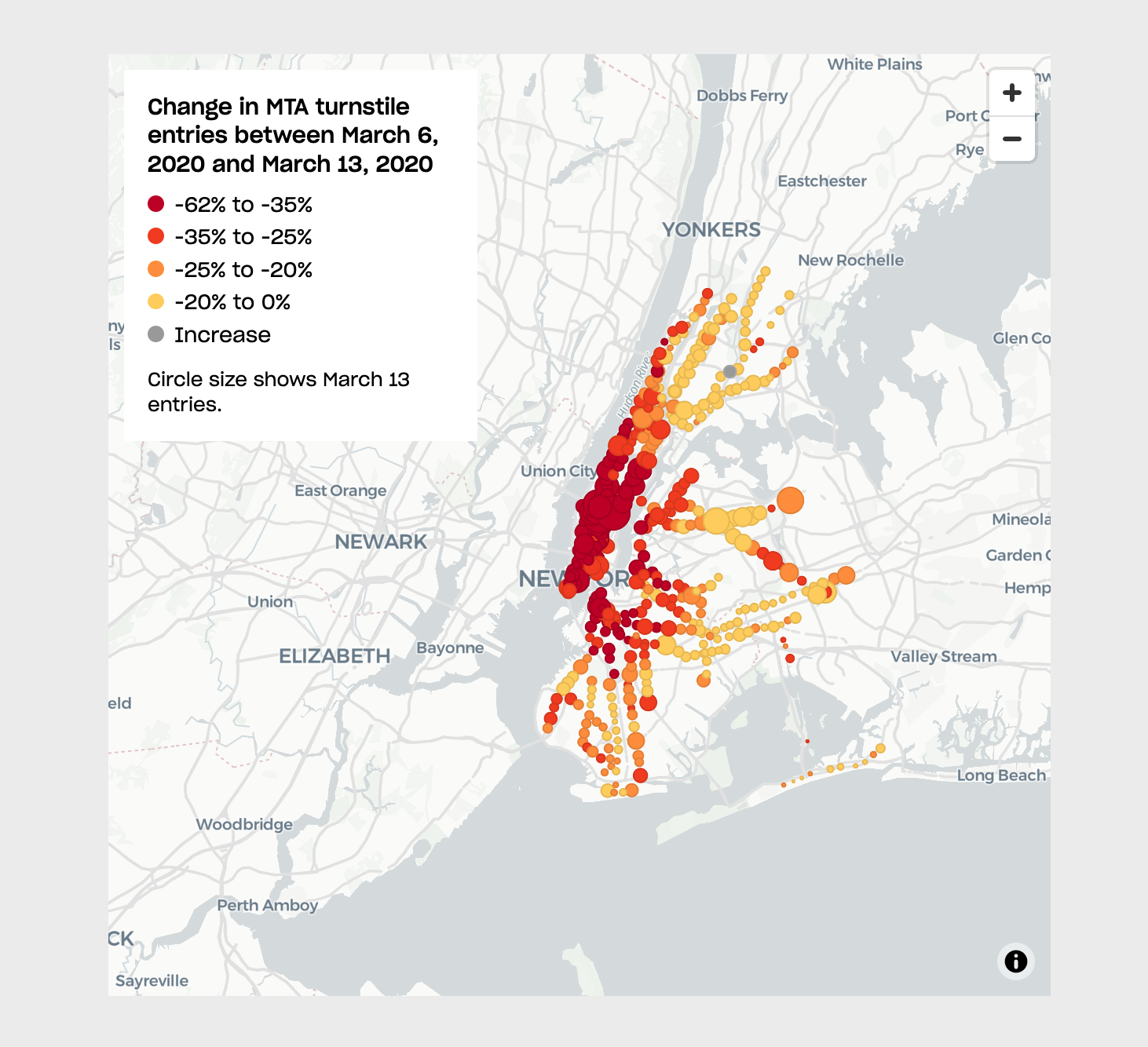
This analysis is based on previous work by Ben Wellington on his I Quant NY blog and an article on The City (map below).
There are many ways of parsing this data. Our tutorial uses Python and Pandas but you could also use, for example, an SQL database. If you would like to try it that way please take a look at Chris Whong’s post Taming the MTA’s Unruly Turnstile Data.
You can also just download a pre-processed version of the data from this Qri repository.
1. Importing libraries
In this tutorial we will use the following libraries: Numpy, Pandas, Geopandas, Matplotlib and Shapely.
Pandas will be our primary library, which will allow us to load our data into dataframes, filter it and merge it with other datasets. Pandas is built on top of Numpy so we need to load that one too.
Geopandas expands Pandas' functionality to include geographic attributes and operations. And Shapely complements Geopandas and will help us transform our MTA data into points with geographic attributes.
Finally, Altair will allow us to create graphs with our data, including maps.
Specifically, are importing all Numpy (as np), all Pandas (as pd), all Geopandas (as gpd), all Altair (as alt), but only Point from Shapely.
import numpy as np
import pandas as pd
import altair as alt
import datetime
Google Colab doesn’t include Geopandas so we need to install it ourselves. In addition, in order to perform spatial joins we need to install two more libraries, libspatialindex-dev and rtree.
# !pip install geopandas
# !apt install libspatialindex-dev
# !pip install rtree
Now we can import Geopandas and Shapely.
import geopandas as gpd
from shapely.geometry import Point
2. Loading the base data
The data for this tutorial comes from two sources:
- Turnstile entry and exit data from the Metropolitan Transit Authority
- Geocoded turnstile locations from Chris Whong
In working with MTA’s turnstile data make sure you checkout their documentation. Here’s what each of the fields contains:
- C/A = Control Area (A002)
- UNIT = Remote Unit for a station (R051)
- SCP = Subunit Channel Position represents an specific address for a device (02-00-00)
- STATION = Represents the station name the device is located at
- LINENAME = Represents all train lines that can be boarded at this station. Normally lines are represented by one character. LINENAME 456NQR repersents train server for 4, 5, 6, N, Q, and R trains.
- DIVISION = Represents the Line originally the station belonged to BMT, IRT, or IND
- DATE = Represents the date (MM-DD-YY)
- TIME = Represents the time (hh:mm:ss) for a scheduled audit event
- DESc = Represent the “REGULAR” scheduled audit event (Normally occurs every 4 hours):
- Audits may occur more that 4 hours due to planning, or troubleshooting activities.
- Additionally, there may be a “RECOVR AUD” entry: This refers to a missed audit that was recovered.
- ENTRIES = The comulative entry register value for a device
- EXITS = The cumulative exit register value for a device
Let’s read the data directly from their location online. We load the data into a Pandas dataframe using the read_csv function, and providing the location of the file (in this case its URL), and specifying the type of delimiter the data uses (in this case a comma).
You can ream more about Pandas here and there are simple tutorials here.
In this next line we set the ending dates for the two weeks we will compare (this needs to match the way the MTA names their files), and the specific days we will compare.
week1_endingDate = '200307'
week2_endingDate = '200321'
day1 = pd.to_datetime('03/06/2020')
day2 = pd.to_datetime('03/20/2020')
week1 = pd.read_csv('http://web.mta.info/developers/data/nyct/turnstile/turnstile_' + week1_endingDate + '.txt', delimiter=',')
week2 = pd.read_csv('http://web.mta.info/developers/data/nyct/turnstile/turnstile_' + week2_endingDate + '.txt', delimiter=',')
It’s always a good idea to check your data after you load it. In this case we do this by printing its head (its first 5 lines), and its tail (its last 5 lines). You could also do head(25) or tail(25) to print the first or last 25 rows of the dataframe.
week1.head()
| C/A | UNIT | SCP | STATION | LINENAME | DIVISION | DATE | TIME | DESC | ENTRIES | EXITS | |
|---|---|---|---|---|---|---|---|---|---|---|---|
| 0 | A002 | R051 | 02-00-00 | 59 ST | NQR456W | BMT | 02/29/2020 | 03:00:00 | REGULAR | 7394747 | 2508844 |
| 1 | A002 | R051 | 02-00-00 | 59 ST | NQR456W | BMT | 02/29/2020 | 07:00:00 | REGULAR | 7394755 | 2508857 |
| 2 | A002 | R051 | 02-00-00 | 59 ST | NQR456W | BMT | 02/29/2020 | 11:00:00 | REGULAR | 7394829 | 2508945 |
| 3 | A002 | R051 | 02-00-00 | 59 ST | NQR456W | BMT | 02/29/2020 | 15:00:00 | REGULAR | 7395039 | 2509013 |
| 4 | A002 | R051 | 02-00-00 | 59 ST | NQR456W | BMT | 02/29/2020 | 19:00:00 | REGULAR | 7395332 | 2509058 |
week2.head()
| C/A | UNIT | SCP | STATION | LINENAME | DIVISION | DATE | TIME | DESC | ENTRIES | EXITS | |
|---|---|---|---|---|---|---|---|---|---|---|---|
| 0 | A002 | R051 | 02-00-00 | 59 ST | NQR456W | BMT | 03/14/2020 | 00:00:00 | REGULAR | 7409147 | 2514552 |
| 1 | A002 | R051 | 02-00-00 | 59 ST | NQR456W | BMT | 03/14/2020 | 04:00:00 | REGULAR | 7409154 | 2514554 |
| 2 | A002 | R051 | 02-00-00 | 59 ST | NQR456W | BMT | 03/14/2020 | 08:00:00 | REGULAR | 7409160 | 2514587 |
| 3 | A002 | R051 | 02-00-00 | 59 ST | NQR456W | BMT | 03/14/2020 | 12:00:00 | REGULAR | 7409214 | 2514672 |
| 4 | A002 | R051 | 02-00-00 | 59 ST | NQR456W | BMT | 03/14/2020 | 16:00:00 | REGULAR | 7409371 | 2514718 |
week1.tail()
| C/A | UNIT | SCP | STATION | LINENAME | DIVISION | DATE | TIME | DESC | ENTRIES | EXITS | |
|---|---|---|---|---|---|---|---|---|---|---|---|
| 207878 | TRAM2 | R469 | 00-05-01 | RIT-ROOSEVELT | R | RIT | 03/06/2020 | 04:00:00 | REGULAR | 5554 | 507 |
| 207879 | TRAM2 | R469 | 00-05-01 | RIT-ROOSEVELT | R | RIT | 03/06/2020 | 08:00:00 | REGULAR | 5554 | 507 |
| 207880 | TRAM2 | R469 | 00-05-01 | RIT-ROOSEVELT | R | RIT | 03/06/2020 | 12:00:00 | REGULAR | 5554 | 507 |
| 207881 | TRAM2 | R469 | 00-05-01 | RIT-ROOSEVELT | R | RIT | 03/06/2020 | 16:00:00 | REGULAR | 5554 | 507 |
| 207882 | TRAM2 | R469 | 00-05-01 | RIT-ROOSEVELT | R | RIT | 03/06/2020 | 20:00:00 | REGULAR | 5554 | 507 |
week2.tail()
| C/A | UNIT | SCP | STATION | LINENAME | DIVISION | DATE | TIME | DESC | ENTRIES | EXITS | |
|---|---|---|---|---|---|---|---|---|---|---|---|
| 206740 | TRAM2 | R469 | 00-05-01 | RIT-ROOSEVELT | R | RIT | 03/20/2020 | 05:00:00 | REGULAR | 5554 | 508 |
| 206741 | TRAM2 | R469 | 00-05-01 | RIT-ROOSEVELT | R | RIT | 03/20/2020 | 09:00:00 | REGULAR | 5554 | 508 |
| 206742 | TRAM2 | R469 | 00-05-01 | RIT-ROOSEVELT | R | RIT | 03/20/2020 | 13:00:00 | REGULAR | 5554 | 508 |
| 206743 | TRAM2 | R469 | 00-05-01 | RIT-ROOSEVELT | R | RIT | 03/20/2020 | 17:00:00 | REGULAR | 5554 | 508 |
| 206744 | TRAM2 | R469 | 00-05-01 | RIT-ROOSEVELT | R | RIT | 03/20/2020 | 21:00:00 | REGULAR | 5554 | 508 |
Printing the shape of the dataframe will give us its number of rows and columns.
week1.shape
(207883, 11)
week2.shape
(206745, 11)
Now let’s read the geocoded turnstile data, but because the file doesn’t include a header row we should specify the column names. We do this by adding a third attribute to the read_csv function which will contain the header names.
geocoded_turnstiles = pd.read_csv('https://raw.githubusercontent.com/chriswhong/nycturnstiles/master/geocoded.csv', delimiter=',', names=['unit','id2','stationName','division','line','lat','lon'])
geocoded_turnstiles.head()
| unit | id2 | stationName | division | line | lat | lon | |
|---|---|---|---|---|---|---|---|
| 0 | R470 | X002 | ELTINGVILLE PK | Z | SRT | 40.544600 | -74.164581 |
| 1 | R544 | PTH02 | HARRISON | 1 | PTH | 40.738879 | -74.155533 |
| 2 | R165 | S102 | TOMPKINSVILLE | 1 | SRT | 40.636948 | -74.074824 |
| 3 | R070 | S101 | ST. GEORGE | 1 | SRT | 40.643738 | -74.073622 |
| 4 | R070 | S101A | ST. GEORGE | 1 | SRT | 40.643738 | -74.073622 |
geocoded_turnstiles.tail()
| unit | id2 | stationName | division | line | lat | lon | |
|---|---|---|---|---|---|---|---|
| 763 | R549 | PTH18 | NEWARK BM BW | 1 | PTH | NaN | NaN |
| 764 | R549 | PTH19 | NEWARK C | 1 | PTH | NaN | NaN |
| 765 | R549 | PTH20 | NEWARK HM HE | 1 | PTH | NaN | NaN |
| 766 | R550 | PTH07 | CITY / BUS | 1 | PTH | NaN | NaN |
| 767 | R550 | PTH16 | LACKAWANNA | 1 | PTH | NaN | NaN |
geocoded_turnstiles.shape
(768, 7)
3. Filtering by date and time
Once we’ve loaded the data, we need to get the number of entries and exits for each individual turnstile, for the two days we are comparing. To do this we will compare the last reading on the previous day for each date with the last reading on the actual date. We will do this for every turnstile in the dataset.
This is not a perfect method though. The data has errors and some measurements were taken at 11pm while others were takend at 10pm or midnight. So for some turnstiles, our comparison method will only give us the number of entries or exits that happened over 23 or 22 hours, but hopefully most of them will return the usage over 24 hours.
First, to perform this comparison, we need to join the TIME and DATE columns and create a new column of type DateTime.
week1['DATETIME'] = pd.to_datetime(week1['DATE'] + ' ' + week1['TIME'])
week2['DATETIME'] = pd.to_datetime(week2['DATE'] + ' ' + week2['TIME'])
week1.head()
| C/A | UNIT | SCP | STATION | LINENAME | DIVISION | DATE | TIME | DESC | ENTRIES | EXITS | DATETIME | |
|---|---|---|---|---|---|---|---|---|---|---|---|---|
| 0 | A002 | R051 | 02-00-00 | 59 ST | NQR456W | BMT | 02/29/2020 | 03:00:00 | REGULAR | 7394747 | 2508844 | 2020-02-29 03:00:00 |
| 1 | A002 | R051 | 02-00-00 | 59 ST | NQR456W | BMT | 02/29/2020 | 07:00:00 | REGULAR | 7394755 | 2508857 | 2020-02-29 07:00:00 |
| 2 | A002 | R051 | 02-00-00 | 59 ST | NQR456W | BMT | 02/29/2020 | 11:00:00 | REGULAR | 7394829 | 2508945 | 2020-02-29 11:00:00 |
| 3 | A002 | R051 | 02-00-00 | 59 ST | NQR456W | BMT | 02/29/2020 | 15:00:00 | REGULAR | 7395039 | 2509013 | 2020-02-29 15:00:00 |
| 4 | A002 | R051 | 02-00-00 | 59 ST | NQR456W | BMT | 02/29/2020 | 19:00:00 | REGULAR | 7395332 | 2509058 | 2020-02-29 19:00:00 |
week2.head()
| C/A | UNIT | SCP | STATION | LINENAME | DIVISION | DATE | TIME | DESC | ENTRIES | EXITS | DATETIME | |
|---|---|---|---|---|---|---|---|---|---|---|---|---|
| 0 | A002 | R051 | 02-00-00 | 59 ST | NQR456W | BMT | 03/14/2020 | 00:00:00 | REGULAR | 7409147 | 2514552 | 2020-03-14 00:00:00 |
| 1 | A002 | R051 | 02-00-00 | 59 ST | NQR456W | BMT | 03/14/2020 | 04:00:00 | REGULAR | 7409154 | 2514554 | 2020-03-14 04:00:00 |
| 2 | A002 | R051 | 02-00-00 | 59 ST | NQR456W | BMT | 03/14/2020 | 08:00:00 | REGULAR | 7409160 | 2514587 | 2020-03-14 08:00:00 |
| 3 | A002 | R051 | 02-00-00 | 59 ST | NQR456W | BMT | 03/14/2020 | 12:00:00 | REGULAR | 7409214 | 2514672 | 2020-03-14 12:00:00 |
| 4 | A002 | R051 | 02-00-00 | 59 ST | NQR456W | BMT | 03/14/2020 | 16:00:00 | REGULAR | 7409371 | 2514718 | 2020-03-14 16:00:00 |
Next, we need to create two new dataframes with just the data for the previous and actual dates we are comparing.
twoDays1 = week1[(week1['DATETIME'].dt.date == (day1 - pd.Timedelta(days=1)).date()) | (week1['DATETIME'].dt.date == day1.date())]
twoDays2 = week2[(week2['DATETIME'].dt.date == (day2 - pd.Timedelta(days=1)).date()) | (week2['DATETIME'].dt.date == day2.date())]
twoDays1.head()
| C/A | UNIT | SCP | STATION | LINENAME | DIVISION | DATE | TIME | DESC | ENTRIES | EXITS | DATETIME | |
|---|---|---|---|---|---|---|---|---|---|---|---|---|
| 30 | A002 | R051 | 02-00-00 | 59 ST | NQR456W | BMT | 03/05/2020 | 03:00:00 | REGULAR | 7399943 | 2510880 | 2020-03-05 03:00:00 |
| 31 | A002 | R051 | 02-00-00 | 59 ST | NQR456W | BMT | 03/05/2020 | 07:00:00 | REGULAR | 7399957 | 2510928 | 2020-03-05 07:00:00 |
| 32 | A002 | R051 | 02-00-00 | 59 ST | NQR456W | BMT | 03/05/2020 | 11:00:00 | REGULAR | 7400074 | 2511205 | 2020-03-05 11:00:00 |
| 33 | A002 | R051 | 02-00-00 | 59 ST | NQR456W | BMT | 03/05/2020 | 15:00:00 | REGULAR | 7400256 | 2511283 | 2020-03-05 15:00:00 |
| 34 | A002 | R051 | 02-00-00 | 59 ST | NQR456W | BMT | 03/05/2020 | 19:00:00 | REGULAR | 7400949 | 2511369 | 2020-03-05 19:00:00 |
twoDays2.head()
| C/A | UNIT | SCP | STATION | LINENAME | DIVISION | DATE | TIME | DESC | ENTRIES | EXITS | DATETIME | |
|---|---|---|---|---|---|---|---|---|---|---|---|---|
| 30 | A002 | R051 | 02-00-00 | 59 ST | NQR456W | BMT | 03/19/2020 | 00:00:00 | REGULAR | 7411352 | 2515627 | 2020-03-19 00:00:00 |
| 31 | A002 | R051 | 02-00-00 | 59 ST | NQR456W | BMT | 03/19/2020 | 04:00:00 | REGULAR | 7411358 | 2515630 | 2020-03-19 04:00:00 |
| 32 | A002 | R051 | 02-00-00 | 59 ST | NQR456W | BMT | 03/19/2020 | 08:00:00 | REGULAR | 7411365 | 2515672 | 2020-03-19 08:00:00 |
| 33 | A002 | R051 | 02-00-00 | 59 ST | NQR456W | BMT | 03/19/2020 | 12:00:00 | REGULAR | 7411397 | 2515741 | 2020-03-19 12:00:00 |
| 34 | A002 | R051 | 02-00-00 | 59 ST | NQR456W | BMT | 03/19/2020 | 16:00:00 | REGULAR | 7411494 | 2515769 | 2020-03-19 16:00:00 |
After this, we will create a new column with a composite ID that will allow us to identify each single turnstile in the data. This composite will be a concatenation of the C/A, UNIT and SCP columns. Having this id will let us loop through the dataset.
twoDays1['ID'] = twoDays1['C/A'] + ' ' + twoDays1['UNIT'] + ' ' + twoDays1['SCP']
twoDays2['ID'] = twoDays2['C/A'] + ' ' + twoDays2['UNIT'] + ' ' + twoDays2['SCP']
/usr/local/lib/python3.7/site-packages/ipykernel_launcher.py:1: SettingWithCopyWarning:
A value is trying to be set on a copy of a slice from a DataFrame.
Try using .loc[row_indexer,col_indexer] = value instead
See the caveats in the documentation: https://pandas.pydata.org/pandas-docs/stable/user_guide/indexing.html#returning-a-view-versus-a-copy
"""Entry point for launching an IPython kernel.
/usr/local/lib/python3.7/site-packages/ipykernel_launcher.py:2: SettingWithCopyWarning:
A value is trying to be set on a copy of a slice from a DataFrame.
Try using .loc[row_indexer,col_indexer] = value instead
See the caveats in the documentation: https://pandas.pydata.org/pandas-docs/stable/user_guide/indexing.html#returning-a-view-versus-a-copy
twoDays1.head()
| C/A | UNIT | SCP | STATION | LINENAME | DIVISION | DATE | TIME | DESC | ENTRIES | EXITS | DATETIME | ID | |
|---|---|---|---|---|---|---|---|---|---|---|---|---|---|
| 30 | A002 | R051 | 02-00-00 | 59 ST | NQR456W | BMT | 03/05/2020 | 03:00:00 | REGULAR | 7399943 | 2510880 | 2020-03-05 03:00:00 | A002 R051 02-00-00 |
| 31 | A002 | R051 | 02-00-00 | 59 ST | NQR456W | BMT | 03/05/2020 | 07:00:00 | REGULAR | 7399957 | 2510928 | 2020-03-05 07:00:00 | A002 R051 02-00-00 |
| 32 | A002 | R051 | 02-00-00 | 59 ST | NQR456W | BMT | 03/05/2020 | 11:00:00 | REGULAR | 7400074 | 2511205 | 2020-03-05 11:00:00 | A002 R051 02-00-00 |
| 33 | A002 | R051 | 02-00-00 | 59 ST | NQR456W | BMT | 03/05/2020 | 15:00:00 | REGULAR | 7400256 | 2511283 | 2020-03-05 15:00:00 | A002 R051 02-00-00 |
| 34 | A002 | R051 | 02-00-00 | 59 ST | NQR456W | BMT | 03/05/2020 | 19:00:00 | REGULAR | 7400949 | 2511369 | 2020-03-05 19:00:00 | A002 R051 02-00-00 |
twoDays2.head()
| C/A | UNIT | SCP | STATION | LINENAME | DIVISION | DATE | TIME | DESC | ENTRIES | EXITS | DATETIME | ID | |
|---|---|---|---|---|---|---|---|---|---|---|---|---|---|
| 30 | A002 | R051 | 02-00-00 | 59 ST | NQR456W | BMT | 03/19/2020 | 00:00:00 | REGULAR | 7411352 | 2515627 | 2020-03-19 00:00:00 | A002 R051 02-00-00 |
| 31 | A002 | R051 | 02-00-00 | 59 ST | NQR456W | BMT | 03/19/2020 | 04:00:00 | REGULAR | 7411358 | 2515630 | 2020-03-19 04:00:00 | A002 R051 02-00-00 |
| 32 | A002 | R051 | 02-00-00 | 59 ST | NQR456W | BMT | 03/19/2020 | 08:00:00 | REGULAR | 7411365 | 2515672 | 2020-03-19 08:00:00 | A002 R051 02-00-00 |
| 33 | A002 | R051 | 02-00-00 | 59 ST | NQR456W | BMT | 03/19/2020 | 12:00:00 | REGULAR | 7411397 | 2515741 | 2020-03-19 12:00:00 | A002 R051 02-00-00 |
| 34 | A002 | R051 | 02-00-00 | 59 ST | NQR456W | BMT | 03/19/2020 | 16:00:00 | REGULAR | 7411494 | 2515769 | 2020-03-19 16:00:00 | A002 R051 02-00-00 |
Now, using the new ID column we can create a list of unique IDs and use it to loop through the dataset.
idList1 = twoDays1['ID'].unique()
idList2 = twoDays2['ID'].unique()
idList1
array(['A002 R051 02-00-00', 'A002 R051 02-00-01', 'A002 R051 02-03-00',
..., 'TRAM2 R469 00-03-01', 'TRAM2 R469 00-05-00',
'TRAM2 R469 00-05-01'], dtype=object)
idList2
array(['A002 R051 02-00-00', 'A002 R051 02-00-01', 'A002 R051 02-03-00',
..., 'TRAM2 R469 00-03-01', 'TRAM2 R469 00-05-00',
'TRAM2 R469 00-05-01'], dtype=object)
We will use loops now to iterate over the list of individual turnstiles we created above and produce a new dataframe with the difference in entries and exits for each individual turnstile.
Specifically we will do the following for each of our main dataframes:
- We will create a new empty dataframe with three columns:
UNIT,ENTRIES_Day1, andEXITS_Day1 - We will loop through each of the turnstile IDs in the list we created above and for each element in that list we will:
- Extract from the main dataframe just the rows for that turnstile
- From that subset get just the rows for the previous day
- From that sub-subset get the row with the latest
DATETIMEvalue. This means we will get the last reading for those dates - Do the same for the actual dates we are comparing
- Calculate the difference in the turnstile counter effectively giving us the actual number of entries and exits for that (hopefully) 24 hour period.
- Add those values to the new dataframe we created at the beginning
- All of this wrapped in a
try / exceptstatement, which will help us catch any errors without breaking the loop.
oneDay1 = pd.DataFrame(columns=['UNIT', 'ENTRIES_Day1', 'EXITS_Day1'])
for turnstile in idList1:
try:
df = twoDays1.loc[(twoDays1['ID'] == turnstile)]
df2 = df.loc[df['DATETIME'].dt.date == (day1 - pd.Timedelta(days=1)).date()]
df2 = df2[df2['DATETIME'] == df2['DATETIME'].max()]
df3 = df.loc[df['DATETIME'].dt.date == day1.date()]
df3 = df3[df3['DATETIME'] == df3['DATETIME'].max()]
entries = df3.iloc[0]['ENTRIES'] - df2.iloc[0]['ENTRIES']
exits = df3.iloc[0]['EXITS '] - df2.iloc[0]['EXITS ']
oneDay1 = oneDay1.append({'UNIT': df2.iloc[0]['UNIT'],'ENTRIES_Day1': entries,'EXITS_Day1':exits}, ignore_index=True)
except IndexError:
print('IndexError')
IndexError
IndexError
IndexError
IndexError
oneDay2 = pd.DataFrame(columns=['UNIT', 'ENTRIES_Day2', 'EXITS_Day2'])
for turnstile in idList2:
try:
df = twoDays2.loc[(twoDays2['ID'] == turnstile)]
df2 = df.loc[df['DATETIME'].dt.date == (day2 - pd.Timedelta(days=1)).date()]
df2 = df2[df2['DATETIME'] == df2['DATETIME'].max()]
df3 = df.loc[df['DATETIME'].dt.date == day2.date()]
df3 = df3[df3['DATETIME'] == df3['DATETIME'].max()]
entries = df3.iloc[0]['ENTRIES'] - df2.iloc[0]['ENTRIES']
exits = df3.iloc[0]['EXITS '] - df2.iloc[0]['EXITS ']
oneDay2 = oneDay2.append({'UNIT': df2.iloc[0]['UNIT'],'ENTRIES_Day2': entries,'EXITS_Day2':exits}, ignore_index=True)
except IndexError:
print('IndexError')
IndexError
IndexError
IndexError
IndexError
These loops might have returned some errors. These errors ocurr because some turnstiles might not have measurements for one of the days we are looking at. The try / except syntax allows us to run the loop, catch the errors, and continue running the loop. Otherwise, as soon as you get an error Python breaks the loop.
4. Cleaning up the data
Now that we have the individual turnstile data, we will create a couple of quick graphs to take a look at its distribution, and given that distribution we will exclude certain values which appear to be errors.
Here we use Altair to create horizontal boxplots of entries and exits.
chart1 = alt.Chart(oneDay1).mark_boxplot().encode(x='ENTRIES_Day1:Q').properties(
width=1000,
title='Turnstile Entries ' + str(day1.date()))
chart2 = alt.Chart(oneDay1).mark_boxplot().encode(x='EXITS_Day1:Q').properties(
width=1000,
title='Turnstile Exits ' + str(day1.date()))
alt.vconcat(chart1, chart2)
We see some negative values in the data. We clear them and any outliers with the following line.
oneDay1 = oneDay1[(oneDay1['ENTRIES_Day1'] > 0) & (oneDay1['EXITS_Day1'] > 0) & (oneDay1['ENTRIES_Day1'] < 10000) & (oneDay1['EXITS_Day1'] < 10000)]
Now let’s graph the data again to make sure it looks good.
chart1 = alt.Chart(oneDay1).mark_boxplot().encode(x='ENTRIES_Day1:Q').properties(
width=1000,
title='Turnstile Entries ' + str(day1.date()))
chart2 = alt.Chart(oneDay1).mark_boxplot().encode(x='EXITS_Day1:Q').properties(
width=1000,
title='Turnstile Exits ' + str(day1.date()))
alt.vconcat(chart1, chart2)
Let’s do the same thing for the data for the second day.
chart1 = alt.Chart(oneDay2).mark_boxplot().encode(x='ENTRIES_Day2:Q').properties(
width=1000,
title='Turnstile Exits ' + str(day2.date()))
chart2 = alt.Chart(oneDay2).mark_boxplot().encode(x='EXITS_Day2:Q').properties(
width=1000,
title='Turnstile Exits ' + str(day2.date()))
alt.vconcat(chart1, chart2)
We can get rid of any negative values or outliers for the second day with the following line.
oneDay2 = oneDay2[(oneDay2['ENTRIES_Day2'] > 0) & (oneDay2['EXITS_Day2'] > 0) & (oneDay2['ENTRIES_Day2'] < 10000) & (oneDay2['EXITS_Day2'] < 10000)]
Again, let’s check to see the data for the second day looks good.
chart1 = alt.Chart(oneDay2).mark_boxplot().encode(x='ENTRIES_Day2:Q').properties(
width=1000,
title='Turnstile Exits ' + str(day2.date()))
chart2 = alt.Chart(oneDay2).mark_boxplot().encode(x='EXITS_Day2:Q').properties(
width=1000,
title='Turnstile Exits ' + str(day2.date()))
alt.vconcat(chart1, chart2)
Now, again, let’s print the head and tail of the two dataframes to make sure they are alright.
oneDay1.head()
| UNIT | ENTRIES_Day1 | EXITS_Day1 | |
|---|---|---|---|
| 0 | R051 | 1245 | 508 |
| 1 | R051 | 1184 | 269 |
| 2 | R051 | 706 | 1843 |
| 3 | R051 | 746 | 1875 |
| 4 | R051 | 757 | 1370 |
oneDay2.head()
| UNIT | ENTRIES_Day2 | EXITS_Day2 | |
|---|---|---|---|
| 0 | R051 | 291 | 165 |
| 1 | R051 | 235 | 91 |
| 2 | R051 | 100 | 446 |
| 3 | R051 | 326 | 530 |
| 4 | R051 | 268 | 374 |
oneDay1.tail()
| UNIT | ENTRIES_Day1 | EXITS_Day1 | |
|---|---|---|---|
| 4905 | R468 | 437 | 9 |
| 4907 | R469 | 1087 | 14 |
| 4908 | R469 | 1124 | 24 |
| 4909 | R469 | 197 | 13 |
| 4910 | R469 | 177 | 18 |
oneDay2.tail()
| UNIT | ENTRIES_Day2 | EXITS_Day2 | |
|---|---|---|---|
| 4907 | R468 | 34 | 3 |
| 4909 | R469 | 294 | 12 |
| 4910 | R469 | 353 | 17 |
| 4911 | R469 | 36 | 8 |
| 4912 | R469 | 35 | 12 |
5. Aggregating by station
Finally, we can aggregate the data by station using the UNIT column. Here we will use Pandas’ groupby function, specifying that we are aggregating the values using a sum.
day1Stations = oneDay1.groupby('UNIT').agg({'ENTRIES_Day1':'sum', 'EXITS_Day1':'sum'})
day2Stations = oneDay2.groupby('UNIT').agg({'ENTRIES_Day2':'sum', 'EXITS_Day2':'sum'})
day1Stations.head()
| ENTRIES_Day1 | EXITS_Day1 | |
|---|---|---|
| UNIT | ||
| R001 | 27053 | 22042 |
| R003 | 1548 | 985 |
| R004 | 3950 | 2813 |
| R005 | 3796 | 1946 |
| R006 | 4929 | 2912 |
day2Stations.head()
| ENTRIES_Day2 | EXITS_Day2 | |
|---|---|---|
| UNIT | ||
| R001 | 5708 | 5310 |
| R003 | 630 | 394 |
| R004 | 1460 | 997 |
| R005 | 1625 | 784 |
| R006 | 1910 | 1191 |
You will notice that the dataframes appear to have gained a second header row, and now the UNIT column is working as the index. Before we move on we should reset the index so we get only one header row, the UNIT value as a column, not an index, and a regular index. We do this using the reset_index function, and we specify inplace=True so that we don’t create a new dataframe but overwrite our current one.
day1Stations.reset_index(inplace=True)
day2Stations.reset_index(inplace=True)
day1Stations.head()
| UNIT | ENTRIES_Day1 | EXITS_Day1 | |
|---|---|---|---|
| 0 | R001 | 27053 | 22042 |
| 1 | R003 | 1548 | 985 |
| 2 | R004 | 3950 | 2813 |
| 3 | R005 | 3796 | 1946 |
| 4 | R006 | 4929 | 2912 |
day2Stations.head()
| UNIT | ENTRIES_Day2 | EXITS_Day2 | |
|---|---|---|---|
| 0 | R001 | 5708 | 5310 |
| 1 | R003 | 630 | 394 |
| 2 | R004 | 1460 | 997 |
| 3 | R005 | 1625 | 784 |
| 4 | R006 | 1910 | 1191 |
6. Merging the datasets
Finally, in this section we will merge both datasets and calculate the difference in entries and exits from those two dates. We will use the merge function with an outer method, which uses the keys from both dataframes. If one of them doesn’t have a matching key, that row is still left in the merged dataframe. We also specify the UNIT column as the one to use to perform the merge between dataframes.
This link has some illustrative diagrams on the different types of merges you can perform with Pandas.
daysDiff = day1Stations.merge(day2Stations, how='outer', on='UNIT')
daysDiff.head()
| UNIT | ENTRIES_Day1 | EXITS_Day1 | ENTRIES_Day2 | EXITS_Day2 | |
|---|---|---|---|---|---|
| 0 | R001 | 27053 | 22042 | 5708 | 5310 |
| 1 | R003 | 1548 | 985 | 630 | 394 |
| 2 | R004 | 3950 | 2813 | 1460 | 997 |
| 3 | R005 | 3796 | 1946 | 1625 | 784 |
| 4 | R006 | 4929 | 2912 | 1910 | 1191 |
Now we can calculate the difference (in percentage) between the entries and exits for the two dates.
daysDiff['ENTRIES_DIFF'] = (daysDiff['ENTRIES_Day2'] - daysDiff['ENTRIES_Day1']) / daysDiff['ENTRIES_Day1']
daysDiff['EXITS_DIFF'] = (daysDiff['EXITS_Day2'] - daysDiff['EXITS_Day1']) / daysDiff['EXITS_Day1']
daysDiff.head()
| UNIT | ENTRIES_Day1 | EXITS_Day1 | ENTRIES_Day2 | EXITS_Day2 | ENTRIES_DIFF | EXITS_DIFF | |
|---|---|---|---|---|---|---|---|
| 0 | R001 | 27053 | 22042 | 5708 | 5310 | -0.789007 | -0.759096 |
| 1 | R003 | 1548 | 985 | 630 | 394 | -0.593023 | -0.600000 |
| 2 | R004 | 3950 | 2813 | 1460 | 997 | -0.630380 | -0.645574 |
| 3 | R005 | 3796 | 1946 | 1625 | 784 | -0.571918 | -0.597122 |
| 4 | R006 | 4929 | 2912 | 1910 | 1191 | -0.612497 | -0.591003 |
The describe function will give you some basic statistics on a specific column (or all) of the dataset.
daysDiff['ENTRIES_DIFF'].describe()
count 467.000000
mean -0.695458
std 0.119255
min -0.928777
25% -0.797668
50% -0.689748
75% -0.598546
max -0.446575
Name: ENTRIES_DIFF, dtype: float64
daysDiff['EXITS_DIFF'].describe()
count 467.000000
mean -0.647893
std 0.142439
min -0.968966
25% -0.765893
50% -0.647394
75% -0.541357
max -0.131313
Name: EXITS_DIFF, dtype: float64
daysDiff.shape
(467, 7)
Now let’s get the rows containing the maximum and minimum values for our calculated differences. It’s always good practice to see the edge cases and verify that they make sense.
daysDiff[daysDiff['ENTRIES_DIFF'] == daysDiff['ENTRIES_DIFF'].min()]
| UNIT | ENTRIES_Day1 | EXITS_Day1 | ENTRIES_Day2 | EXITS_Day2 | ENTRIES_DIFF | EXITS_DIFF | |
|---|---|---|---|---|---|---|---|
| 446 | R464 | 1390 | 191 | 99 | 42 | -0.928777 | -0.780105 |
daysDiff[daysDiff['ENTRIES_DIFF'] == daysDiff['ENTRIES_DIFF'].max()]
| UNIT | ENTRIES_Day1 | EXITS_Day1 | ENTRIES_Day2 | EXITS_Day2 | ENTRIES_DIFF | EXITS_DIFF | |
|---|---|---|---|---|---|---|---|
| 419 | R433 | 2190 | 2484 | 1212 | 1436 | -0.446575 | -0.4219 |
daysDiff[daysDiff['EXITS_DIFF'] == daysDiff['EXITS_DIFF'].min()]
| UNIT | ENTRIES_Day1 | EXITS_Day1 | ENTRIES_Day2 | EXITS_Day2 | ENTRIES_DIFF | EXITS_DIFF | |
|---|---|---|---|---|---|---|---|
| 460 | R549 | 24967 | 26519 | 6400 | 823 | -0.743662 | -0.968966 |
daysDiff[daysDiff['EXITS_DIFF'] == daysDiff['EXITS_DIFF'].max()]
| UNIT | ENTRIES_Day1 | EXITS_Day1 | ENTRIES_Day2 | EXITS_Day2 | ENTRIES_DIFF | EXITS_DIFF | |
|---|---|---|---|---|---|---|---|
| 280 | R292 | 3901 | 594 | 1594 | 516 | -0.591387 | -0.131313 |
Now let’s make a couple of histogram plots so we can see the distribution of our data.
entriesChart = alt.Chart(daysDiff).mark_bar().encode(
alt.X("ENTRIES_DIFF:Q", bin=True),
y='count()'
).properties(
title='Difference in Entries ' + str(day1.date()) + ' vs ' + str(day2.date()))
exitsChart = alt.Chart(daysDiff).mark_bar().encode(
alt.X('EXITS_DIFF:Q', bin=True), y='count()'
).properties(
title='Difference in Exits ' + str(day1.date()) + ' vs ' + str(day2.date()))
alt.hconcat(entriesChart, exitsChart)
7. Merging the turnstile data with the geocoded dataset
In order to get the turnstile data on a map we need to give it geographic information. To do this we will merge our turnstile dataset with the geocoded turnstile data we downloaded from Chris Whong. As we did above we will use Pandas’ merge function, but this time we will do it with the left method, which means that we will only keep the records that exist in our turnstile dataset. Whatever exists in the geocoded dataset but is not in ours will not be merged.
Before that, though, we need to get rid of the duplicates in the geocoded turnstile dataset.
geocoded_turnstiles = geocoded_turnstiles.drop_duplicates(['unit', 'lat', 'lon'])
tdDiff_geo = daysDiff.merge(geocoded_turnstiles, how='left', left_on='UNIT', right_on='unit')
tdDiff_geo.head()
| UNIT | ENTRIES_Day1 | EXITS_Day1 | ENTRIES_Day2 | EXITS_Day2 | ENTRIES_DIFF | EXITS_DIFF | unit | id2 | stationName | division | line | lat | lon | |
|---|---|---|---|---|---|---|---|---|---|---|---|---|---|---|
| 0 | R001 | 27053 | 22042 | 5708 | 5310 | -0.789007 | -0.759096 | R001 | A060 | WHITEHALL ST | R1 | BMT | 40.703082 | -74.012983 |
| 1 | R003 | 1548 | 985 | 630 | 394 | -0.593023 | -0.600000 | R003 | J025 | CYPRESS HILLS | J | BMT | 40.689945 | -73.872564 |
| 2 | R004 | 3950 | 2813 | 1460 | 997 | -0.630380 | -0.645574 | R004 | J028 | ELDERTS LANE | JZ | BMT | 40.691320 | -73.867135 |
| 3 | R005 | 3796 | 1946 | 1625 | 784 | -0.571918 | -0.597122 | R005 | J030 | FOREST PARKWAY | J | BMT | 40.692304 | -73.860151 |
| 4 | R006 | 4929 | 2912 | 1910 | 1191 | -0.612497 | -0.591003 | R006 | J031 | WOODHAVEN BLVD | JZ | BMT | 40.693866 | -73.851568 |
tdDiff_geo.shape
(470, 14)
tdDiff_geo.tail()
| UNIT | ENTRIES_Day1 | EXITS_Day1 | ENTRIES_Day2 | EXITS_Day2 | ENTRIES_DIFF | EXITS_DIFF | unit | id2 | stationName | division | line | lat | lon | |
|---|---|---|---|---|---|---|---|---|---|---|---|---|---|---|
| 465 | R551 | 19462 | 19990 | 2282 | 2957 | -0.882746 | -0.852076 | R551 | PTH04 | GROVE STREET | 1 | PTH | 40.719876 | -74.042616 |
| 466 | R552 | 23480 | 13797 | 6533 | 4939 | -0.721763 | -0.642024 | R552 | PTH03 | JOURNAL SQUARE | 1 | PTH | 40.732102 | -74.063915 |
| 467 | R570 | 30474 | 27474 | 6944 | 6600 | -0.772134 | -0.759773 | NaN | NaN | NaN | NaN | NaN | NaN | NaN |
| 468 | R571 | 25031 | 17372 | 4012 | 3583 | -0.839719 | -0.793749 | NaN | NaN | NaN | NaN | NaN | NaN | NaN |
| 469 | R572 | 19028 | 13987 | 4381 | 3671 | -0.769760 | -0.737542 | NaN | NaN | NaN | NaN | NaN | NaN | NaN |
As you can see from the tail of our new merged dataset there are some turnstiles which do not have geographic information. We will drop these lines.
tdDiff_geo.dropna(inplace=True)
tdDiff_geo.shape
(460, 14)
8. Creating a basic map of change in subway usage
Now we will finally create some maps showing the amount of change in subway usage. To do this we need to first a list of point objects (using the Shapely library) which we will then use to transform our turnstile dataframe into a geodataframe with geographic information.
We will go through the following steps:
- Create a list of point objects using the
latandloncolumns in our data. - Specify the cordinate reference system (CRS) our data uses
- Use the list of points and the coordinate reference system to transform our dataframe into a geodataframe
- Reproject our geodataframe to the appropriate coordinate reference system for New York city.
For reference here is Geopandas official documentation page.
First, the let’s create the list of point objects.
geometry = [Point(xy) for xy in zip(tdDiff_geo.lon, tdDiff_geo.lat)]
Next, we need to create the geodataframe (using Geopandas), making sure the coordiante reference system (CRS) is the appropriate one for the type of data we have. EPSG:4326 corresponds to the World Geodetic System (WGS) 1984 CRS, which works with latitude and longitude (decimal degrees).
geocodedTurnstileData = gpd.GeoDataFrame(tdDiff_geo, crs='epsg:4326', geometry=geometry)
geocodedTurnstileData.head()
| UNIT | ENTRIES_Day1 | EXITS_Day1 | ENTRIES_Day2 | EXITS_Day2 | ENTRIES_DIFF | EXITS_DIFF | unit | id2 | stationName | division | line | lat | lon | geometry | |
|---|---|---|---|---|---|---|---|---|---|---|---|---|---|---|---|
| 0 | R001 | 27053 | 22042 | 5708 | 5310 | -0.789007 | -0.759096 | R001 | A060 | WHITEHALL ST | R1 | BMT | 40.703082 | -74.012983 | POINT (-74.01298 40.70308) |
| 1 | R003 | 1548 | 985 | 630 | 394 | -0.593023 | -0.600000 | R003 | J025 | CYPRESS HILLS | J | BMT | 40.689945 | -73.872564 | POINT (-73.87256 40.68995) |
| 2 | R004 | 3950 | 2813 | 1460 | 997 | -0.630380 | -0.645574 | R004 | J028 | ELDERTS LANE | JZ | BMT | 40.691320 | -73.867135 | POINT (-73.86714 40.69132) |
| 3 | R005 | 3796 | 1946 | 1625 | 784 | -0.571918 | -0.597122 | R005 | J030 | FOREST PARKWAY | J | BMT | 40.692304 | -73.860151 | POINT (-73.86015 40.69230) |
| 4 | R006 | 4929 | 2912 | 1910 | 1191 | -0.612497 | -0.591003 | R006 | J031 | WOODHAVEN BLVD | JZ | BMT | 40.693866 | -73.851568 | POINT (-73.85157 40.69387) |
Now we should convert this dataset to the appropriate CRS for a map of New York City. We will use EPSG:2263, which corresponds to the North American Datum (NAD) 1983 / New York Long Island (ftUS).
geocodedTurnstileData = geocodedTurnstileData.to_crs('epsg:2263')
Next, let’s just plot the points to make sure they look alright.
points = alt.Chart(geocodedTurnstileData).mark_circle(size=5).encode(
longitude='lon:Q',
latitude='lat:Q')
points
The next thing to do is to create a new column with a value for the marker size. We will do this based on the maximum value in the ENTRIES_DIFF field. We will convert those numbers to somewhere between 0 and 50. This will give us our circle sizes.
maxEntriesValue = max(abs(geocodedTurnstileData['ENTRIES_DIFF'].max()),abs(geocodedTurnstileData['ENTRIES_DIFF'].min()))
print(maxEntriesValue)
0.9287769784172661
geocodedTurnstileData['Size'] = (abs(geocodedTurnstileData['ENTRIES_DIFF']) / maxEntriesValue) * 50
geocodedTurnstileData.head()
| UNIT | ENTRIES_Day1 | EXITS_Day1 | ENTRIES_Day2 | EXITS_Day2 | ENTRIES_DIFF | EXITS_DIFF | unit | id2 | stationName | division | line | lat | lon | geometry | Size | |
|---|---|---|---|---|---|---|---|---|---|---|---|---|---|---|---|---|
| 0 | R001 | 27053 | 22042 | 5708 | 5310 | -0.789007 | -0.759096 | R001 | A060 | WHITEHALL ST | R1 | BMT | 40.703082 | -74.012983 | POINT (980650.229 195428.470) | 42.475577 |
| 1 | R003 | 1548 | 985 | 630 | 394 | -0.593023 | -0.600000 | R003 | J025 | CYPRESS HILLS | J | BMT | 40.689945 | -73.872564 | POINT (1019590.877 190667.713) | 31.924955 |
| 2 | R004 | 3950 | 2813 | 1460 | 997 | -0.630380 | -0.645574 | R004 | J028 | ELDERTS LANE | JZ | BMT | 40.691320 | -73.867135 | POINT (1021095.700 191170.902) | 33.936013 |
| 3 | R005 | 3796 | 1946 | 1625 | 784 | -0.571918 | -0.597122 | R005 | J030 | FOREST PARKWAY | J | BMT | 40.692304 | -73.860151 | POINT (1023031.906 191532.416) | 30.788759 |
| 4 | R006 | 4929 | 2912 | 1910 | 1191 | -0.612497 | -0.591003 | R006 | J031 | WOODHAVEN BLVD | JZ | BMT | 40.693866 | -73.851568 | POINT (1025411.115 192105.415) | 32.973334 |
geocodedTurnstileData['Size'].min()
24.041042836072705
geocodedTurnstileData['Size'].max()
50.0
Now let’s map the stations with the new Size value. In addition, we will also color the dots based on the ENTRIES_DIFF column, using a plasma color scheme.
points = alt.Chart(geocodedTurnstileData).mark_circle(opacity=1).encode(
longitude = 'lon:Q',
latitude = 'lat:Q',
size = alt.Size('Size:Q'),
color = alt.Color('ENTRIES_DIFF:Q', scale = alt.Scale(scheme = 'plasma', domain=[maxEntriesValue * -1, -0.4])),
).properties(
width=600, height=600,
title='Change in turnstile entries ' + str(day1.date()) + ' vs ' + str(day2.date())).configure_view(
strokeWidth=0)
points
9. Adding income data
From this we can already see how the stations that saw the greatest decrease were the ones nearest Manhattan and around Midtown and Downtown. Similarly, the ones that saw the smallest decrease were the ones in the Bronx, outer Queens and outer Brooklyn. But the variation in decrease could also be related to the difference in income levels between those parts of the city. To do this properly, let’s bring in a median household income dataset and create some more maps and graphs.
-
Median household income comes from the U.S. Census Bureau (table B19013) American Community Survey 5-year Estimates, 2018 for all Census Tracts in New York City.
-
New York State census tracts shapefile comes from the U.S. Census Bureau Tiger/line shapefiles.
Let’s read first the income data file. Note that we need to skip the second row (row 1) which comes originally with header descriptors. Column B19013_001E contains the median household income and column B19013_001M the margin of error.
incomeData = pd.read_csv('https://brown-institute-assets.s3.amazonaws.com/Objects/VirtualProgramming/IncomeData.csv', delimiter=',', skiprows=[1])
incomeData.head()
| GEO_ID | NAME | B19013_001E | B19013_001M | |
|---|---|---|---|---|
| 0 | 1400000US36005042902 | Census Tract 429.02, Bronx County, New York | 31678 | 11851 |
| 1 | 1400000US36005033000 | Census Tract 330, Bronx County, New York | 38023 | 6839 |
| 2 | 1400000US36005035800 | Census Tract 358, Bronx County, New York | 80979 | 17275 |
| 3 | 1400000US36005037100 | Census Tract 371, Bronx County, New York | 27925 | 8082 |
| 4 | 1400000US36005038500 | Census Tract 385, Bronx County, New York | 20466 | 4477 |
Now let’s read the census tract shapefiles.
Note that here we will read it directly into a Geopandas geodataframe and that we read the whole zip file. Shapefiles are a specific file format developed by ArcGIS a while back which have become the standard format for geographic data. One particularity of shapefiles is that they are actually made up of several (between 3 and 12) individual files with the same name but different extensions (you can find a detailed explanation of what each individual file is here), and that’s why we need to read them as a single zip file.
censusTracts = gpd.read_file('ftp://ftp2.census.gov/geo/tiger/TIGER2018/TRACT/tl_2018_36_tract.zip')
censusTracts.head()
| STATEFP | COUNTYFP | TRACTCE | GEOID | NAME | NAMELSAD | MTFCC | FUNCSTAT | ALAND | AWATER | INTPTLAT | INTPTLON | geometry | |
|---|---|---|---|---|---|---|---|---|---|---|---|---|---|
| 0 | 36 | 007 | 012702 | 36007012702 | 127.02 | Census Tract 127.02 | G5020 | S | 65411230 | 228281 | +42.0350532 | -075.9055509 | POLYGON ((-75.95917 42.00852, -75.95914 42.008... |
| 1 | 36 | 007 | 012800 | 36007012800 | 128 | Census Tract 128 | G5020 | S | 12342855 | 259439 | +42.1305335 | -075.9181575 | POLYGON ((-75.94766 42.13727, -75.94453 42.137... |
| 2 | 36 | 007 | 012900 | 36007012900 | 129 | Census Tract 129 | G5020 | S | 14480253 | 63649 | +42.1522758 | -075.9766029 | POLYGON ((-76.02229 42.15699, -76.01917 42.157... |
| 3 | 36 | 007 | 013000 | 36007013000 | 130 | Census Tract 130 | G5020 | S | 9934434 | 381729 | +42.1236499 | -076.0002197 | POLYGON ((-76.02417 42.12590, -76.02409 42.125... |
| 4 | 36 | 007 | 013202 | 36007013202 | 132.02 | Census Tract 132.02 | G5020 | S | 2451349 | 3681 | +42.1238924 | -076.0311921 | POLYGON ((-76.03996 42.13284, -76.03862 42.132... |
censusTracts.shape
(4918, 13)
Now, since we actually imported all the census tracts for New York State, let’s filter them based on their county id (using the COUNTYFP) to just the census tracts for New York City. Use the following codes:
- Bronx:
005 - Kings (Brooklyn):
047 - New York (Manhattan):
061 - Queens:
081 - Richmond (Staten Island):
085
censusTracts = censusTracts[(censusTracts['COUNTYFP'] == '061') | (censusTracts['COUNTYFP'] == '081') | (censusTracts['COUNTYFP'] == '085') | (censusTracts['COUNTYFP'] == '047') | (censusTracts['COUNTYFP'] == '005')]
censusTracts.shape
(2167, 13)
Notice that both the income data and the census tract dataframes have a geographic ID column (GEOID in the case of the census tracts and GEO_ID in the case of the income data). However, both columns are not equal: the one for the census tracts contains only 11 characters and the one for the income data contains 20 characters. That being said, if we only take the characters after the US in the income data we will get an equivalent column to the one on the census tracts. Therefore we need to create a new column with the last 11 characters from the GEO_ID column from the income data.
incomeData['GEOID'] = incomeData['GEO_ID'].str[-11:]
incomeData.head()
| GEO_ID | NAME | B19013_001E | B19013_001M | GEOID | |
|---|---|---|---|---|---|
| 0 | 1400000US36005042902 | Census Tract 429.02, Bronx County, New York | 31678 | 11851 | 36005042902 |
| 1 | 1400000US36005033000 | Census Tract 330, Bronx County, New York | 38023 | 6839 | 36005033000 |
| 2 | 1400000US36005035800 | Census Tract 358, Bronx County, New York | 80979 | 17275 | 36005035800 |
| 3 | 1400000US36005037100 | Census Tract 371, Bronx County, New York | 27925 | 8082 | 36005037100 |
| 4 | 1400000US36005038500 | Census Tract 385, Bronx County, New York | 20466 | 4477 | 36005038500 |
Now let’s merge the income data with the census tracts based on their GEOID columns.
nyc_income = censusTracts.merge(incomeData, how='left', left_on="GEOID", right_on="GEOID")
nyc_income.head()
| STATEFP | COUNTYFP | TRACTCE | GEOID | NAME_x | NAMELSAD | MTFCC | FUNCSTAT | ALAND | AWATER | INTPTLAT | INTPTLON | geometry | GEO_ID | NAME_y | B19013_001E | B19013_001M | |
|---|---|---|---|---|---|---|---|---|---|---|---|---|---|---|---|---|---|
| 0 | 36 | 081 | 046200 | 36081046200 | 462 | Census Tract 462 | G5020 | S | 249611 | 0 | +40.7098547 | -073.7879749 | POLYGON ((-73.79203 40.71107, -73.79101 40.711... | 1400000US36081046200 | Census Tract 462, Queens County, New York | 53295 | 9902 |
| 1 | 36 | 081 | 045000 | 36081045000 | 450 | Census Tract 450 | G5020 | S | 172164 | 0 | +40.7141840 | -073.8047700 | POLYGON ((-73.80782 40.71591, -73.80767 40.715... | 1400000US36081045000 | Census Tract 450, Queens County, New York | 90568 | 14835 |
| 2 | 36 | 081 | 045400 | 36081045400 | 454 | Census Tract 454 | G5020 | S | 230996 | 0 | +40.7126504 | -073.7960120 | POLYGON ((-73.79870 40.71066, -73.79792 40.710... | 1400000US36081045400 | Census Tract 454, Queens County, New York | 45958 | 10460 |
| 3 | 36 | 081 | 045500 | 36081045500 | 455 | Census Tract 455 | G5020 | S | 148244 | 0 | +40.7363111 | -073.8623266 | POLYGON ((-73.86583 40.73664, -73.86546 40.736... | 1400000US36081045500 | Census Tract 455, Queens County, New York | 48620 | 10239 |
| 4 | 36 | 081 | 045600 | 36081045600 | 456 | Census Tract 456 | G5020 | S | 162232 | 0 | +40.7166298 | -073.7939898 | POLYGON ((-73.79805 40.71743, -73.79697 40.717... | 1400000US36081045600 | Census Tract 456, Queens County, New York | 76563 | 20682 |
nyc_income.shape
(2167, 17)
There are a couple of issues we need to fix before we can map this new dataset:
- First, there are some census tracts that don’t have income information. These are, for example, parks or purely industrial census tracts. Income here is noted with a
-. - Second, census tracts where the median household income is more than $250,000 have a value of
250,000+which Pandas will understand as a string (text) and won’t know how to symbolize in the map.
To solve the first problem we need to drop the rows with no income information. And to solve the second one we will just replace 250,000+ with 250000. This is, obviously not completely accurate but shouldn’t cause any major distortions in the data.
nyc_income = nyc_income[nyc_income['B19013_001E'] != '-']
nyc_income['B19013_001E'] = nyc_income['B19013_001E'].replace('250,000+', '250000')
nyc_income.shape
(2101, 17)
Next we will create a new column called MHHI with the same values as the B19013_001E column but of type integer. Currently they treated as strings.
nyc_income['MHHI'] = nyc_income['B19013_001E'].astype('int')
nyc_income.head()
| STATEFP | COUNTYFP | TRACTCE | GEOID | NAME_x | NAMELSAD | MTFCC | FUNCSTAT | ALAND | AWATER | INTPTLAT | INTPTLON | geometry | GEO_ID | NAME_y | B19013_001E | B19013_001M | MHHI | |
|---|---|---|---|---|---|---|---|---|---|---|---|---|---|---|---|---|---|---|
| 0 | 36 | 081 | 046200 | 36081046200 | 462 | Census Tract 462 | G5020 | S | 249611 | 0 | +40.7098547 | -073.7879749 | POLYGON ((-73.79203 40.71107, -73.79101 40.711... | 1400000US36081046200 | Census Tract 462, Queens County, New York | 53295 | 9902 | 53295 |
| 1 | 36 | 081 | 045000 | 36081045000 | 450 | Census Tract 450 | G5020 | S | 172164 | 0 | +40.7141840 | -073.8047700 | POLYGON ((-73.80782 40.71591, -73.80767 40.715... | 1400000US36081045000 | Census Tract 450, Queens County, New York | 90568 | 14835 | 90568 |
| 2 | 36 | 081 | 045400 | 36081045400 | 454 | Census Tract 454 | G5020 | S | 230996 | 0 | +40.7126504 | -073.7960120 | POLYGON ((-73.79870 40.71066, -73.79792 40.710... | 1400000US36081045400 | Census Tract 454, Queens County, New York | 45958 | 10460 | 45958 |
| 3 | 36 | 081 | 045500 | 36081045500 | 455 | Census Tract 455 | G5020 | S | 148244 | 0 | +40.7363111 | -073.8623266 | POLYGON ((-73.86583 40.73664, -73.86546 40.736... | 1400000US36081045500 | Census Tract 455, Queens County, New York | 48620 | 10239 | 48620 |
| 4 | 36 | 081 | 045600 | 36081045600 | 456 | Census Tract 456 | G5020 | S | 162232 | 0 | +40.7166298 | -073.7939898 | POLYGON ((-73.79805 40.71743, -73.79697 40.717... | 1400000US36081045600 | Census Tract 456, Queens County, New York | 76563 | 20682 | 76563 |
Now we can at last map the income data.
incomeMap = alt.Chart(nyc_income).mark_geoshape().encode(
color = alt.Color('MHHI:Q', scale = alt.Scale(scheme = 'Blues'))
).properties(
width=600, height=600,
title='Median Household Income (2018)').configure_view(
strokeWidth=0)
incomeMap
Now we can overlay our turnstile data on top of our income map to see where the greatest and smallest change happened.
incomeMap = alt.Chart(nyc_income).mark_geoshape().encode(
color = alt.Color('MHHI:Q', scale = alt.Scale(scheme = 'Greys'))
).properties(
width=600, height=600)
points = alt.Chart(geocodedTurnstileData).mark_circle(opacity=1).encode(
longitude = 'lon:Q',
latitude = 'lat:Q',
size = alt.Size('Size:Q'),
color = alt.Color('ENTRIES_DIFF:Q', scale = alt.Scale(scheme='plasma', domain=[maxEntriesValue * -1, -0.4]))
).properties(
width=600,
height=600,
title='Median Household Income (2018) & Change in Subway Entries (' + str(day1.date()) + ' vs ' + str(day2.date()) + ')')
alt.layer(incomeMap,points).resolve_scale(color='independent').configure_view(
strokeWidth=0)
Finally, we can join the income data to the turnstile data. That way we will be able to directly compare the change in entries or exits versus the median household income for that station.
Here we will perform a merge based on the spatial location of both datasets. This is also called a spatial join and works pretty much like a traditional merge function, but instead of joining data based on a common field they are joined based on a series of spatial operations: intersects, within, or contains. In our case we will use the intersects operation. Here’s the documentation for Geopandas’ merge (or spatial join) function.
nyc_income_2263 = nyc_income.to_crs('epsg:2263')
stationsIncome = gpd.sjoin(geocodedTurnstileData, nyc_income_2263, how='inner', op='intersects')
stationsIncome.head()
| UNIT | ENTRIES_Day1 | EXITS_Day1 | ENTRIES_Day2 | EXITS_Day2 | ENTRIES_DIFF | EXITS_DIFF | unit | id2 | stationName | ... | FUNCSTAT | ALAND | AWATER | INTPTLAT | INTPTLON | GEO_ID | NAME_y | B19013_001E | B19013_001M | MHHI | |
|---|---|---|---|---|---|---|---|---|---|---|---|---|---|---|---|---|---|---|---|---|---|
| 0 | R001 | 27053 | 22042 | 5708 | 5310 | -0.789007 | -0.759096 | R001 | A060 | WHITEHALL ST | ... | S | 302097 | 473628 | +40.6987242 | -074.0059997 | 1400000US36061000900 | Census Tract 9, New York County, New York | 195313 | 28360 | 195313 |
| 2 | R004 | 3950 | 2813 | 1460 | 997 | -0.630380 | -0.645574 | R004 | J028 | ELDERTS LANE | ... | S | 224878 | 0 | +40.6896831 | -073.8647717 | 1400000US36081000400 | Census Tract 4, Queens County, New York | 59423 | 10691 | 59423 |
| 3 | R005 | 3796 | 1946 | 1625 | 784 | -0.571918 | -0.597122 | R005 | J030 | FOREST PARKWAY | ... | S | 161256 | 0 | +40.6907493 | -073.8592987 | 1400000US36081001000 | Census Tract 10, Queens County, New York | 91350 | 10136 | 91350 |
| 4 | R006 | 4929 | 2912 | 1910 | 1191 | -0.612497 | -0.591003 | R006 | J031 | WOODHAVEN BLVD | ... | S | 146397 | 0 | +40.6913525 | -073.8495160 | 1400000US36081002000 | Census Tract 20, Queens County, New York | 84901 | 10785 | 84901 |
| 5 | R007 | 2630 | 1366 | 1104 | 529 | -0.580228 | -0.612738 | R007 | J034 | 104 ST | ... | S | 148030 | 0 | +40.6972603 | -073.8430922 | 1400000US36081002600 | Census Tract 26, Queens County, New York | 83571 | 19721 | 83571 |
5 rows × 34 columns
stationsIncome.shape
(441, 34)
Now we can create a couple of scatter plots to compare change in entries and exits versus median household income.
entriesChart = alt.Chart(stationsIncome).mark_circle(opacity=1,size=50,color='black').encode(
x='ENTRIES_DIFF',
y='MHHI').properties(title='Income vs Change in Subway Usage')
exitsChart = alt.Chart(stationsIncome).mark_circle(opacity=1,size=50,color='black').encode(
x='EXITS_DIFF',
y='MHHI').properties(title='Income vs Change in Subway Usage')
alt.hconcat(entriesChart,exitsChart)
And we can include a locally weighted polynomial regression in these scatter plots
entriesChart = alt.Chart(stationsIncome).mark_circle(opacity=1,size=50,color='black').encode(
x='ENTRIES_DIFF',
y='MHHI').properties(title='Median Household Income vs. Change in Subway Usage')
entriesRegression = entriesChart + entriesChart.transform_loess(
'ENTRIES_DIFF',
'MHHI'
).mark_line(
color="red").properties(title='Median Household Income vs. Change in Subway Usage')
exitsChart = alt.Chart(stationsIncome).mark_circle(opacity=1,size=50,color='black').encode(
x='EXITS_DIFF',
y='MHHI')
exitsRegression = exitsChart + exitsChart.transform_loess(
'EXITS_DIFF',
'MHHI'
).mark_line(
color="red")
alt.hconcat(entriesChart + entriesRegression, exitsChart + exitsRegression)