Working with Census Data and Creating a Map Highlighting Age in NYC
Session 3: Working with Census Data and Creating a Map Highlighting Age in NYC
Here’s a video recording of the session:
Datasets
In this tutorial we will be using the following datasets:
-
American Community Survey - Table S0101 (Age and Sex) from 2018 (5-Year Estimates). Download from the U.S. Census Bureau Data site.
-
Census Tracts - New York State 2018 census tracts. Download from U.S. Census Bureau - Tiger/Line Shapefiles. Select
2018andWeb Interface. Select2018again, if necessary, andCensus Tracts, and clickSubmit. Then, selectNew Yorkas the state and clickDownload.- Note: if the
Web Interfaceis not working - it often doesn’t - selectFTP Archive. There, select the folderTractand there download thetl_2018_36_tract.zipfile.
- Note: if the
- Boroughs - New York City boroughs. Download from NYC Planning - Open Data. Choose “Borough Boundaries (Clipped to Shoreline)”, under “Borough Boundaries & Community Districts”.
- State Boundaries. Download from TIGER/Line
- Hydrography - New York City hydrography. Download from NYC Open Data. Once you get to the NYC OpenData page, click
Exportand choose theShapefileformat. - Hydrography - US hydrography. Download from the Spatial Information Library
About this tutorial
The CDC reports that 8 out of 10 deaths reported in the U.S. have been in adults ages 65 years and older. This is the first of three tutorials that will build on each other and will explore new ways of visualizing and contextualizing this vulnerable population in New York City. For this first tutorial, we will focus on mapping this demographic and where they reside according to census tracts.
About the Census
Census data is used as a key dataset in understanding the health and progress of our society. It provides metrics about our society and is used to normalize other data for identifying and measuring issues in our economy, environment, and society. This tutorial will explain the proper method for querying and downloading census data; preparing the data for QGIS; and joining, analyzing, and styling the data.
For reference, the U.S. Census has two main surveys, the Decennial Census and the American Community Survey. The Decennial Census is the major census survey, which is carried out every 10 years and attempts to count every person in the country. It has two major disadvantages: one, it only happens every 10 years, so for the years in between the last census might be too outdated and the next one too far away; and two, because it is not using any sampling techniques, it often under-represents minorities.
The second main survey is called the American Community Survey (ACS) and happens continuously. Its questionnaire is sent to 295,000 addresses monthly and it gathers data on topics such as ancestry, educational attainment, income, language proficiency, migration, disability, employment, and housing characteristics. Its results come in 3 forms: 1-year estimates, 3-year estimates and 5-year estimates. The 1-year estimates are the most current but the least reliable. On the contrary, the 5-year estimates are not as current but are much more reliable.
Downloading Census Data
The first step will be to download the ‘empty’ geography files for our unit of analysis (by ‘empty’ we mean without any census attributes, apart from unique identifiers). However, before doing this we should actually decide what unit of analysis we will use.
The American Community Survey, which is the statistical survey we will be using, provides data at multiple geographic levels, all the way from the whole country to the block group (which in Manhattan can be anywhere between 1 and 4 city blocks). Some of the other geographic units of analysis include regions, states, counties and metropolitan statistical areas. However, not all the data comes at every geographical level, and the smaller the unit, the larger the margin of error (generally). In our case, we will focus on the census tract level.
-
Because our data is available at the census tract level, we will download TIGER/Line Shapefiles for that geographical level. Download at U.S. Census Bureau - Tiger/Line Shapefiles. Select
2018andWeb Interface. Select2018again, if necessary, andCensus Tracts, and clickSubmit. Then, selectNew Yorkas the state and clickDownload. -
Note: if the
Web Interfaceis not working - it often doesn’t - selectFTP Archive. There, select the folderTiger 2018->Tractsand there download thetl_2018_36_tract.zipfile.
Now we will fetch our data for analysis:
-
Once you are on the data.census.gov website, click on the
ADVANCED SEARCHtab. Here we will search for the data at multiple levels: -
In the search bar, enter
S0101for the Age and Sex table. -
Geography: Select
Tractfor New York counties. -
Then select ‘Search’
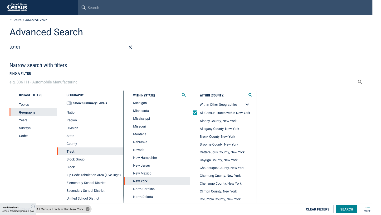
-
Once you get the list of datasets, open the first entry (the
S0101table).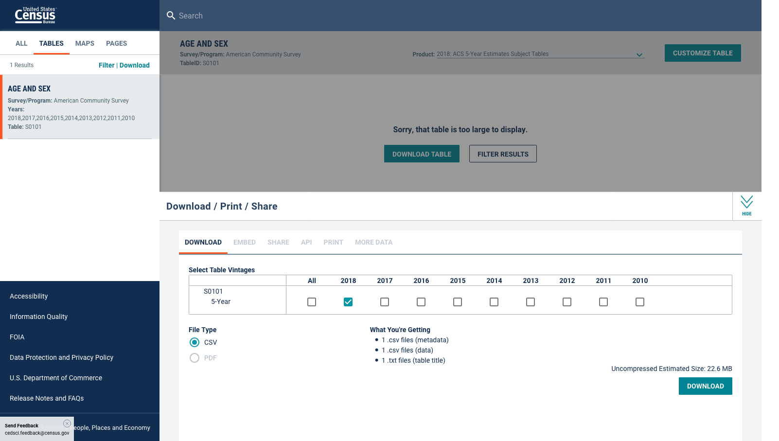
-
Click
Download, wait for your data to be prepared and download it.
Prepping Census Data for QGIS
In order to bring this census data into QGIS we need to re-format the tables, so that they are correctly read by the program and we can join them to their geographic boundaries. This is a two step process: first, we will format the actual tables in Excel, Google Spreadsheet or a simple text editor and, second, we will create a .csvt file, which will tell QGIS the exact format for each of the fields in the table.
Again, as with many things GIS, there are multiple ways of formatting the data. In our case we could do it using Excel, Google Documents (Spreadsheet) or even a simple text editor. Here, though, we will show you how to do it through Google Sheets. If you know how to do it in Google Sheets you should be able to figure out how to re-format the data using Excel in case you need to.
The great advantage of using Google Sheets (or Excel) is that if you need to, you can add and calculate new fields into your data (you can also do this in QGIS). However, if you were to do that in a text editor, you would need to manually calculate the value for every single row. On the other hand, doing the re-formating through a simple text editor means that you can control the format of the data much better and that you won’t have any problems with Google Sheets or Excel auto-converting your data into other types (for example, from text into numbers or vice versa).
Another great advantage of using Excel or Google Sheets is that if you need to delete multiple fields (for example, all the margin of error fields), you can easily do it. Doing it in the text editor would be a nightmare.
Re-formating data in Google Sheets
-
First, open a new Google Sheet
-
Once you’ve opened it, click on
File,Import..., and chooseUpload. -
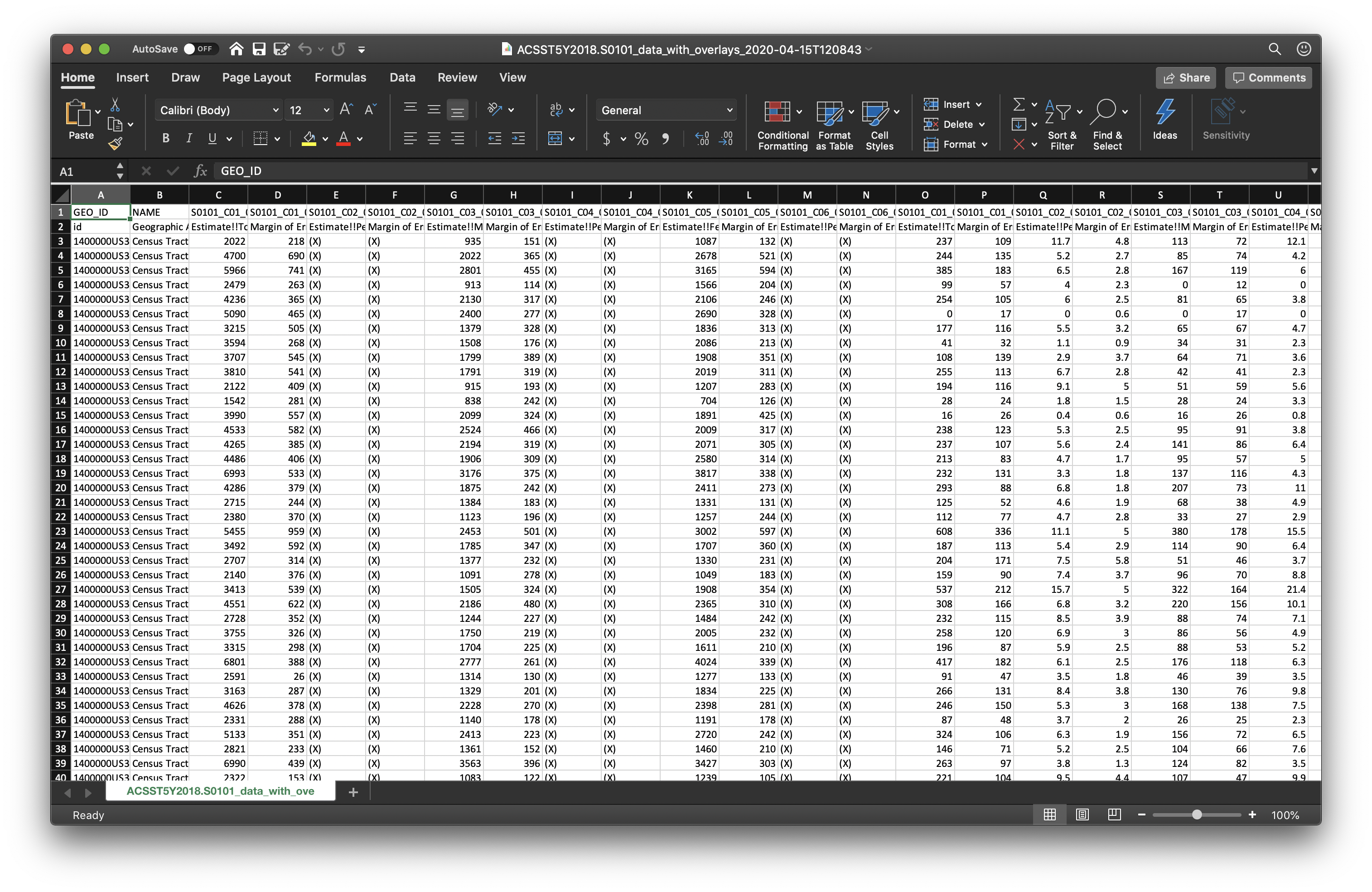
Navigate to the folder where you saved your downloaded census tables and select the
ACSST5Y2018.S0101_data_with_overlays_2020-04-15T120843.csvfile. -
In the menu that follows select the following:
-
Import location:
Replace spreadsheet -
Separator type:
Detect automatically -
Convert text to numbers, dates and formulas:
No(this is very important) -
Click
Import data.
-
-
Now we need to do two things:
-
One, rename the field names (header) and get rid of the second row, which is also a kind of header.
-
And two, delete all fields we won’t be using.
-
-
QGIS – and specially ArcGIS – are particular about field names, so to avoid problems limit your titles to maximum 8 characters, no spaces, no weird characters and start with a letter, not a number.
-
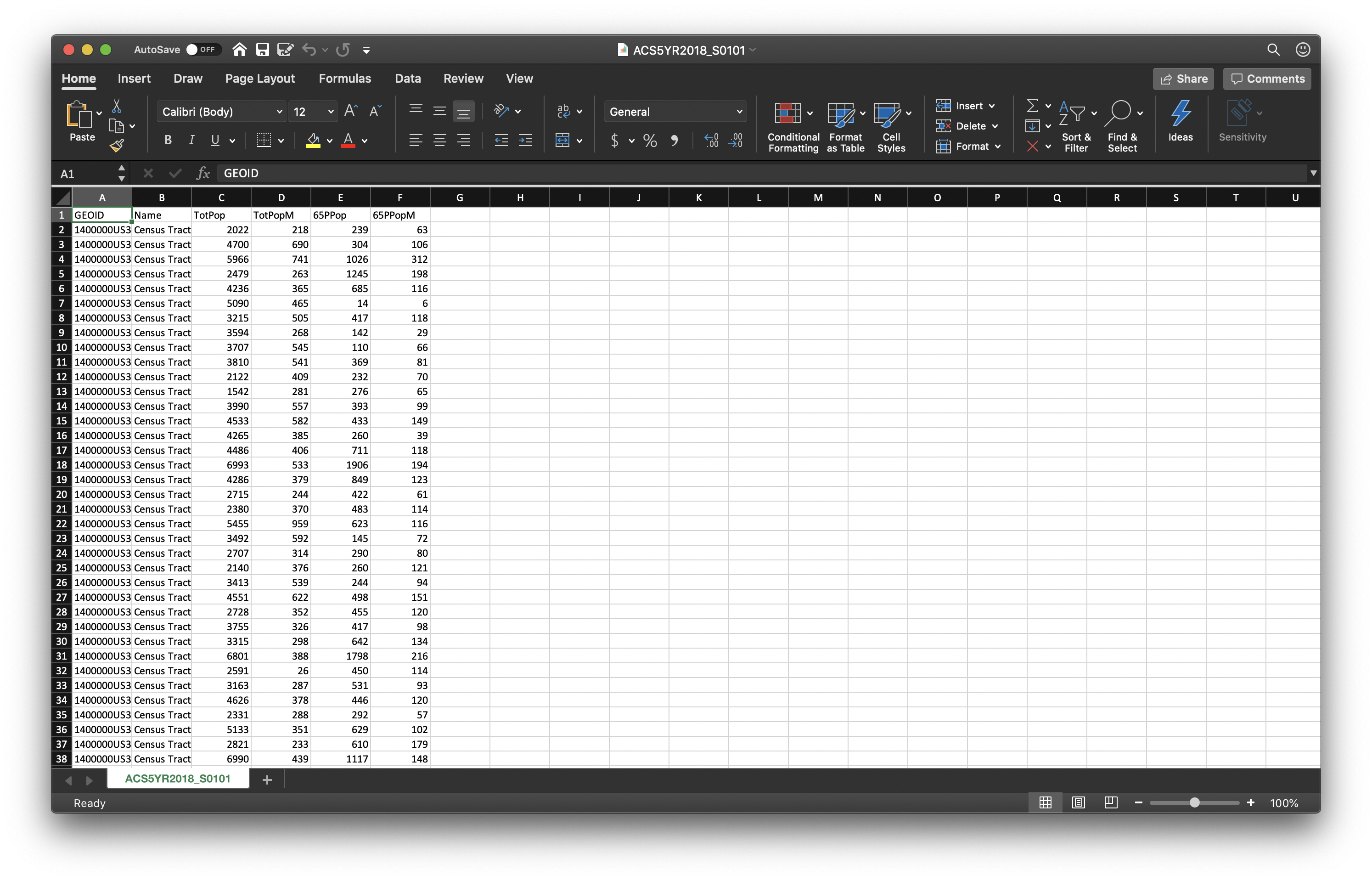
First, delete all the fields we won’t be using. Only keep the following ones:
-
GEO_ID (id)
-
NAME (Geographic Area Name)
-
GEO.display-label (Geography)
-
S0101_C01_001E (Estimate!!Total!!Total population)
-
S0101_C01_001M (Margin of Error!!Total MOE!!Total population)
-
S0101_C01_030E (Estimate!!Total!!Total population!!SELECTED AGE CATEGORIES!!65 years and over)
-
S0101_C01_030M (Margin of Error!!Total MOE!!Total population!!SELECTED AGE CATEGORIES!!65 years and over)
-
-
To make this more legible in QGIS, rename the fields in the following way:
-
GEOID
-
Name
-
TotPop
-
TotPopM
-
65PPop
-
65PPopM
-
-
The names don’t necessarily need to be like these ones. There’s no standard way of naming these fields. The only thing we would recommend is to name them as close as possible to something you can actually read and understand, so that you and the other people who use these files can easily get what they mean. In the end, that is what metadata is there for, to tell you exactly what each of the fields means.
-
Once you’ve renamed the fields, delete the second row. Now you are left with only one header field and the actual data.
-
The last step before we export is to profit from the fact that we are Google Sheets (or Excel) and calculate a couple of fields that we will use in our maps. You could also do this in QGIS but it is much easier in Excel or Google Sheets.
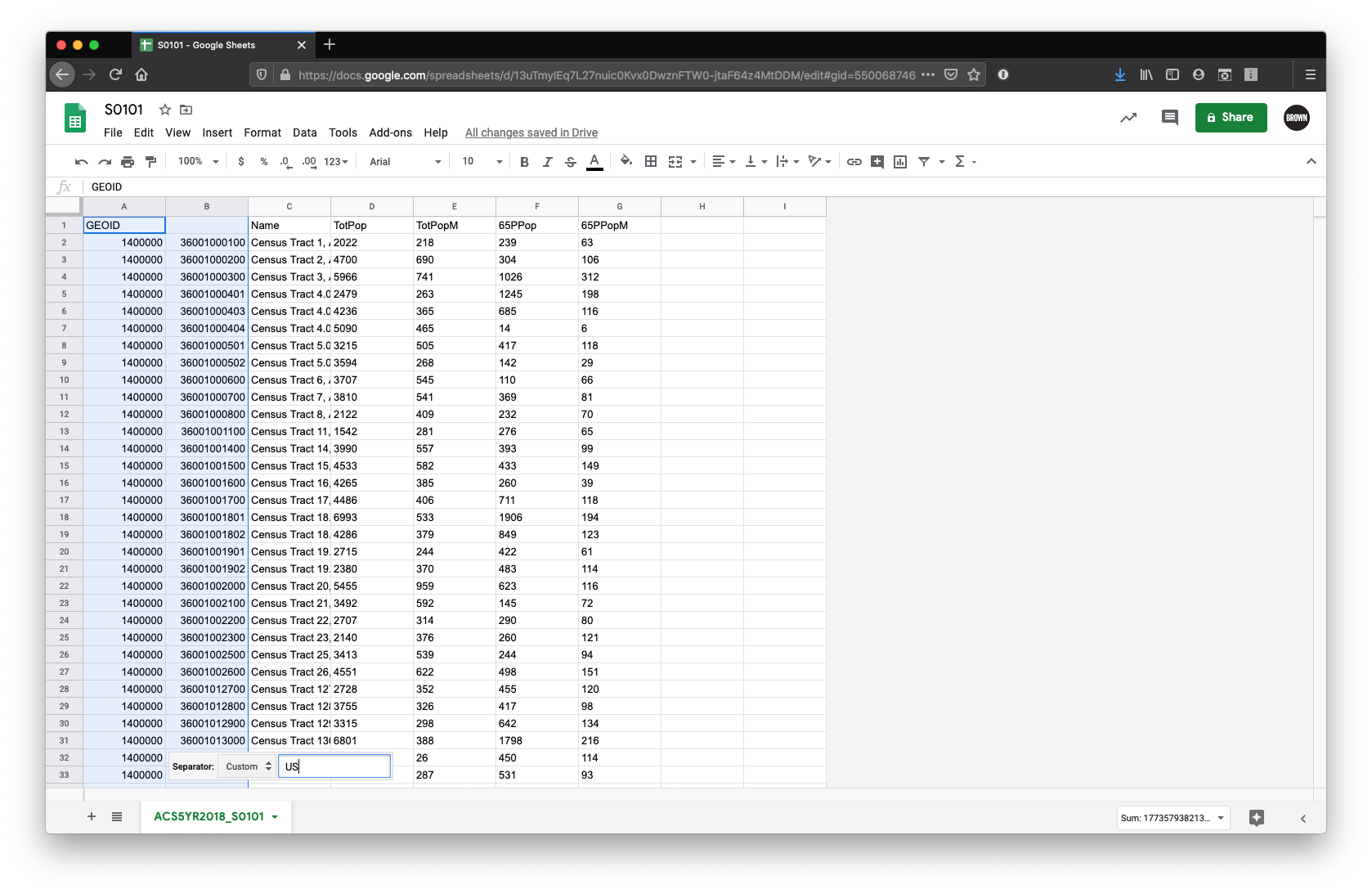
- First, we need to format the GEOID so that it can be joined to the GEOID as formatted by TIGERLINE. To do so, we need to add a column to the right of GEOID (Column A) split the column after ‘US’. In Google Sheets, this can be done by navigating to ‘Data’ -> ‘Split Text to Columns’, and entering the custom separator: ‘US’. In Excel, this can be done by navigating to
Data->Text to Columnsand selecting Fixed Width. You can then click to insert a break following the US in the sample cell. Once split, replace Column A with these new values. If by any reason Google Sheets or Excel are rendering theGEO_IDcolumn in scientific notation (for example, something like3.6005E+11), you should select that column and go toFormat / Number / Plain text. You should see the numbers in their full value with no decimals.
-
Next, we need to convert our values into numbers. In the import section, we specified that they’d be kept as text. This is a safe way to ensure Google Sheets (or specially Excel) doesn’t convert our text into numbers with a weird format. However, now that we need to do some calculations, we do need them to be numbers:
-
To do this select all the columns that have actual values (from
TotPopto65PPopM) and selectFormat / Number / Number.
- First, we need to format the GEOID so that it can be joined to the GEOID as formatted by TIGERLINE. To do so, we need to add a column to the right of GEOID (Column A) split the column after ‘US’. In Google Sheets, this can be done by navigating to ‘Data’ -> ‘Split Text to Columns’, and entering the custom separator: ‘US’. In Excel, this can be done by navigating to
-
Finally, export your file as a .csv file. Go to
File / Download / Comma separated values (.csv, current sheet). Save your file and rename itACS5YR2018_S0101.csv.
Creating the .csvt file
-
After exporting your CSV, you will need to create a .csvt file. This file will tell QGIS exactly what type of data each of the fields is in. The different types of data your fields can take are:
-
String - Represents text
-
Integer - Represents whole numbers
-
Real - Represents both negative and positive numbers, with decimal points
-
Date - Date in the format YYYY-MM-DD
-
Time - Time in the format HH:MM:SS+nn
-
DateTime - Date and time in the format YYYY-MM-DD HH:MM:SS+nn
-
-
So, for every column we need to specify what type the data is in.
-
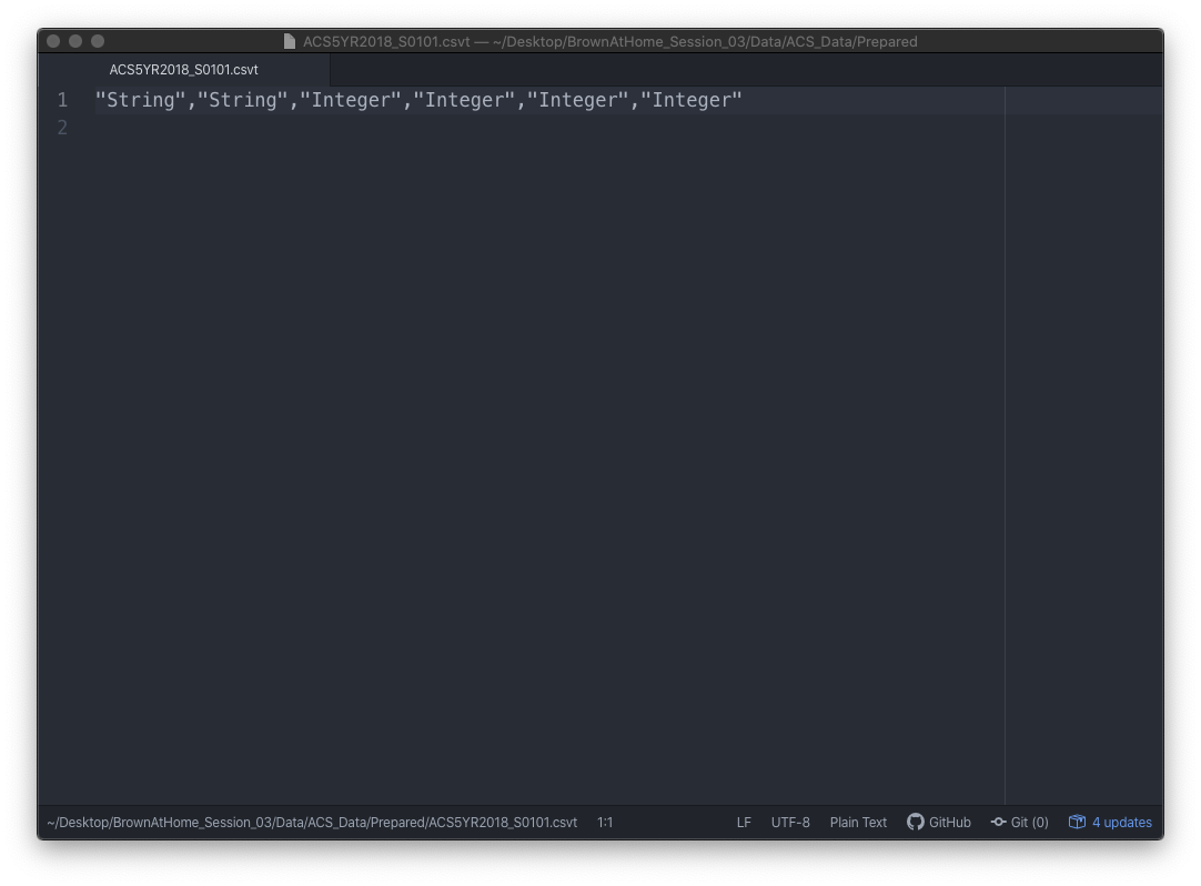
In your text editor, open a new file.
-
For every field, write the type of data it takes in quotation marks:
-
On the new file write (all in one line):
"String","String","Integer","Integer","Integer","Integer" -
Note that every item is separated by a comma and that the first three fields, even though they seem like they are numbers, are actually text fields. This is very important, since we are going to use those fields to join our census table to the census boundaries, which also contain those fields as text. If we have one file with text and another with integers or real numbers, the program won’t be able to match it.
-
-
If you are working on Mac’s TextEdit you need to format your file as ‘Plain Text’. To do this click on
Formatand thenMake Plain Text. This will change your file from an .rtf to a simple .txt. -
Save your file with the same name as the table but with a different extension. It is important to do this so that QGIS understands that this .csvt file corresponds to the other .csv or .txt file. In both Windows Notepad and in Mac TextEdit you need to manually type the extension (.csvt) and in TextEdit you need to un-check the option that says ‘If no extension is provided, use .txt’.
-
This file should be saved as
ACS5YR2018_S0101.csvt. -
Your final file should look something like this:
Now that the files are ready we can move into QGIS and bring everything together. A packaged version of these csv/csvt files, along with all the other files you will need for this tutorial can be found here.
Importing Data to QGIS
-
First, open a new map in QGIS and add the following layers (links at the beginning of this tutorial or in the package referred to right above). Remember to add the boroughs first so that the map takes on the right projection. To add these shapefiles, open QGIS and navigate to
Layer->Add Layer->Add Vector Layer.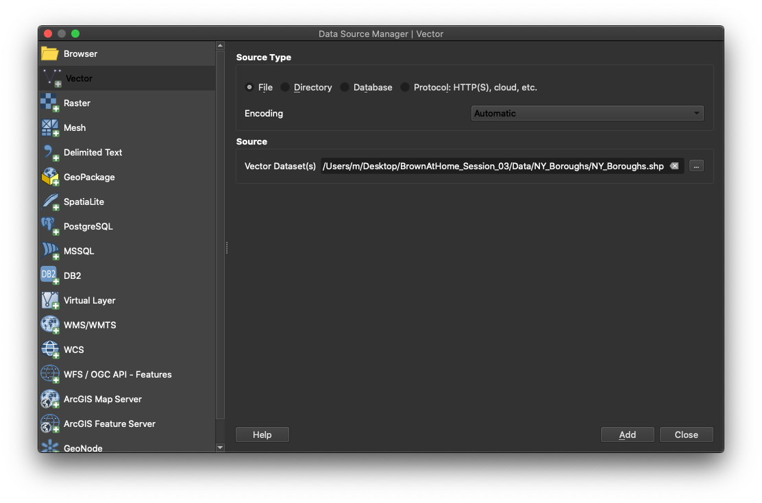
- Boroughs
- Census Tracts
- US Hydrography
- NY Hydrography
- States
-
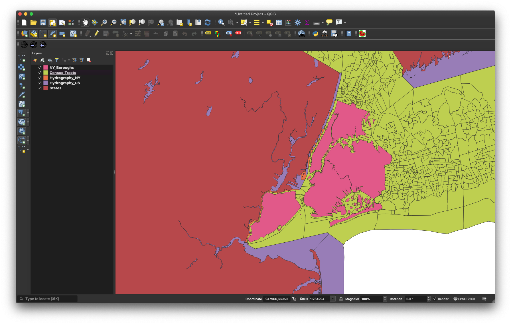
Organize your layers in the following order, by dragging and dropping the layers in the left-hand layers panel.
- Boroughs
- Census Tracts
- NY Hydrography
- US Hydrography
- States
-
It’s a good idea to rename your layers as you bring them in, as they sometimes come with cryptic file names. Go ahead and rename the census tracts and the boroughs layers by right-clicking on them and choosing
Rename Layer. You file should look something like this (colors will vary):
-
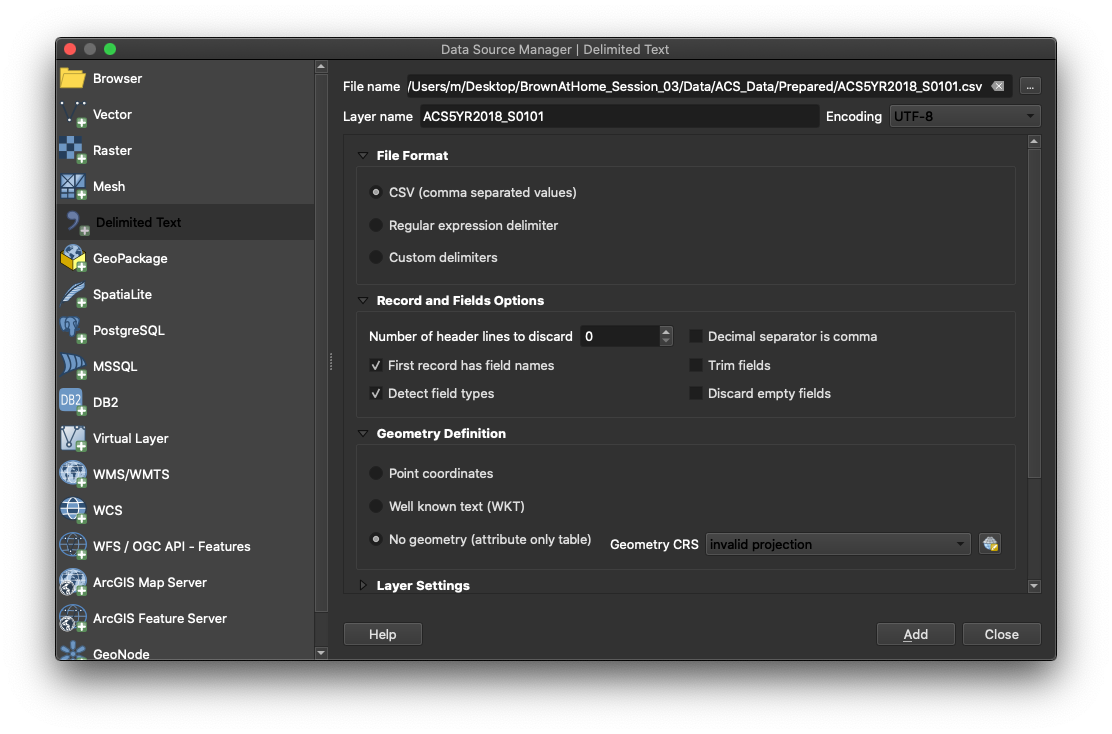
Next, import your cleaned ACS dataset. To do so, click on
Add Delimited Tex Layer(Represented by a comma icon with a plus sign). -
In the menu that comes up, look for your
ACS5YR2018_S0101.csvfile. Once you’ve selected your file QGIS will automatically select some presets. You should have the following options selected:-
File format:
CSV (comma separated values)- this is the format our data is in: each value is separated by a comma. -
Record and Fields options:
-
Number of header lines to discard:
0 -
First record has field names: checked. -
Detect field types: checked.
-
-
Geometry definition:
No Geometry (attribute only table)- our data does not have any geometry data: no coordinates or WKT (“well known text representation of geometry”) data. -
Your menu should look something like this:
-
-
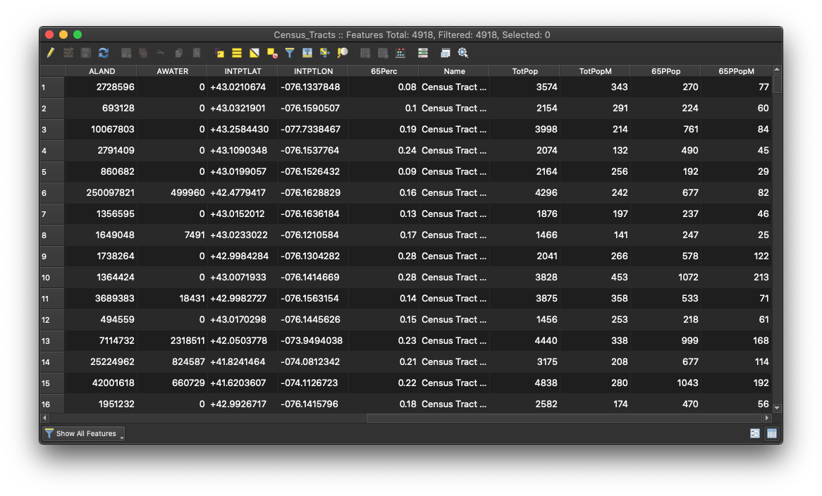
Add the data. Your table should appear in the layers panel, and if you right-click on it and open its attribute table you should see your data more or less how it was in Excel.
-
To make sure the fields were imported in the right format, right-click on the layer and select
Properties.... In there, select theFieldstab. This will show you the different fields in your layer as well as their types.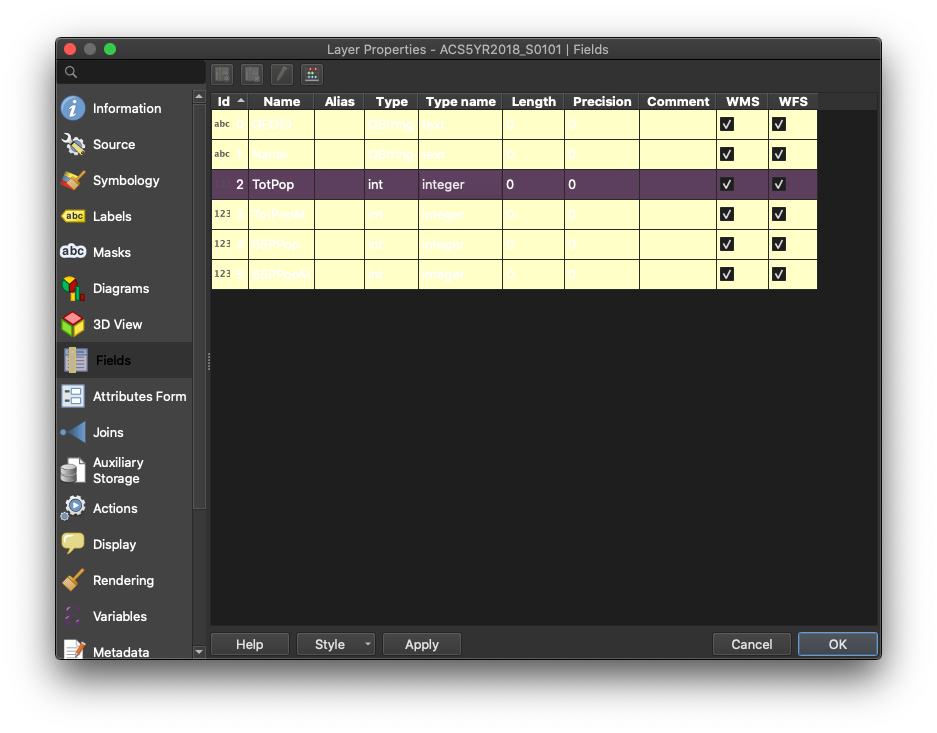
-
Now that we have our layers loaded, we need to join our census dataset to the Census Tract geometry:
-
First, right click on your
Census_Tractslayer and selectProperties, and on the left column, select theJoinstab. -
Next, click the
+sign and a prompt will appear. -
Now, select
ACS5YR2018_S0101as the join layer, andGEOIDas the join field. -
Next, select
GEOIDas the target field. Make sure both the join field and the target field are of the same type. In this case, both of them should sayabcbefore their names. This means they are both text fields. -
Next, check the
Custom Field Name Prefixbox and get rid of the text there. This will make sure the new fields don’t have any prefix in their titles (you would leave this on if, for example, you wanted to maintain a record of where the fields are coming from).
-
-
Your join menu should look like this:
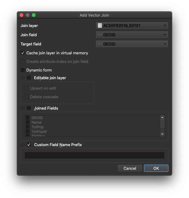
-
Hit
OKandOKto close the properties panel. -
After joining any dataset, the first thing you should do is check the attribute table of the recipient dataset (census tract) and make sure you see the new columns.
-
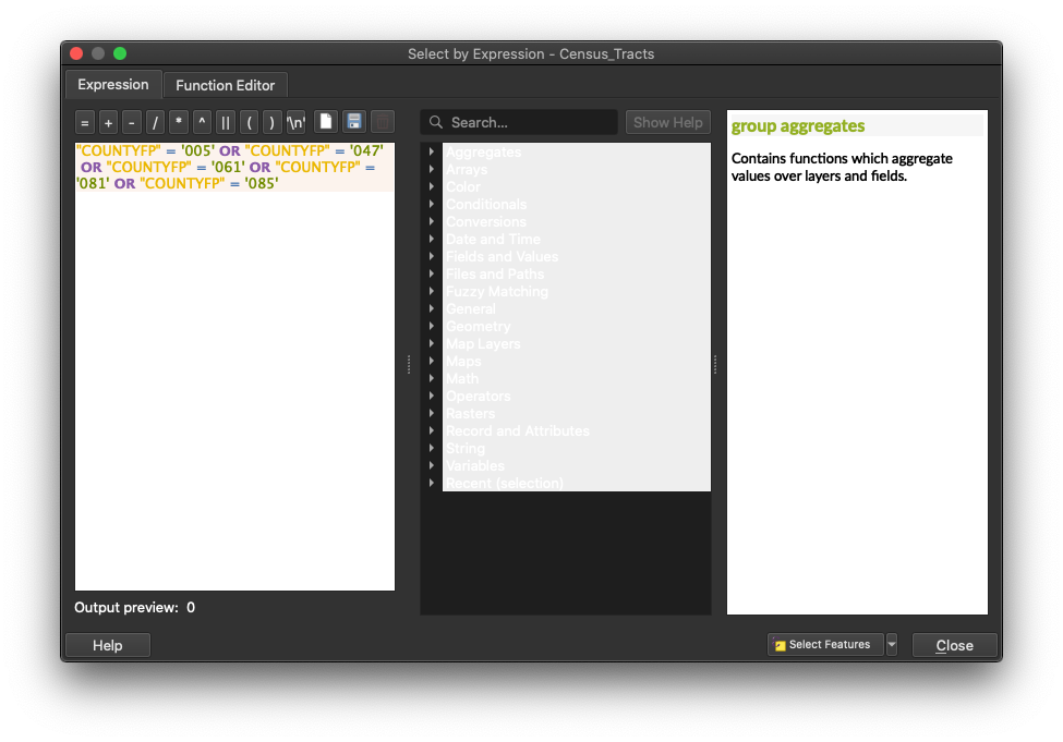
The join was successful, but we are really only interested in mapping out census tracts in New York City. So we will write a selection query that picks only the Census Tracts whose county code (
COUNTYFP) matches those of New York City. Then, we will export these selected Census Tracts as a new file, and in the process, give that file the standard New York City geographic projection:-
In the attribute table of the census tract file click on the
Select features using an expressionbutton (the one with an “ε” over a yellow square). -
Once in there write the following expression:
"COUNTYFP" = '005' OR "COUNTYFP" = '047' OR "COUNTYFP" = '061' OR "COUNTYFP" = '081' OR "COUNTYFP" = '085'and clickSelect features. In the top of the attribute table behind the selection panel you will see that it now says there are 6493 features selected.
-
-
Click
Closeand close also the attribute table. In the map you should see all the census tracts for New York City highlighted in yellow while the ones for the rest of the state remain in their original color. -
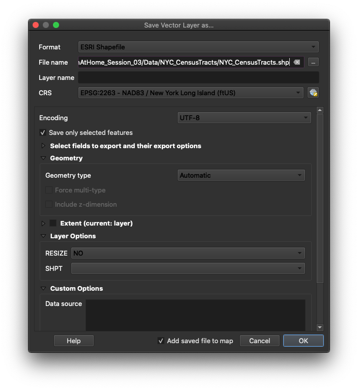
Finally, right-click on the census tracts layer and select
Export,Save Selected Features As.... -
In the following menu choose:
-
Format:
ESRI Shapefile- this is the same format of our other layers. -
Save as: choose the appropriate location and name for your file.
-
CRS:
EPSG:2263 - NAD 83 / New York Long Island (ftUS)- this is the coordinate system we are working with and we want this layer to have the same one. -
Check
Save only selected features. -
Check
Add saved file to map- so that once you export the layer, the layer is added to your map.
-
-
Once you export your layer, and it’s automatically added to your map, you can open its attribute table to check that it has all the right fields. Finally, right-click on the original NY Census Tract layer and the csv file that we imported and remove them from the map.
-
Now, we are ready to process, symbolize, and visualize our data.
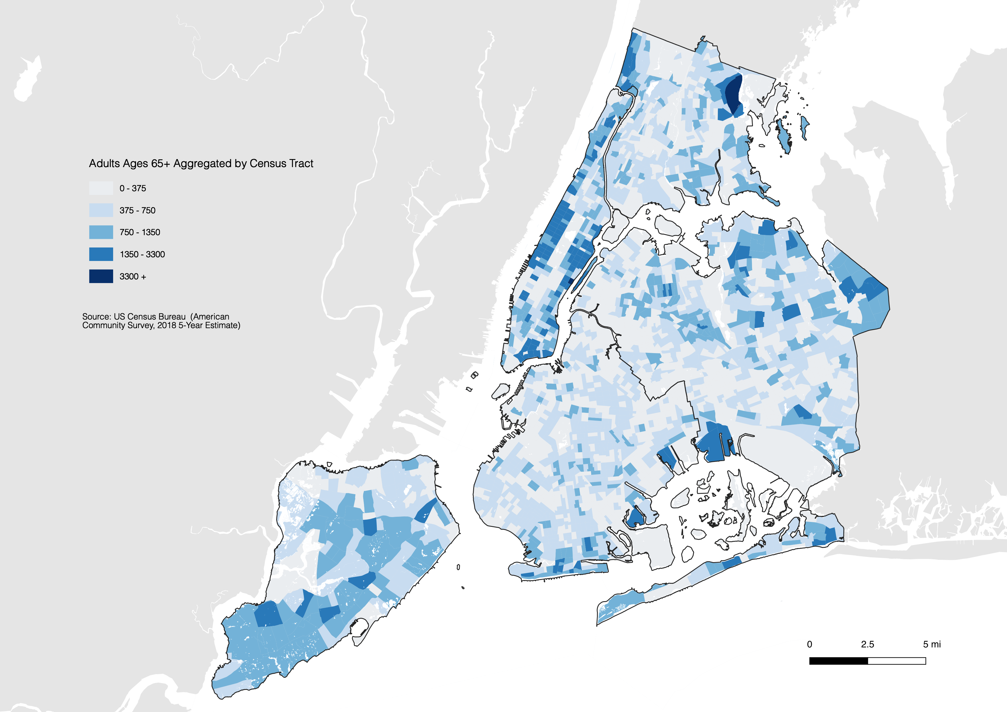
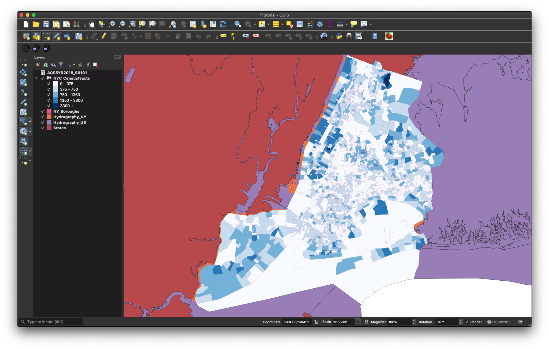
Creating a Choropleth of 65+ Adults in New York City
-
To create a choropleth map highlighting the estimated population of adults ages 65+ in the city, right-click on the NYC_CensusTracts layer and choose
Properties... -
Once there, choose the
Symbologytab on the left, and chooseGraduatedfrom the dropdown menu at the top. -
Next, select the
65PPopfield as theValue, selectNatural Breaks (Jenks)under mode, and selectClassifyto load all the different values in that column. -
For the purpose of this tutorial, we will select the Blue color ramp, only altering the first color to the hex value of #eaedf0. A great resource for choosing color is Color Brewer. Their default color choices might not be the most stylish, but they will provide a good starting point.
- For each value, we will select more relatable breaks, making the map easier to read. I will set the values to the following:
- 0-375
- 375-750
- 750-1350
- 1350-3300
- 3500+
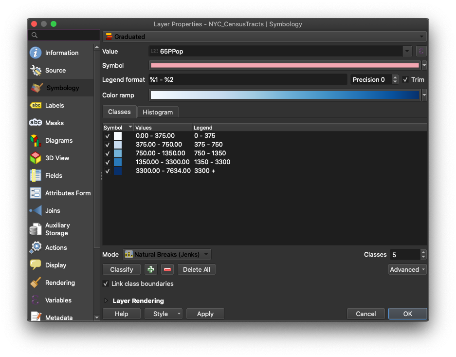
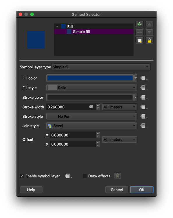
- To better style the map, we will also click on each symbol and navigate to
Stroke style, selectingNo Penfor each.
-
While you are on that menu, change the
Legendvalue to the actual name of the category. -
Your final symbology menu should look something like this:
-
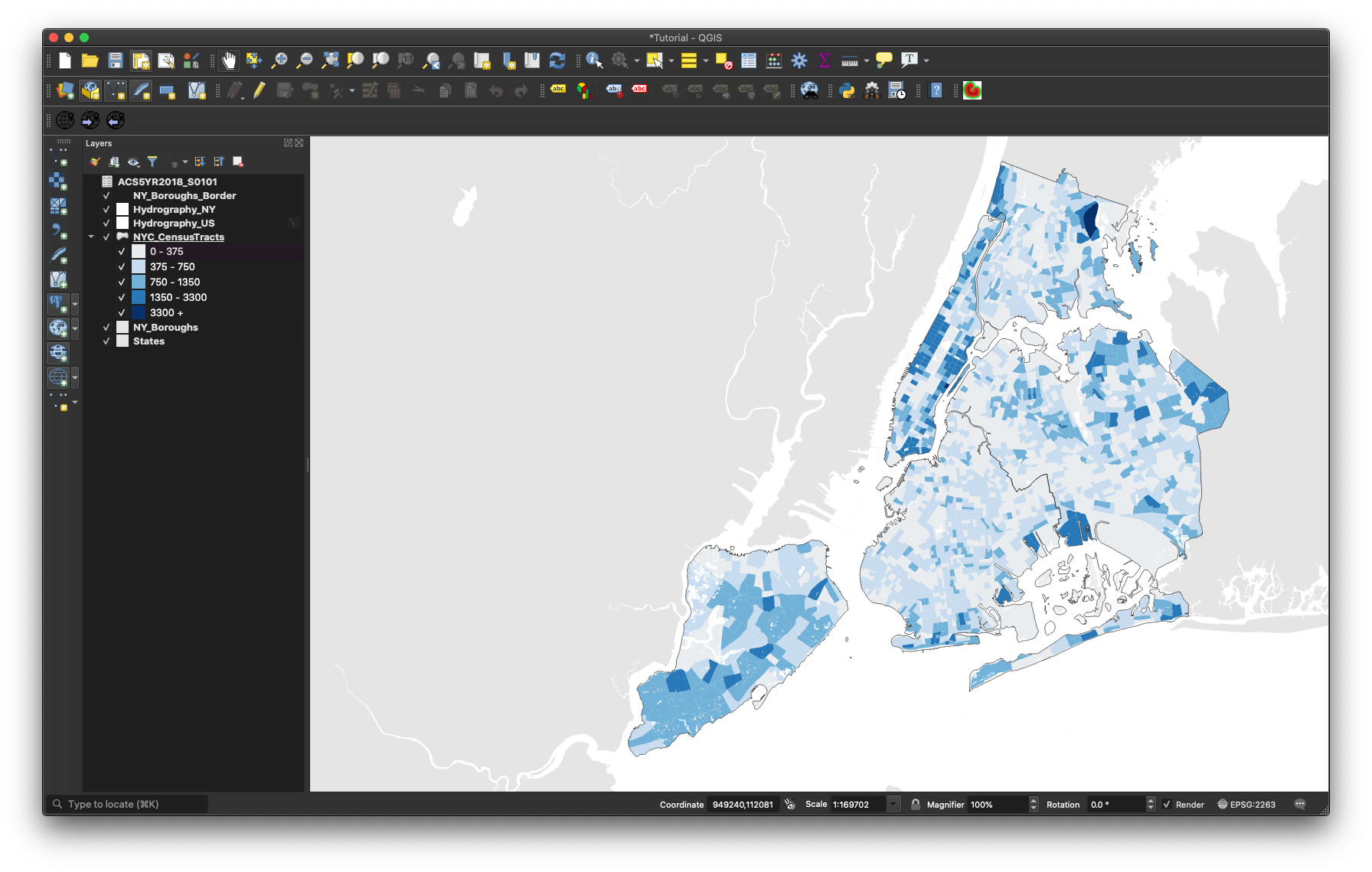
After this, we will style the remaining shapefiles to make the map more legible.
-
To begin, right-click on the boroughs layer and make a copy of it. We will use one of them as a background color and another as an overall border on top of the other layers.
-
Apply the following style to each of the other layers (by right-clicking on them and going to the
Symbologytab): -
NY_Boroughs_Border:
* `Fill style` `No Brush` * `Stroke color` `#000000` * `Stroke width` `0.25 Points` -
US Hydrography: *
Fill color#ffffff* `Fill style` `Solid` * `Stroke style` `No Pen` -
NYC_Hydrography:
* `Fill color` `#ffffff` * `Fill style` `Solid` * `Stroke style` `No Pen` -
Boroughs (the bottom layer):
* `Fill style` `Solid` * `Fill color` `#e5e5e5` * `Stroke style` `No Pen`-
States:
* `Fill style` `Solid`

* `Fill color` `#e5e5e5`

* `Stroke style` `No Pen`
-
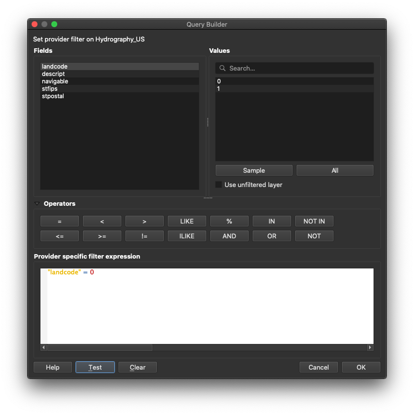
Finally, we will apply a filter the US Hydrography layer, so that it doesn’t show islands (as well as water). To do so, right-click on the Hydrography_US layer, and select Filter. In the Query Builder, enter "landcode" = 0.
Your workspace should look like the following:
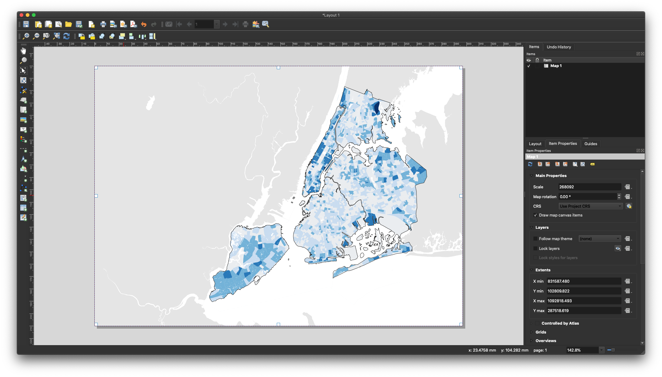
Print Layout
The Print Layout (previously called ‘Print Composer’) is where you will format your map for its final output. Here you will specify the output size, you will add a legend, a scale bar, a north arrow (if needed) and any additional text (titles, sources, explanations and credits). Although the Print Layout exists as its own window it will still be linked to the map Project we have been working on.
-
First, create a new Print Layout in
Project,New Print Layout. Give it a custom name if you want, although this is not necessary. -
Once you are in the Print Layout you need to add a new map. Think of it as if you had a blank piece of paper and you were adding a window onto the map you’ve been working on. That window is a link to your Project and if you change things in the Project those changes will still be reflected in the Print Layout.
-
To add a new map, click on the button
Add new mapon the left-hand panel and draw a rectangle on the blank page.
-
Once you add the map you can adjust its size and position by dragging it from its corners.
-
You might notice that if you change the size of the map it doesn’t necessarily update. To avoid this, on the right-hand panel, where it says
Main properties, click onUpdate preview. -
To move the content inside the Print Layout (as opposed to the whole page) use the
Move item contenttool on the left-hand panel. -
Next, you need to center and zoom in the map on the area you want to focus on. For the purposes of this tutorial, we will move and zoom so the whole city is in the map. To do this, move the content of the map to this area and on the right-hand panel, under
Main properties, adjust yourScaleto 235,000. -
If any of the colors or line weights seem too big or two small or not correct, you can always go back to the Project and change them there. When you return to your Print Composer you can update your preview and the changes will be reflected.
-
Add a scale bar by going to
Add ItemAdd scale barand clicking on the map. -
The default scale bar is too big. To change this, go to the right-hand panel, in the top part make sure you select the
Scale bar, and adjust its properties in theMain Propertiespanel. You can also adjust its units, its colors and even its font. -
To add a legend click on
Add ItemAdd legendand then click on the map. You will notice that QGIS automatically generates a line in the legend for every layer in the map. We only need the land use ones, so we need to customize the legend: -
On the right-hand panel, under Legend items uncheck
Auto updateand then select the layers that you don’t want in the legend and remove them with the ‘minus’ button. Do the same thing inside the Lots layer with the categories you don’t want to display. -
Also, further down, uncheck the
Backgroundoption. -
Under
Spacingchange theSymbol spaceto 0.00mm. -
And under
Fontschange theItem fontto 8. -
Since we did not rotate the map we don’t need to add a north arrow. If you rotate your map you must add a north arrow. If you wanted to, you could add a north arrow by clicking on
Add ItemAdd arrow. -
Finally, to add a title and a ‘source’ text, click on the
Add new labelbutton on the left-hand panel and click on the map. Customize these labels by changing their color, size and location. -
The last step is to export the map as a .pdf file. Use the
Export as PDFbutton on the top toolbar and save your map. -
Your final map should look something like this: