
Intermediate GIS (Geocoding and Network Analysis)
Session 6: Intermediate GIS
Here’s a video recording of the session:
Datasets
In this tutorial we will be using the following datasets:
-
American Community Survey - Table S0101 (Age and Sex) from 2018 (5-Year Estimates). Download from the U.S. Census Bureau Data site.
-
Census Tracts - New York State 2018 census tracts. Download from U.S. Census Bureau - Tiger/Line Shapefiles. Select
2018andWeb Interface. Select2018again, if necessary, andCensus Tracts, and clickSubmit. Then, selectNew Yorkas the state and clickDownload.- Note: if the
Web Interfaceis not working - it often doesn’t - selectFTP Archive. There, select the folderTractand there download thetl_2018_36_tract.zipfile.
- Note: if the
- Boroughs - New York City boroughs. Download from NYC Planning - Open Data. Choose “Borough Boundaries (Clipped to Shoreline)”, under “Borough Boundaries & Community Districts”.
- State Boundaries. Download from TIGER/Line
- Hydrography - New York City hydrography. Download from NYC Open Data. Once you get to the NYC OpenData page, click
Exportand choose theShapefileformat. - Hydrography - US hydrography. Download from the Spatial Information Library
- Retail Food Stores for NY State. Download from NY Open Data.
- LION - A single line representation of New York City streets containing address ranges and other information. Download from NYC.gov
About this tutorial
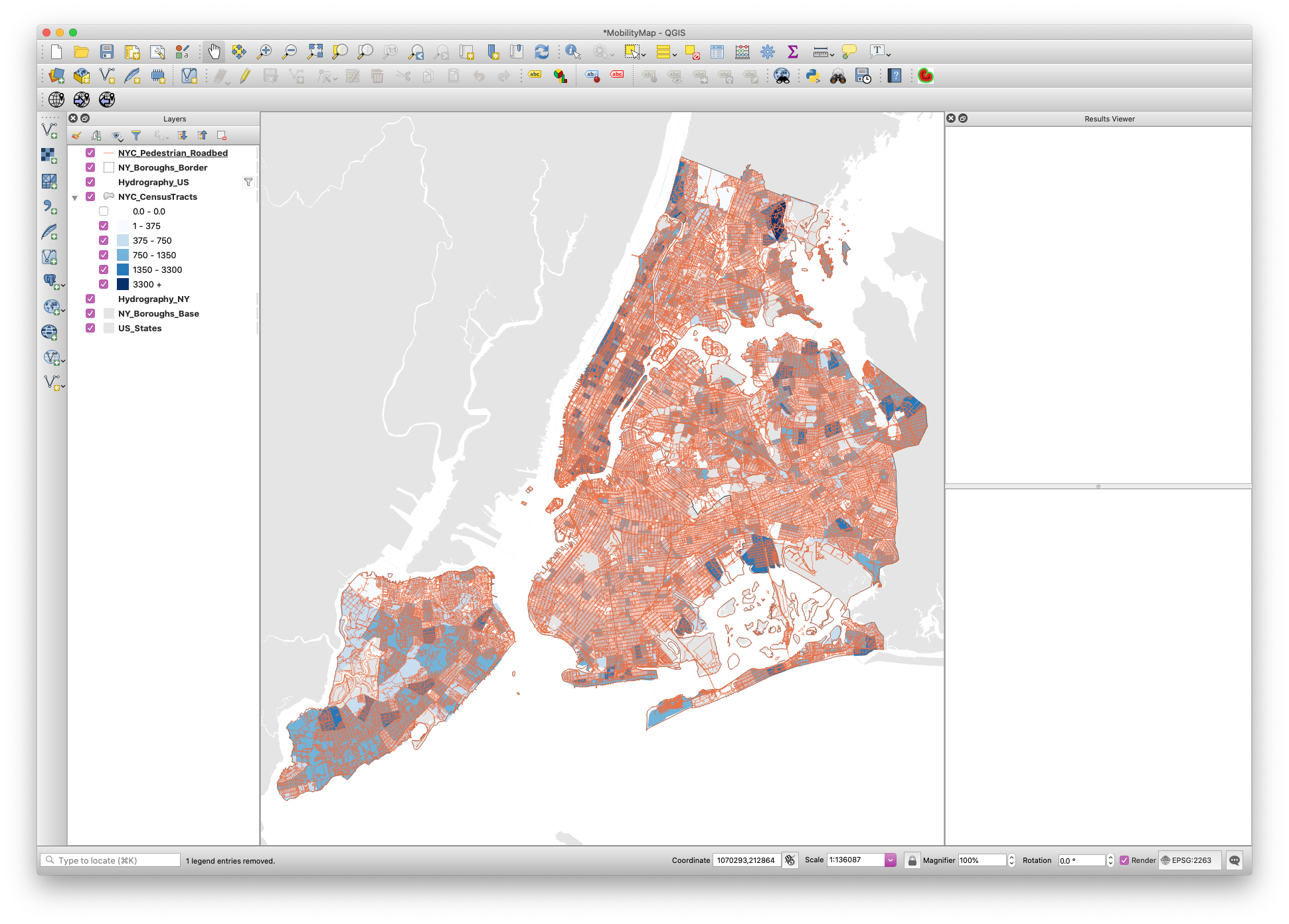
The CDC reports that 8 out of 10 deaths reported in the U.S. have been in adults ages 65 years and older. Our Introduction to GIS tutorial focused on mapping this demographic and where they reside according to census tracts in New York City. This tutorial will start where the last tutorial left off, exploring walking distance to food retailers across the city. With both walking distance and vulnerable population mapped, we can begin to investigate where communities are that have a) high counts of individuals ages 65 and older and b) are within walking distance of their nearest food retailer.
A package of the data needed for this tutorial as well as a completed QGIS file from the previous session can be found at brwn.co/athome6
Geocoding
In the download packet is a shapefile of the Food Retailer dataset that has already been geocoded. This was provided due to the time it takes for geocoding to process in the QGIS browser. That said, below is a brief demo of how to geocode, should you want to do this on this, or any other dataset.
Geocoding is the process of converting addresses (like a street address) to latitude and longitude so that it can be read into GIS. It is not perfect, though in cities like NY, when searching with complete addresses, you’re likely to find the results complete and accurate. That said, always double check your work once geocoding has taken place.
To begin, you’ll need to download a plugin to extend the functionality of your base install of QGIS. To do so, navigate to Plugins -> Mange and Install Plugins. Search MMQGIS and install the plugin by that name.
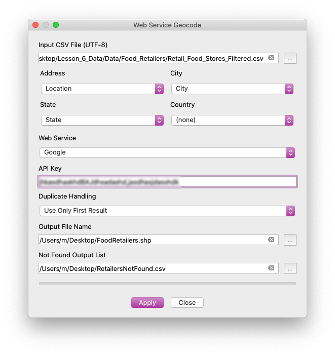
You should now see a new toolbar menu item labeled MMQGIS. Navigate to MMQGIS on the upper toolbar and select Geocode -> Geocode CSV with Web Service. In the option panel, you now must select the CSV you will be geocoding, as well as the fields that are identifiable.
In the data folder provided, you’ll notice that provided are two Food Retailer datasets. One is for the entire state, whereas one has been filtered down to the five counties of New York City, Establishment Type of JAC, and square footage greater than or equal to 6000 Square Feet. Initial filtering took place in Google Sheets so that we would only need to geocode the stores that were eligible for our analysis. This is because geocoding is limited to a certain amount of queries, depending on the vendor.
In MMQGIS, we will use Google, which requires a simple API Key, which can be generated on their Developers site.
In the geocoding menu, match up the address, city, and state fields that are found in your CSV, enter your Google API Key, and select where you’d like the shapefile and not found files to be saved. The Shapefile will be point data, with the same table as what is found in the CSV. For any addresses that Google cannot locate, it will simply place them in the not found csv.
Importing LION (and other geodatabases)
To perform network analysis, we need to have a dataset that includes all roads/paths accessible to pedestrians. This can be found in LION, which is a single line representation of New York City streets containing address ranges and other information.
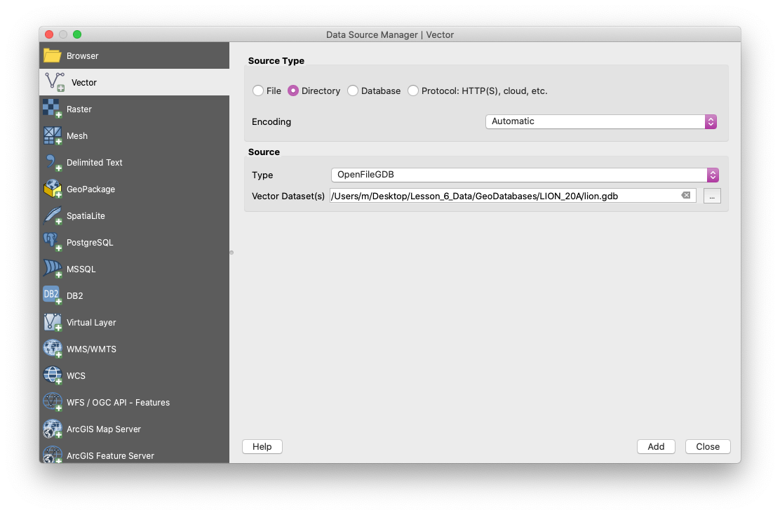
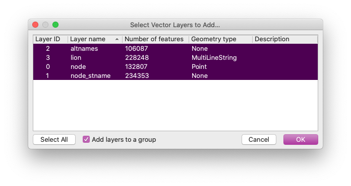
To import LION, navigate to layer -> add layer -> add vector layer. Instead of importing a file, select Directory and under “Source Type”, select OpenFileGDB. Then load the file directory lion.gdb located in the main LION folder. It will then ask which layer to add – highlight all layers and select OK.
Extracting Roads from LION
Once you have your workspace setup and have imported the LION geodatabase, we need to extract features that will allow us to calculate the walking distance from each food retailer. This requires a spatial file that has roads that are accessible to pedestrians (for walking). Do this by accessing the Attribute Table and select Select features using an expression. Inside the query builder, we want to filter out all features from LION that are pedestrian accessible roads. This is a somewhat complex filter (provided below). Please reference the metadata file included in the data packet for the tutorial to understand exactly what is being filtered. If you’re going to analyze NYC features a lot, you will work with LION. You should always reference the metadata of the dataset to determine what query fields you have available to you. The LION metadata document can be found alongside the dataset at nyc.gov.
The query to select pedestrian accessible roads is: FeatureTyp <> 'F' AND FeatureTyp <> '9' AND FeatureTyp <> '1' AND FeatureTyp <> '7' AND FeatureTyp <> '3' AND TrafDir <> '' AND NonPed <> 'V'. Remember, this should be entered in the Select features using an expression option found via the attribute table of the LION layer. Once selected, Save selected features by right-clicking on the LION layer and selecting Export -> Save Selected Features As. In this window, save selected features as an ESRI Shapefile titled ‘NYC_Pedestrian_Roadbed’ in your working directory.
Following the save/automatic import of your roadbed file, move the layer to the top of the stack and delete the unfiltered LION GDB layers.
Importing Food Retailers and Performing Network Anaylsis
For this tutorial, we are attempting to identify census tracts that have high populations of individuals who are ages 65 and above who are a far walking distance from their nearest food retailer. To begin, we need to import the Food Retailer point dataset, found in your data folder under Shapefiles -> NYC_FoodRetailers. Import this shapefile as you would with any other vector shapefile.
As discussed in the session, this dataset includes all Food Retailers that are 6000 square feet and above located in the five boroughs. This number is drawn from the AECOM report that was also included in the data packet provided. This is the size designated to be a small/independent full service grocer. That said, this number is not an official government designation and is at the discretion of the map maker.
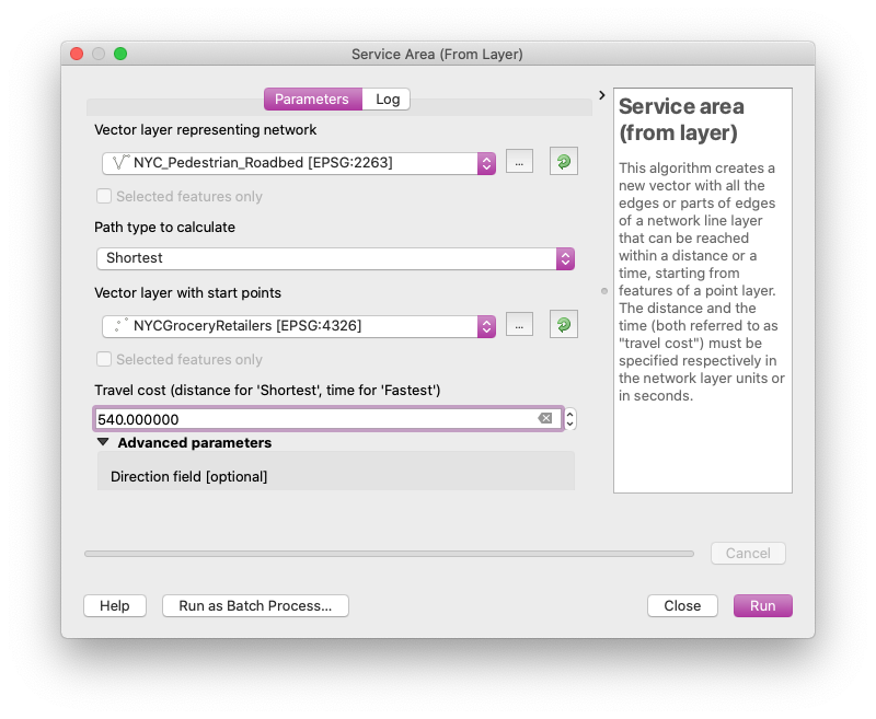
Similarly, we should always highlight how we are estimating any metric that isn’t already pre-defined. For example, the 10-minute walk is a somewhat arbitrary value–specifically how to measure distance over the course of 10-minutes. Guidelines and Recommendations to Accommodate Older Drivers and Pedestrians recommends an assumed walking speed of 0.9 m/s (2.8 ft/s) for less capable older pedestrians because of their shorter stride, slower gait, difficulty negotiating curbs, difficulty judging speeds of oncoming vehicles, and exaggerated startup time before leaving the curb. This translates to 54m/minute, or 540m/10 minutes. This is the metric we will use to calculate our buffer.
To perform network analysis and create walking buffers, navigate to Processing in the menubar and select Toolbox. Within the toolbox that appears on the right side of the workspace, expand Network Analysis and select Service Area from Layer. Here we will generate a service area, or a graph of streets from each food retailer based upon cost (time or distance). In our case, cost is equal to 660m. For the vector layer representing the network, select NYC_Pedestrian_Roadbed and for the Vector layer with start points select NYCGroceryRetailers. Set the travel cost to 540, and make sure that Path type to calculate is set to Shortest (distance) and not Fastest (time). All other options can be left at their defaults.
Select run, and let the algorithm process the network. This will generate a new temporary layer. Export this as an ESRI Shapefile and save it in your working directory.
Generating Bounding Geometry
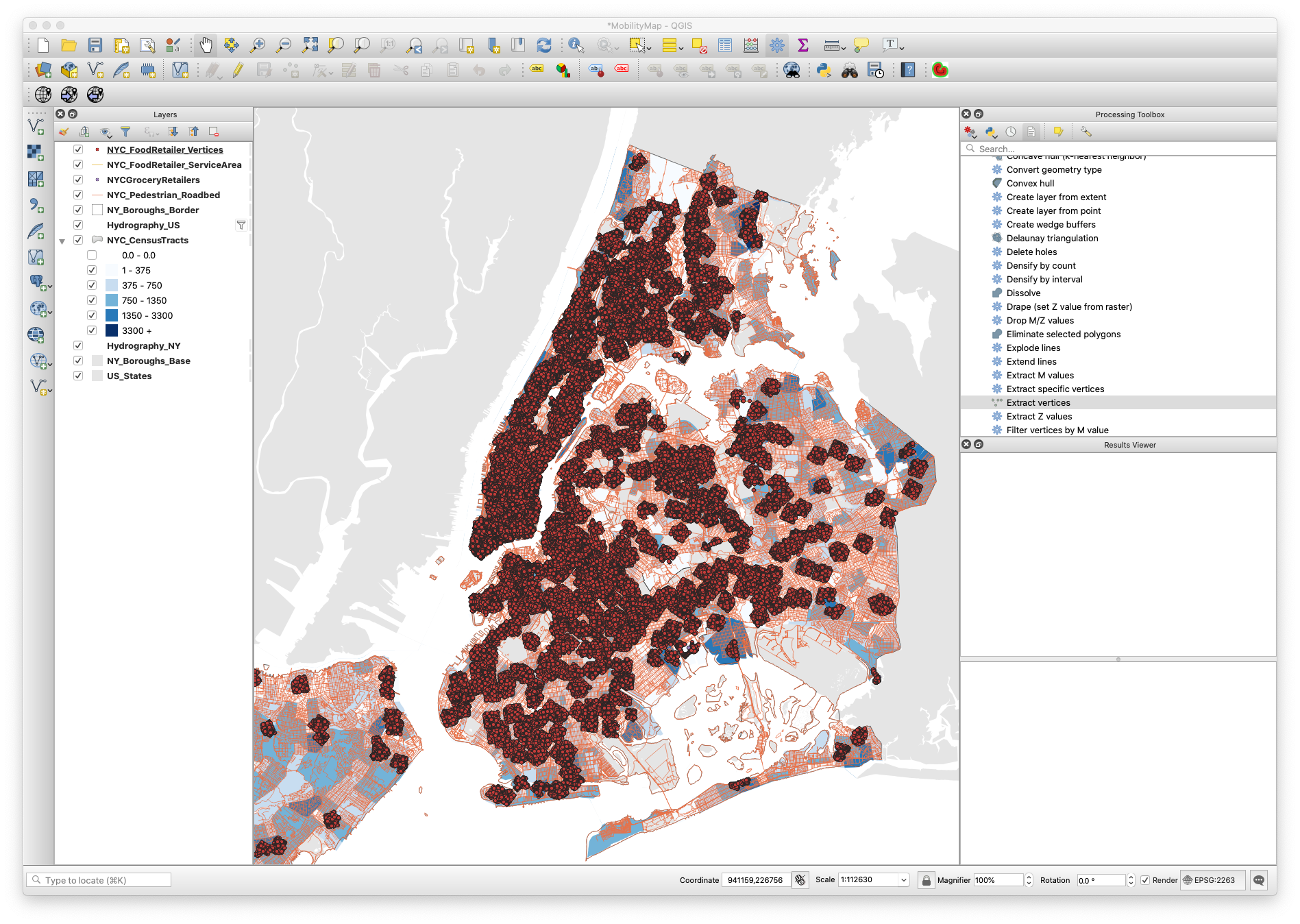
After running network analysis, the output is insufficient for the representation and future analysis that we’d like to conduct. To begin, we need to turn this network of roads into a polygon. To do so, we need to perform two operations.
First, we need to generate vertices at each of the line (road) endpoints (nodes). To do so, navigate to the Processing Toolbox and expand Vector geometry. Select Extract vertices. In the algorithm parameter settings, set your input layer to the network outputs (NYC_FoodRetailer_ServiceArea). Save the temporary vertices output file as a new ESRI Shapefile (NYC_FoodRetailer_Vertices).
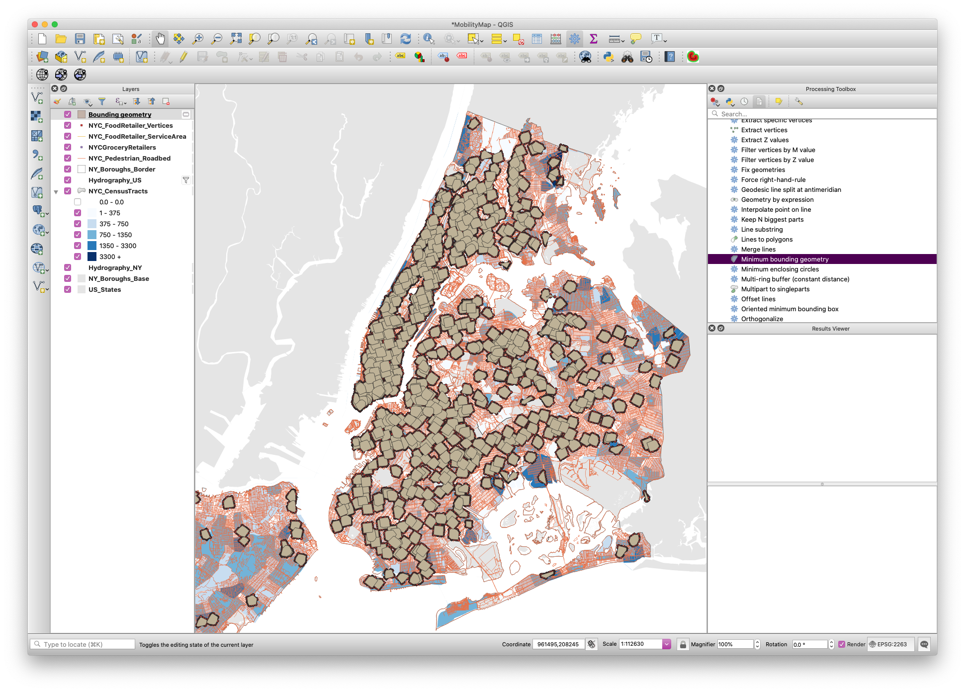
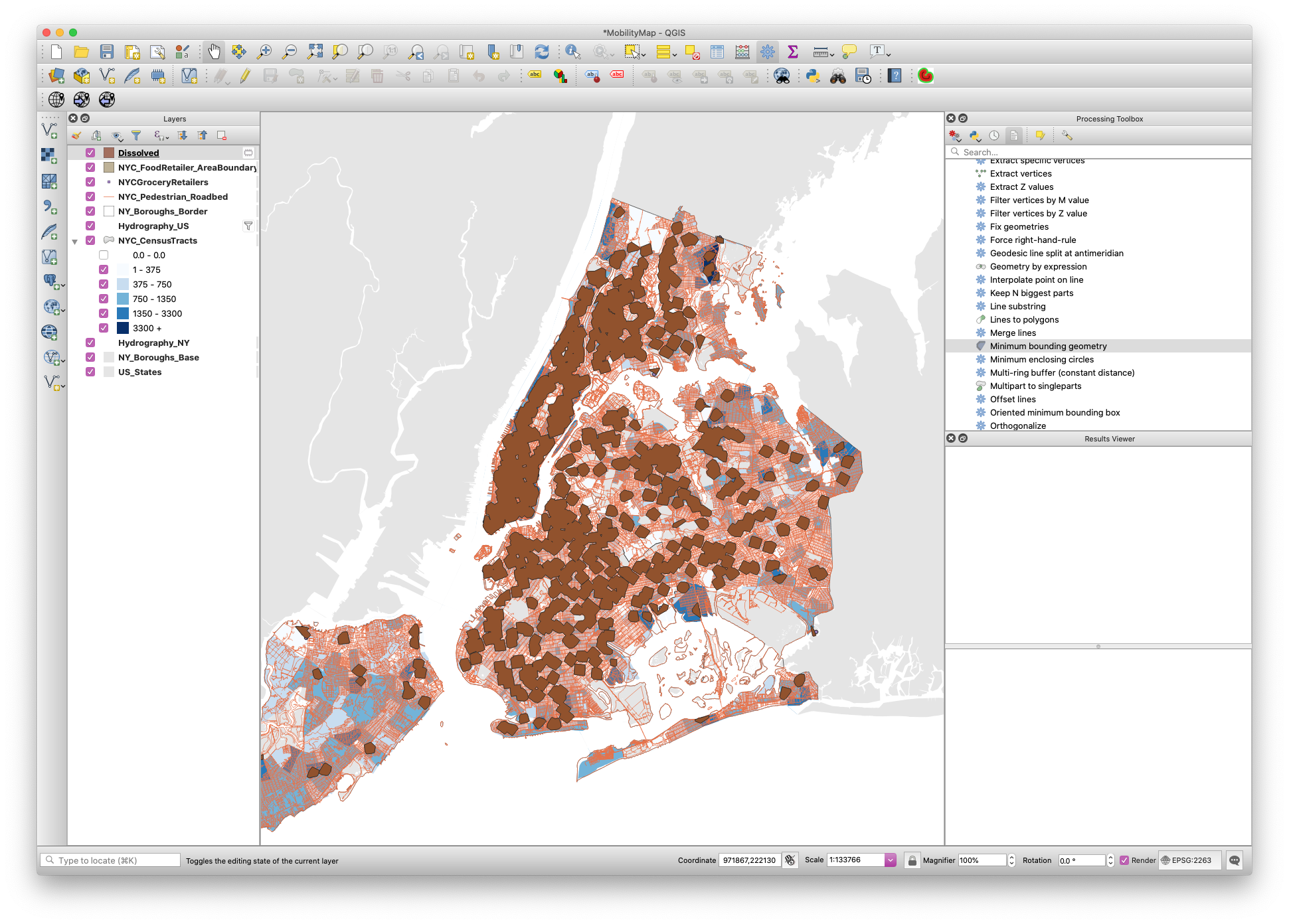
Now we are able to draw a polygon based on the newly generated vertices. Navigate to your Processing Toolbox and expand Vector geometry. Select Minimum bounding geometry. For your input layer, select NYC_FoodRetailer_Vertices and identify the field License Number. This makes sure that the geometry is bound to the vertices of each retailer, not the collective set of vertices. For Geometry type, select Convex Hull. Once you run this process, it will again generate a temporary layer. Save this layer as a new ESRI Shapefile (NYC_FoodRetailer_AreaBoundary).
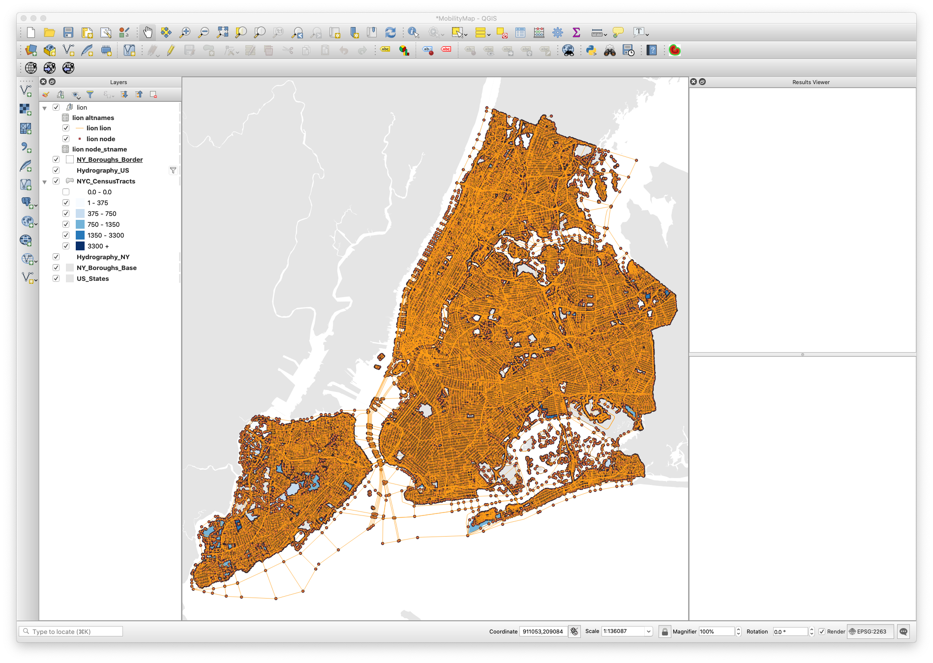
Now is a great time to clean-up your workspace, removing any layers that won’t be needed in our final analysis. A cleaned up workspace should include:
-
Borough Boundaries (2x)
-
NYC Hydrography
-
US Hydrography
-
NYC Census Tracts (with 65+)
-
US State Boundaries
-
Pedestrian Road Network (as generated from LION)
-
NYC Food Retailers
-
Service Area Boundary for each retailer (as generated from our Vertices vector layer)
Geoprocessing
To properly communicate areas in which there exists a high count of adults age 65+ outside a 10-minute walking area of the nearest food retailer, we must conduct basic geoprocessing. For instance, the Service Area Boundaries intersect many of the census tracts. For this reason, we should not show their mobility impaired population as the total population in that census tract. Instead, we should try and come up with a more accurate estimate based on the proportion of area. If we had more time, we would allocate population by building outline via the PLUTO dataset, but we will use proportion of area for this exercise.
To begin, we need to add a new field to our NYC Census Tracts with Age layer. To do so, open the Attribute Table and select Field Calulator. In the query field, enter the value $area. The field name should be set to Area and the field type should be set to Decimel Number Real. Once you select OK, each row will gain a column with a value set to its polygonal area.
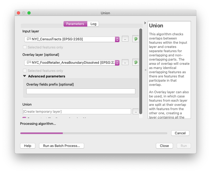
Now, we need to calculate overlap of the Service Boundary Area on our Census Tract layer. To start, we need to generate a single polygon for all service boundary areas that overlap. To do so, navigate to your menubar and select Geoprocessing -> Dissolve. Set your input layer to the Service Area Boundary layer (as generated from our Vertices vector layer). This will generate a new temporary layer. Save this as a new ESRI Shapefile.
Now we will breakup our census tracts by overlaps from this newly generated NYC_FoodRetailer_AreaBoundaryDissolved layer. Navigate to your menubar Vector -> GeoProcessing Tools -> Union. For your input layer, select your Census layer and for the overlay, select your Joined Service Area Boundary layer. Once you select run, this will generate a new temporary layer. Save this as an ESRI Shapefile, NYC_CensusTracts_Split.
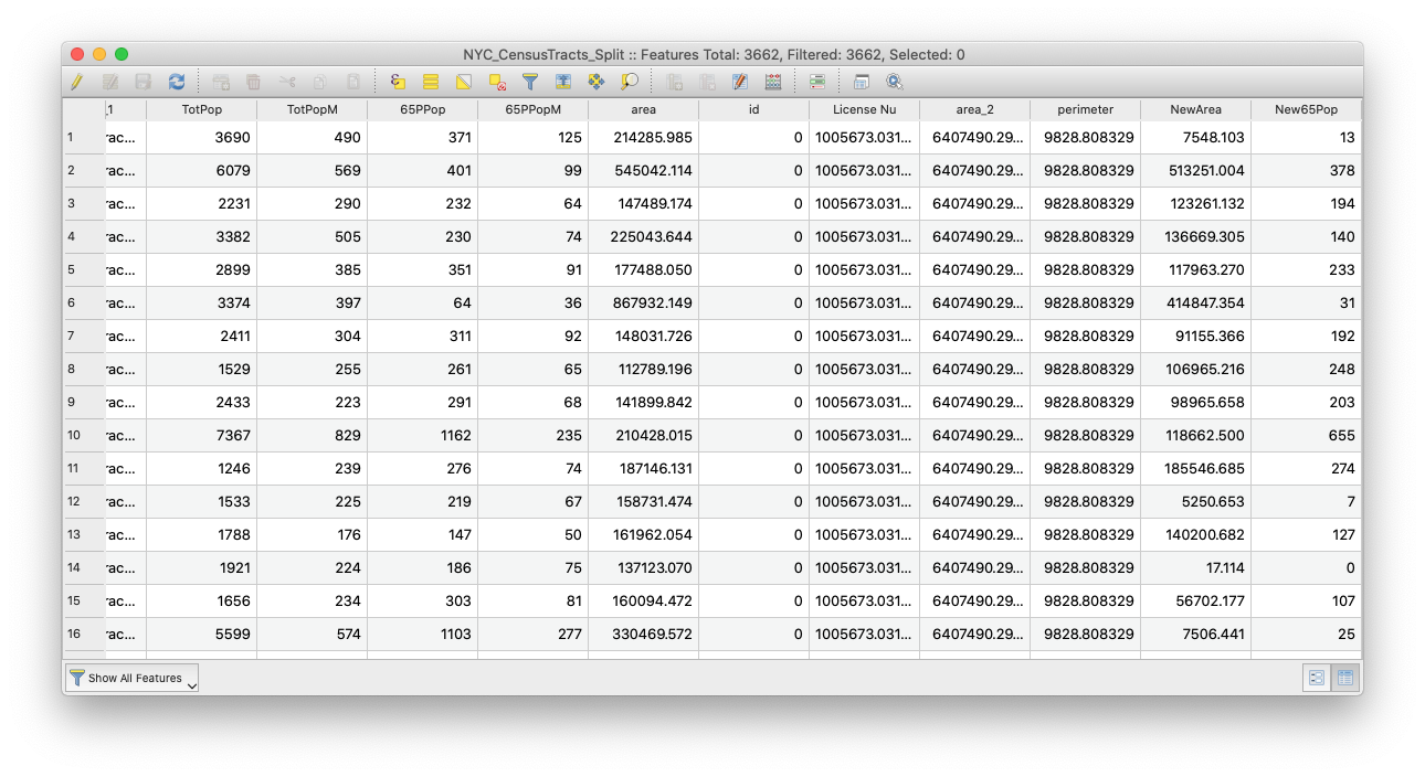
Now we have the layers needed to run analysis that can generate an estimated population based on proportional area. To do so, open your attribute table of your newly generated Census layer and once again, navigate to the Field Calculator. Begin by navigating to the query field and entering the value $area. The field name should be set to NewArea and the field type should be set to Decimel Number Real. Once you select OK, each row will gain a column with a value set to its newly generated polygonal area based on the Union operation. In instances in which there was no overlap between the census tract and the buffer, the area will remain constant. Next, we will calculate the proportional population of the new area. To do so, once again enter the Field Calculator.
Create a new field labeled New65Pop and set it to Whole Number (Integer). In the query, enter the following equation: (NewArea / Area) * 65PPop. This will generate a new impaired population based on the proportional area of space remaining after removing any buffer overlap. Once you’ve checked to make sure that your new area and population calculations are working, exit out of the Attribute Table and be sure to save your changes.
Creating a Choropleth (with Buffers) of 65+ Adults in New York City
Now we need to recreate the choropleth of the census tracts, using the new shapefiles and figures we’ve generated.
-
To create a choropleth map, right-click on the NYC_CensusTracts layer and choose
Properties... -
Once there, choose the
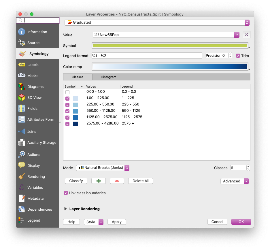
Symbologytab on the left, and chooseGraduatedfrom the dropdown menu at the top. -
Next, select the
New65Popfield as theValue, selectNatural Breaks (Jenks)under mode, and selectClassifyto load all the different values in that column. -
For the purpose of this tutorial, we will select the Blue color ramp, only altering the first color to the hex value of #eaedf0. A great resource for choosing color is Color Brewer. Their default color choices might not be the most stylish, but they will provide a good starting point.
- For each value, we will select more relatable breaks, making the map easier to read. I will set the values to the following:
- 1 - 225
- 225 - 550
- 550 - 1125
- 1125 - 2575
- 2575 +
-
To better style the map, we will also click on each symbol and navigate to
Stroke style, selectingNo Penfor each. -
While you are on that menu, change the
Legendvalue to the actual name of the category. - Your final symbology menu should look something like this:
-
After this, we will style the remaining shapefiles to make the map more legible.
-
To begin, place your census tracts layer above the old census tracts layer in the
Layerspanel and disable the old census tract layer. -
Apply the following style to each of the other layers (by right-clicking on them and going to the
Symbologytab): -
NYC Food Retailer Area Boundary:
* `Fill style` `Simple Fill` * `Stroke color` `#e5e5e5` * `Stroke width` `0.1mm Dashed` -
NYC Pedestrian Roadbed:
* `Simple Line` * `Stroke Width` `.05mm` * `Color` `#888888` * `Opacity` `50%` -
NYC Grocery Retailers:
* `Size` `.6mm` * `Color` `#888888` -
NYC_Hydrography:
* `Fill color` `#ffffff` * `Fill style` `Solid` * `Stroke style` `No Pen` -
Boroughs (the bottom layer):
* `Fill style` `Solid` * `Fill color` `#e5e5e5` * `Stroke style` `No Pen`-
States:
* `Fill style` `Solid`

* `Fill color` `#e5e5e5`

* `Stroke style` `No Pen`
-
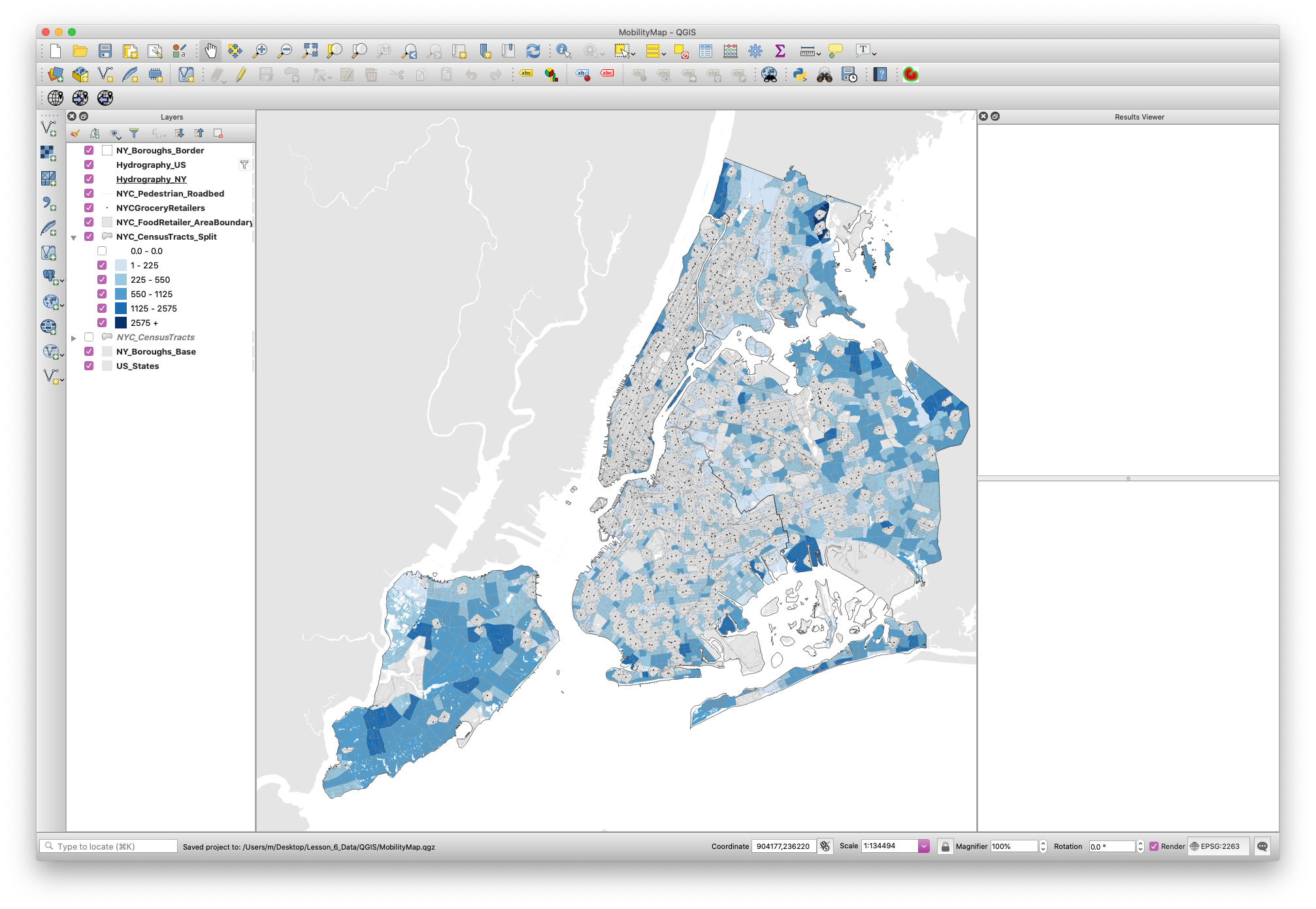
Your workspace should look like the following:
Print Layout
The Print Layout (previously called ‘Print Composer’) is where you will format your map for its final output. Here you will specify the output size, you will add a legend, a scale bar, a north arrow (if needed) and any additional text (titles, sources, explanations and credits). Although the Print Layout exists as its own window it will still be linked to the map Project we have been working on.
-
First, create a new Print Layout in
Project,New Print Layout. Give it a custom name if you want, although this is not necessary. -
Once you are in the Print Layout you need to add a new map. Think of it as if you had a blank piece of paper and you were adding a window onto the map you’ve been working on. That window is a link to your Project and if you change things in the Project those changes will still be reflected in the Print Layout.
-
To add a new map, click on the button
Add new mapon the left-hand panel and draw a rectangle on the blank page. -
Once you add the map you can adjust its size and position by dragging it from its corners.
-
You might notice that if you change the size of the map it doesn’t necessarily update. To avoid this, on the right-hand panel, where it says
Main properties, click onUpdate preview. -
To move the content inside the Print Layout (as opposed to the whole page) use the
Move item contenttool on the left-hand panel. -
Next, you need to center and zoom in the map on the area you want to focus on. For the purposes of this tutorial, we will move and zoom so the whole city is in the map. To do this, move the content of the map to this area and on the right-hand panel, under
Main properties, adjust yourScaleto 235,000. -
If any of the colors or line weights seem too big or two small or not correct, you can always go back to the Project and change them there. When you return to your Print Composer you can update your preview and the changes will be reflected.
-
Add a scale bar by going to
Add ItemAdd scale barand clicking on the map. -
The default scale bar is too big. To change this, go to the right-hand panel, in the top part make sure you select the
Scale bar, and adjust its properties in theMain Propertiespanel. You can also adjust its units, its colors and even its font. -
To add a legend click on
Add ItemAdd legendand then click on the map. You will notice that QGIS automatically generates a line in the legend for every layer in the map. We only need the land use ones, so we need to customize the legend: -
On the right-hand panel, under Legend items uncheck
Auto updateand then select the layers that you don’t want in the legend and remove them with the ‘minus’ button. Do the same thing inside the Lots layer with the categories you don’t want to display. -
Also, further down, uncheck the
Backgroundoption. -
Under
Spacingchange theSymbol spaceto 0.00mm. -
And under
Fontschange theItem fontto 8. -
Since we did not rotate the map we don’t need to add a north arrow. If you rotate your map you must add a north arrow. If you wanted to, you could add a north arrow by clicking on
Add ItemAdd arrow. -
Finally, to add a title and a ‘source’ text, click on the
Add new labelbutton on the left-hand panel and click on the map. Customize these labels by changing their color, size and location. -
The last step is to export the map as a .pdf file. Use the
Export as PDFbutton on the top toolbar and save your map. -
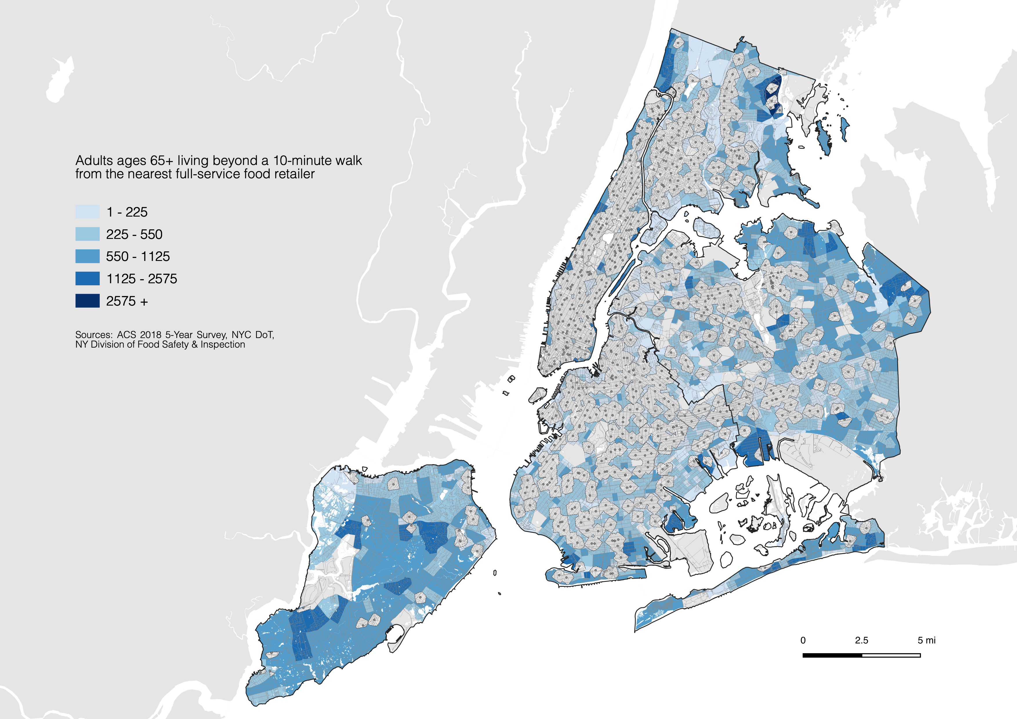
Your final map should look something like this:
If you are having any errors or would like access to a final copy of the QGIS file/data, you can download the working directory at brwn.co/athome6_complete